


Digital Re-Touching
What piano playing has taught me about retouching
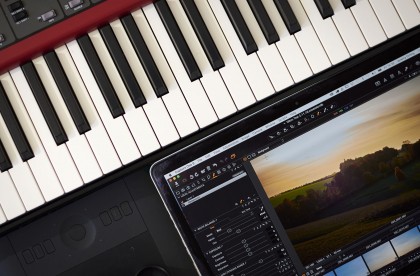
Six Piano Lessons for Photo Retouchers
I have been working as a retoucher for over fifteen years now. While this may seem like a long time my piano playing goes back much further. It has never been a full time profession for me, but never the less it is one of my passions.
If anyone’s interested they can find just a few clips of me on YouTube.
A few decades of playing music has taught me a lot about how to improve, make efficient use of learning time, keep an audience engaged and stay motivated. I believe a lot of these principles are universal and I have applied them when retouching.
So here are six ideas I use when learning piano and how they are useful in retouching.
Performance
When learning a piece of music for performance it is there to be judged by an audience. Making the best possible impression is what helps give a piano player a good reputation. Being put under this level of pressure regularly, improves their level of musicianship and gives them confidence.
When retouching, your audience is your client. You need regular work or employment as a retoucher, being put under pressure to achieve deadlines while maintaining a high standard. This helps to make you a fast, efficient and confident artist with a reputation for quality and reliability.
Practice
If a musician only picks up their instrument for a performance they are very unlikely to change their repertoire. Playing the same music will soon get boring for both them and their audience.
Previously I worked for a small company as a retoucher where eight hours a day needed to be spent rushing through work, meeting deadlines and answering emails and phone calls. While I recognise that this helped to make me a fast and efficient worker, it also prevented me from expanding my “repertoire”. Software updates and new Photoshop plugins meant there were faster and more efficient ways of working. While I may have been aware of some of these new developments I hadn’t had time to become familiar with them and so relied on my out-dated methods through habit.
Embrace the Unfamiliar until it isn’t.
A common mistake Musicians make is to practice material and styles they are most familiar with. It is far more beneficial if they diversify. This may lead them to exciting new paths to follow or, as is more common it will add depth to their chosen style.
In the retouching world diversifying may mean learning several ways to tackle the same problem or learning to use new software. This allows you to choose the best method for any given problem. However, this doesn’t truly become a choice until the new method is as familiar as the old.
Repetition is key.
A piano player may sit at home and run through a piece of music they want to learn. They may go through it several times and memorise it. The moment comes when they get a chance to play infront of an audience and prove themselves. They get several bars in and what’s sounded great in rehearsal is suddenly full of mistakes.
Stage fright plays a large part here, but I’d like to focus on another reason for this happening. When learning something new it is common for a pianist to run over the same music several times until they can play it without mistakes. This seems perfectly logical until we take a closer look and analyse what they have done. Very often they have played the music badly dozens of times and only got it right the last one or two times. It’s no surprise that mistakes are made as these have become the stronger habit. Therefore repetition is vital, but it is more repetition than most expect.
Retouchers who are just starting out may follow a video tutorial step by step and then feel they can offer what they have learnt as a service to clients. Often what separates amateurs from professionals, is that the professionals have repeated certain methods thousands of times, until they have become second nature. When put under the pressure of time constraints on a job, retouchers can’t be referring to online tutorials.
So, if you want to offer a new service that you are unfamiliar with by all means follow online tutorials, there are a lot of great ones out there. Go over them several times then try to copy the methods without referring back to the tutorials and do that several times.
Understand what you do.
Music follows certain rules and structures. When these are understood the learning process is quicker, easier to memorise and gives an idea of possible alternatives vital to developing an individual style.
For retouchers, seeing the logic in what they are doing allows for adaptation of ideas to suit different circumstances. Also when following online tutorials it makes the learning process quicker.
Don’t ever just follow a sequence of steps blindly. Make sure you understand what you are doing and why.
A good tutorial should explain this.
Practice the Minimum.
There’s a quote from the great jazz pianist, Bill Evans, “I practice the minimum”. I remember this one because on first reading it seemed very unusual to me. This line was a response to the question “What do you practice?” rather than how much. The point being made here is that a musician should concentrate their efforts on learning fewer musical ideas over a given period of time. This gives a deeper understanding and results in ideas being retained in the memory more permanently, rather than being learnt one week and forgotten the next.
This is very good advice when learning anything. In the context of image manipulation software such as Photoshop there seems to be an almost limitless amount of ideas on how to use it. The temptation is to move quickly through as many ideas as possible without fully understanding any of them.
So yes, diversify, but be patient, take it at a pace that allows ideas to be fully absorbed. In the busy world we work in it may seem counter intuitive to slow the rate of learning, but it is a real time saver if you don’t have to keep referring to tutorials to jog your memory.
Specialise or not?
There may seem to be a conflict of ideas in this post. As a retoucher, should you specialise or diversify?
The majority of retouchers are capable of achieving very good results in a variety of styles and are unlikely to turn down what work comes their way.
A few are lucky and fit into a niche often working with a few select photographers over a long period of time. I believe the truly exceptional work comes from those that have developed their own individual style within that niche, often as a collaboration with the photographer.
I have observed some very talented retouchers working very much on the artistic side of things within their niche. One thing that is very striking is, they often can’t answer questions about using alternative methods. This is because they have developed a personal style over the years and focused their attention very much within that style.
The path that leads to this has to come from an understanding of many different ways of working. After all, you can’t narrow your focus if you already have a narrow focus to start with.

Piano by candlelight
The art of choosing good photo retouching samples.
The art of choosing good photo retouching samples
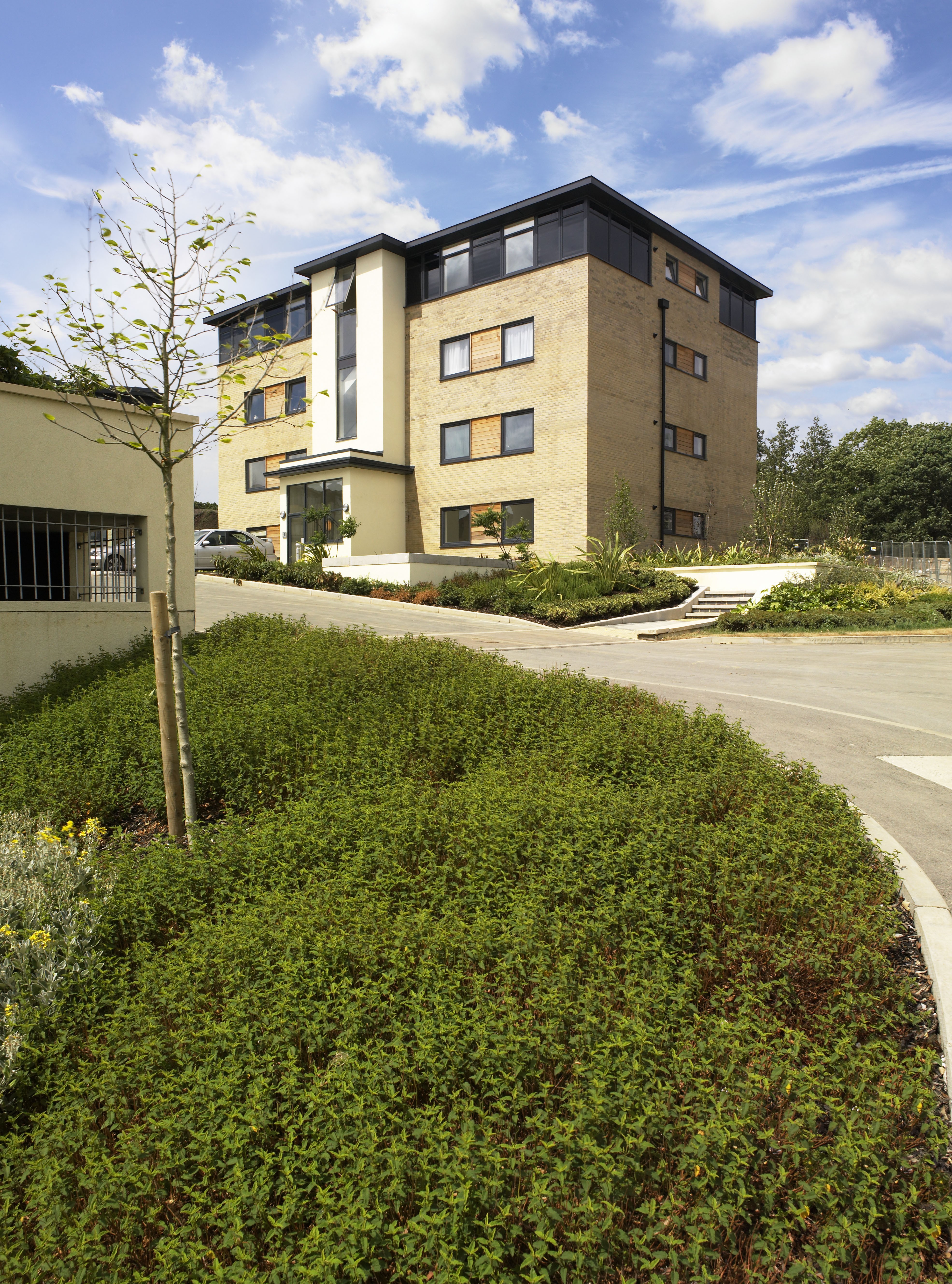
There is a definite art in choosing good photo retouching samples. Making the right choice lessens the retoucher’s workload, whereas the wrong choice can mean hours of unnecessary work with less than ideal results at the end of it. Light direction and quality need to be taken into consideration as well as viewing angle, perspective and sometimes reflective qualities. Experimenting with a certain amount of trial and error can be beneficial. This is where a Photoshop file with well labelled paths and layers can allow you to quickly try different retouching samples.
My Downloadable Skies for retouching help with both direction and quality of light. Having a large selection of viable skies will help you to choose which ones suit or enhance the composition of the shot.
I recently took a series of clear blue skies, available on my ““Buy Images”” tab through July 2015. Interesting cloud formations and sunsets are often good images before even being added to a shot, but sometimes it’s the less obvious skies that sit just right in some shots. So here are a few ideas on how I may use some of these skies in my retouching.
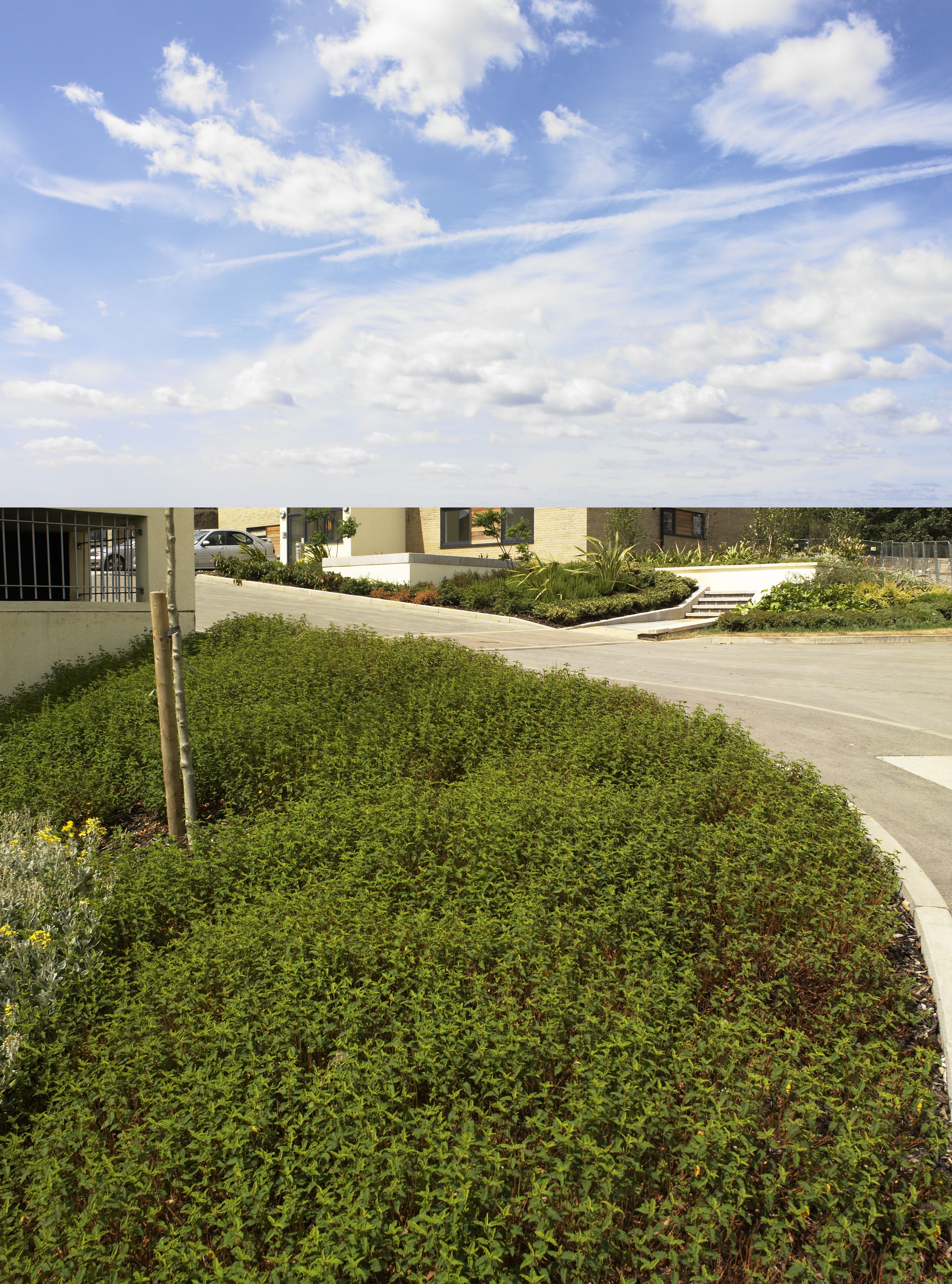
First example is this plain blue sky:

Clear blue sky
This is a north facing sky taken on a summer morning. The sun is roughly behind the camera, which gives an even tone left to right. Technically speaking this sky should be used on a shot that has the sun on it. Compositionally I would use it on a shot that has simple shapes that may look too busy with the addition of clouds, such as the shot below:
Final shot
There is a certain amount of personal preference involved. You may choose to have a few clouds in this shot, but the idea of keeping the shot simple makes it stronger in my opinion.
Where there is a large area to fill you may choose to add a sky with clouds to add interest:
Cloudy Sky Added
The large cloud at the top of this image fills what would otherwise be an empty space and the smaller clouds roughly follow the line of houses, thus enhancing the overall composition.
Now for the exception that breaks the rule – below is the same image in the same format with a clear blue sky:

Blank Spaces are useful if text needs to be added
As a retoucher it is useful to work as part of a team with Photographers and design agencies. If a shot is needed for a magazine cover or as part of a page layout other compositional elements need to be taken into consideration.
Note how the above image has the front of the building in shadow indicating that the sun is on the left hand side. The added sky was taken in the morning, facing south east with the sun also just off to the left indicated by a lighter shade on this side.
Now for the hidden gem in your arsenal of retouching sky samples, the one taken into the sun:

Clear blue sky facing the sun.
The reason this may be such a useful retouching sample is because it’s often the shots taken facing the sun that need rescuing. The choice is to either expose for the sky and have the subject matter in deep shadow, or expose for the subject and have the sky completely burnt out. My rule for adding skies to this type of shot is to not make the sky perfect as this will look unrealistic.
Here’s a cityscape image taken into the sun:
Original shot facing the sun.
There’s no detail in the sky here. Also if you look on the horizon you will notice how much it lightens, as is usually the case when shooting into the sun. A strong blue sky will look wrong with the most noticeable problem being where the sky meets the horizon. Adding a sky which is already burnt out makes the retouching more believable. In the example below I’ve used my clear blue sky facing the sun and burnt out the highlights even further with a levels adjustment:
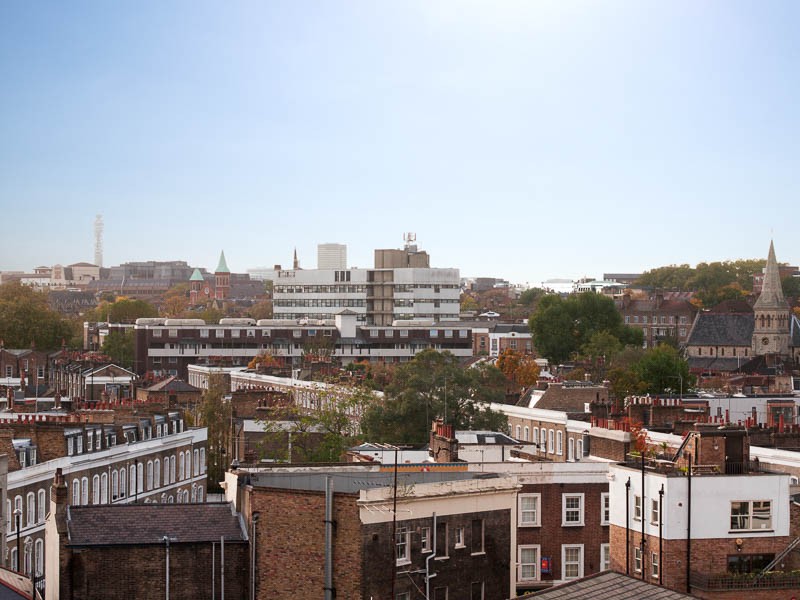
Cityscape with morning sky added.
Other uses for a burnt out sky may be when retouching interior shots. If there is a window view it is common for the exterior daylight to be brighter than the internal lighting depending on how sunny the day is and what photographic lighting is used.
Below is a section taken from a retouched image to show a bright sky added to a skylight:
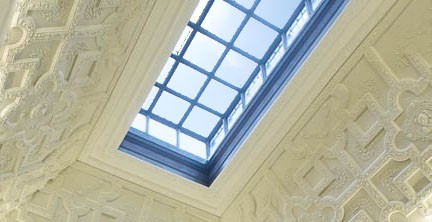
Again a stronger sky would look out of place here. Also it’s surprisingly difficult to make a darker sky fit by lightening it. Particularly it is difficult to artificially achieve the natural graduation seen in the above example.
I’d like to backtrack now and take another look at my cityscape image. As already mentioned it’s usual for the horizon to look lighter, having a hazy feel to it, specifically when the sun is at a low angle catching atmospheric particles. This is a problem as it restricts the type of sky that can be added. It is also an advantage as haze can add depth and atmosphere to a shot. The sky used on this occasion is an evening shot taken as the sun goes down:
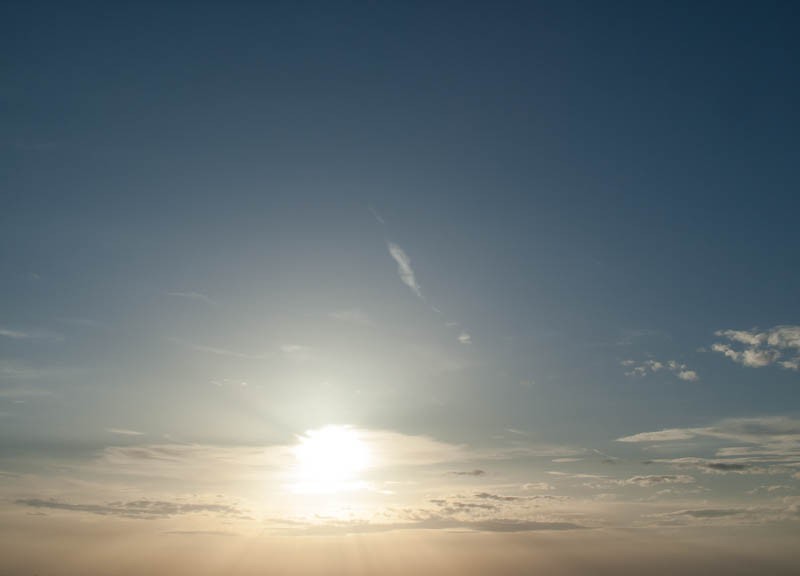
Evening sky
Neither this sky image or the original cityscape strike me as prizewinners, but when added together the final result is more than the sum of the parts:
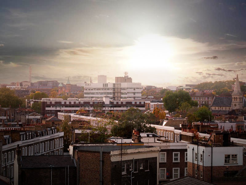
Cityscape with evening sky added
The underlying message when adding skies, or doing any type of compositional retouching, is to keep focused on the final result. I’m often tempted to add skies that look fantastic on their own. Sometimes they work well, but they can also be detrimental to the final result.
I hope you have found this blog useful. If you have any thoughts on how to use sky samples in retouching please feel free to share them in the comments box.
Colour Consistency – was it more achievable before digital photography?
Colour consistency – was it more achievable before digital Photography?
A lot of problems occur in colour consistency these days due to misunderstanding of calibration, use of colour space and conversion between colour spaces. I have often heard photographers comment that analogue methods of film and print were a lot more reliable for showing how the colours of an image should be represented. A photograph or transparency will not change colour, whereas a digital image may look different depending on what monitor or device it is viewed on.
As someone who worked in a darkroom dealing with professional photographers early in my career I can definitely say that the above argument is not completely true. Colour calibration problems with accurate viewing of colours has always been there in one form or another, whether dealing with film and print or digital images.
Colour consistency in traditional photography
Below are a few ideas used to achieve tonal and colour consistency when dealing with film and photographic print:
Raw materials
These include film, paper and chemicals and form a solid foundation if high quality is needed. Possible areas where quality may drop is if film or paper is old or not correctly stored, making sure chemicals are adequately replenished and making sure working areas are as close to 100% light-tight as possible. Small amounts of light will not always cause obvious fogging, but will reduce the punchiness of the final result. The use of a densitometer will highlight problems caused by chemicals before they become visually obvious and help in maintaining colour consistency. I used to operate a densitometer to maintain quality on an E6 processor. It involved taking readings from a test film strip, plotting a graph and sending the results off for analysis.
Viewing conditions
It is important to make colour judgements for prints or transparencies based on consistent viewing conditions and a neutral light source. This means looking at prints under daylight bulbs or daylight fluorescent tubes. The colour temperature of fluorescent tubes changes as they get older, so they will need to be replaced regularly.
Transparencies need to be viewed on a lightbox with a neutral colour source.
If transparencies need to be matched up to prints a special viewing hood is needed where the backlit/lightbox sources and reflective overhead light sources match.
As you can see maintaining colour consistency in the pre digital days still needed a considerable amount of effort, time and expense. Having said that, when things did go wrong it was not usually as pronounced as colour problems in digital photography.
Colour consistency for Digital images
Monitors
Colour consistency in digital photography starts with accurate viewing conditions. This means having a good quality monitor that is regularly calibrated, as a starting point. “Good quality” in this case, doesn’t necessarily mean a huge, high definition 4K monitor. More important factors are colour accuracy, tonal and colour consistency in different areas of the screen and viewing angle. It is possible to spend a huge amount of money on a monitor and still not get the best colour accuracy. Eizo and NEC make good quality monitors for Photographers, retouchers and graphic designers. Here’s a link to the Eizo range of monitors. I use the Eizo CG246 which is very quick to calibrate via the built in calibration tool and gives me confidence when making colour and tonal corrections.
Monitors cost significantly less without built in calibration, but if you go for this option I would recommend buying an external calibration device such as the i1 Profiler. You’ll probably save some money overall, but spend a bit longer calibrating your screen. The accuracy of calibration is very good whichever you go for according to all reports I have read.
If you’re not familiar with monitor calibration here’s a rough guide to how it works. The calibration software has a series of colours which it displays on your monitor, one after the other. These colours are measured, either by an external device such as the i1 Profiler, or your monitor’s built in device, which pops up only during calibration. These measurements are compared with the values of the colours stored within the calibration software and a colour profile created which corrects any inconsistencies.
Printing
If you need to print from digital images you may well need to give printer calibration some thought. Some solutions are beyond the budgets of most individuals. Conversely some printers give decent results out of the box without spending any additional money, providing you use good inks and paper. Most people using prints for personal use don’t feel a need for calibration.
If on the other hand you’re a commercial printer churning out tens of thousands of copies, or if exactly the right colours are important, any inaccuracies could be very costly. Calibrating a printer will improve things, but you need to bear in mind that some colours seen on a monitor cannot be reproduced on paper however good your calibration.
Remote calibration offers a relatively cheap solution if you have a lower budget. It involves downloading a colour chart, printing and sending it off. Readings are taken to produce a colour profile. This file can then be sent to you to be placed in your colour sync profiles and selected from your print dialog settings. The colour profile will be specific to your printer and paper type. A different profile will be needed for each paper type you use and each printer.
Some companies very conveniently offer an onsite calibration service, which is very popular if a little more expensive than remote calibration.
For those who need a consistently high level of colour accuracy the solution is to buy a spectrophotometer to create your own profiles. Prices vary from about £300 to £1000. For this you will get the convenience of being able to calibrate whenever you need.
Scanning
There is a huge variation in the price and quality of scanners. At the lowest end you can buy a multifunction printer for under £100. In my experience the scanning function on these tends to produce over saturated colours with detail being lost in the dark areas of an image. They are often more relevant to text and graphics rather than photographic images.
At the other end of the scale are the Hasselblad Flextight Scanners (formerly Imacon), which sell for somewhere in the region of £16,000 and are clearly aimed at the professional market. I worked for many years one of these, building a digital archive of a photographer’s huge library of 5×4 transparencies and negatives. I haven’t come across any other scanner I would prefer to use for a job such as this.
If you want to reproduce the subtle balance of colours and tones of a photographic image choose your scanner carefully. For personal use I think the scanner function of the Epson xp850 produces good results at reasonable budget.
Most scanning software these days lets you alter the colour as you scan in. So is calibration necessary for a scanner? As with printers I think it depends largely on how important accuracy is to you. There is a subtle relationship between colours and tones in a photographic image. An uncalibrated scanner can upset this relationship, which is difficult and sometimes impossible to compensate for with the more general colour and tonal adjustments offered by the scanner’s software or any image manipulation software used post scanning. In addition you may also find you need to make a different adjustment to each image as the range of colours in each image are different. This means a calibrated scanner will also save time.
Calibrating a scanner involves scanning in a specific image or colour chart, which is then compared to a digital copy and any differences used to generate a colour profile.
Has the digital revolution been good for photography?
I have always worked at the post shooting stage and feel that my job is hugely more creative and enjoyable since the digital revolution. So for me the answer to the above question is definitely “yes!”. The ease of being able to make alterations to digital images is a good thing, but does throw up a new set of problems. Consider for example, an image that has been carefully colour corrected by the photographer on a calibrated system to match the mood they want and the original colours as they saw them. This same image may be altered by someone else to look good on their uncalibrated monitor and sent off to the printers, giving an unsatisfactory result. It is therefore important for anyone dealing with images in a professional capacity to be reasonably well educated when it comes to colour management.
Other consequences of the digital age are an expectation of a higher volume of shots, faster turn around times and in some cases a struggle to maintain standards of quality. These expectations could not be met by a photographer who chose to shoot on film. With the accessibility of digital photography providing cheaper alternatives, I feel that the value of the professional photographer has been devalued somewhat. It may be easier to set up as a photographer these days, but it is more difficult to earn a high wage from it.
As traditional methods of photography become a distant memory it will be more difficult to make comparisons such as these. I have witnessed a lot of changes in my career, seeing some photographers thrive and other choose alternative employment. These are my opinions based on my experiences. If you have any comments or differing experiences I would be glad to read them.
Old Photo Restoration and the Joy of Painting
Old Photo Restoration and the Joy of Painting
Anyone taking a casual look at my portfolio can clearly see all my retouching is of architectural or interior shots. When I was asked to restore some old family photos I was more than happy to do it. After all, most of old photo restoration work is just cloning out scratches and restoring contrast levels. I may not be experienced in the business of Photo Restoration, but the tools needed in Photoshop are the ones a beginner learns about first. I expected the work to be very simple and maybe a bit tedious.
Having now done the work I can say without a doubt that it was much more involved, more challenging and definitely more fun than I expected.
As with any job some parts of retouching can become repetitive and monotonous. What makes things a lot more interesting is when areas of an image need to be recreated from scratch. I’m not talking about cloning, photo montage or copying and pasting areas of an image here. I’m talking about painting and applying a texture to make it look like part of the original. This is not a step by step tutorial on how to do this, but I will give a few pointers to anyone wanting to give it a go.
Here’s the image we will be discussing:

Before Restoration
First you will need a good quality scan of this. The original was very small, so I scanned it in at a larger size to allow for larger prints. Also I delicately moved areas of the paper emulsion in the torn areas to reveal as much of the image as possible. I used a decent quality scanner which is adequate for this job. It may be worth bearing in mind that the price and quality of scanners varies hugely and a poor quality scan will effect the final image.
After scanning I made a good compositional crop, removing the old border. I avoided being lazy here. For example I could have cropped off large areas on the left hand side and therefore not had to make up any missing areas. This would have been a lot easier, but given a poorly composed final image.
Initial stages involved tonal adjustments to give a good level of contrast and making up missing areas by utilising existing parts of the image.
Now for the fun part! The left hand side of the girl is completely missing and parts of her face obscured by a tear. I could not copy any parts of the original image to make up these areas. Instead I painted in the parts needed using photoshop’s brushes. This is a skill that needs to be learnt through trial and error, rather than be explained. If you wanted to give it a go yourself, here are a few pointer’s;
1.Allways paint on a separate layer from the main image.
2.Block in the main shapes first, then add shadows and highlights gradually using low opacity brushes
3.Constantly evaluate what you are doing at different magnification levels.
4.Apply a matching texture to your painted layer(s). For this image I used a grain effect, but needed to enlarge it to fit with the texture of the original.
5.Don’t be afraid to experiment. If you experiment on a new layer and don’t like what you’ve done you only need to trash the layer. Experimenting is an important part of learning the skill.
6.Don’t be put off if you’re not happy with the way it’s initially looking. It takes time and patience to get believable results.
Here’s my finished image;

Old Photo Restoration
The Importance of painting
This was by no means the first job I had to use painting skills on. I realised a long time ago that painting was a valuable part of the retouching process, but also a very creative and rewarding way of working in Photoshop. It is not something to be used instead of other methods such as cloning or using 3D objects, but sometimes gives the best results and is often the only viable method. It had never occurred to me that this is often the case in Photo Restoration jobs.
Going back a few years, I experimented with painting in a few of my professional retouching jobs and dismissed it as looking unrealistic. I then entered a few Photoshop competitions and needed to gain a lot of painting skills. Having no paying client to answer to gave me the freedom to experiment and take a few risks. I was amazed to find myself winning a few competitions and getting a lot of encouragement from other retouchers. With my newly gained skill and a bit more confidence I was ready to start using what I had learnt on a professional level. Here’s something I painted as an experiment when learning;
Landscape Painting
Going back even further to my days as a darkroom technician I remember enjoying printing from old negatives. Some of these were on glass and of an exceptionally high quality and of historical interest. Photo Restoration combines my love of painting and an interest in old images. So next time I get offered a job like this there will certainly be no hesitation in accepting it.
If you like what you see here and have a photo restoration job please contact me via my e-mail address on this website. I will be glad to help.
Architectural Retouching – Seeing the potential in your shots
Architectural Retouching – Seeing the potential in your shots
My last post was on the subject of choosing a suitable photographer for interior and architectural shoots. In this post I would like to discuss what you can do if you have already had shots taken and are not happy with the images you have been supplied with. This can sometimes be down to poor photography, but there are more common factors such as poor weather on exterior shots, unfinished building work and landscaping or missing the final few fixtures and fittings on interior shots. The site manager’s and photographer’s idea of whether a new property is finished are often very different. I have occasionally been on site with a photographer who has travelled a long way for an exterior shoot to find that the front lawn has not been laid or there are piles of sand and heras fencing in front of the property. If your shots are not as good as you would like is architectural retouching a viable option?
Even if you know a property is unfinished you may need shots for an ad which has been booked in advance and cost a great deal. In cases such as this the photographer may be able to shoot some samples for retouching purposes. If for example a rubbish skip is in front of a building shooting the best angle and then taking a second shot a few yards to one side will give the retoucher the missing bits to add behind the skip.
Here’s an example of one of my very old retouching examples where additional shots have been taken only for retouching:
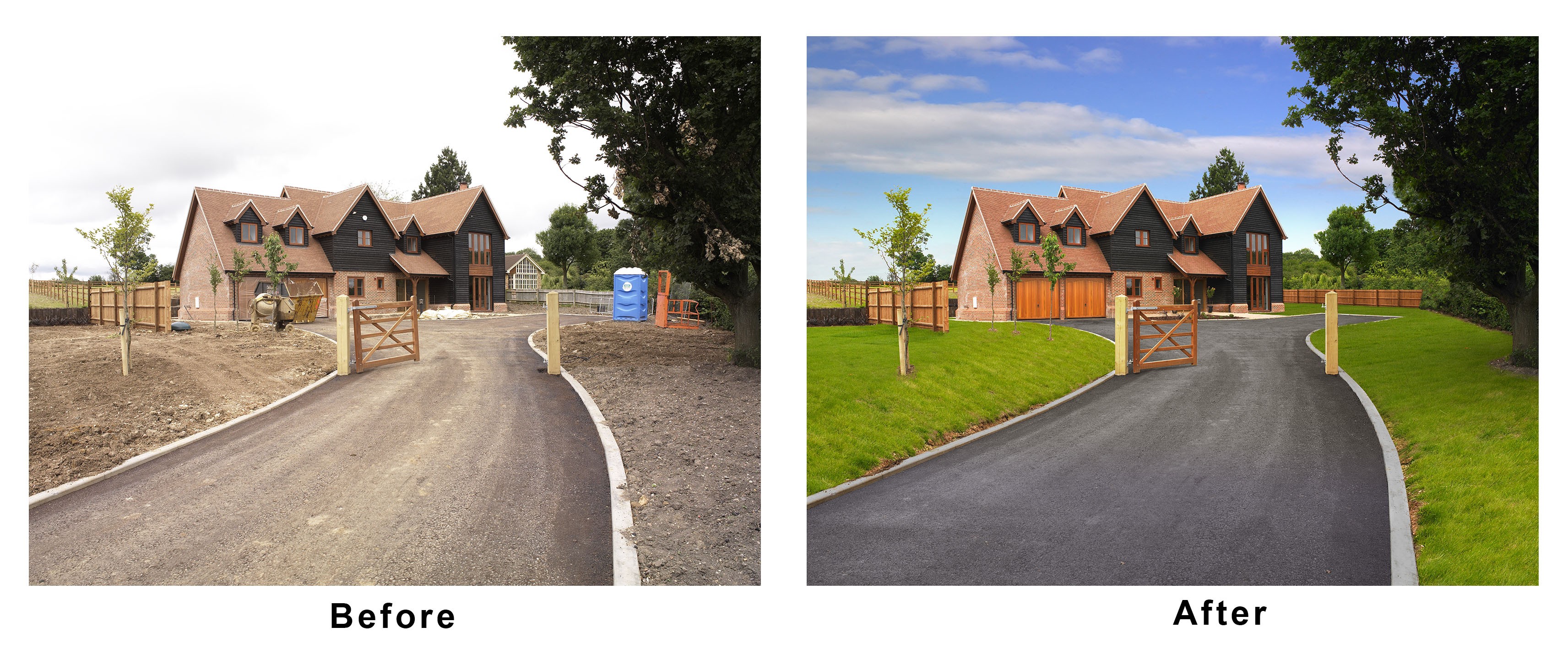
Shots taken for retouching.
Should you pay for retouching?
Retouching can cost a lot, so before spending money you need to know if it will be worthwhile. Putting the skill of the retoucher to one side for the moment, is it possible to get a useable image or is the original too poor quality? Below are a few ideas that might help you make up your mind.
Is the resolution good enough?
To answer this question you have to know what your image will be used for. If it will only be used on a website or e-mail campaign then the resolution doesn’t need to be that high. If it’s going to print then the resolution needs to be a lot higher but the exact amount will depend on the size of the print. Downsizing a high resolution image will not cause any problems, but upsizing will result in a loss in quality.
To give an idea of what size an image will print up to you need to know the pixel dimensions. 300DPI is a good print resolution, but this number on it’s own doesn’t tell you anything and is fairly irrelevant as DPI can be changed without changing the total number of pixels in an image. If you look at the pixel dimensions and see an image has a size of 2400 x 3600 pixels this will print at 8″x12″ if set to 300DPI (2400÷300=8 and 3600÷300=12).
If your original image isn’t high enough resolution for your needs then paying for retouching is not worth it.
Are RAW files available?
If your image is not correctly exposed, or there are either shadow or highlight areas that have no detail in them it may be possible for them to be recovered. This is a lot more achievable if the RAW files are available. Photographers very rarely supply RAW files because they are so flexible and may well result in their photography looking very different from how they intended. As the photographer was there at the time of shooting they have a good idea of how the images should look and so normally process their own RAW files. It may however, be worth politely asking for the RAW files to be made available to a retoucher if the final result is run past the photographer or if the photographer deals directly with the retoucher.
Is it worth adding a blue sky?
This is something I have seen done badly many times. Does your external shot have shadows with clearly defined edges? If not a clear blue sky will not look right, but you may be able to add a sky with lots of clouds and some blue areas. If the shadows are clearly defined then the image will take a sky well.
There is a special case for skies added to north facing buildings (click here to know about Herford’s Tree Care, Inc. who will help in landscaping to capture the perfect shot that you want). The front of a north facing building will be in shadow at any time of day, assuming the building is in the northern hemisphere. The original sky will probably be bleached white. If it’s a sunny day the building will be in heavy shadow, so a less sunny day for shooting may be preferable in this case. It is possible to add a believable sky, but it will need to appear overexposed. I have a collection of sky samples which I have deliberately shot facing roughly toward the sun, but still containing some blue for use in this type of image.
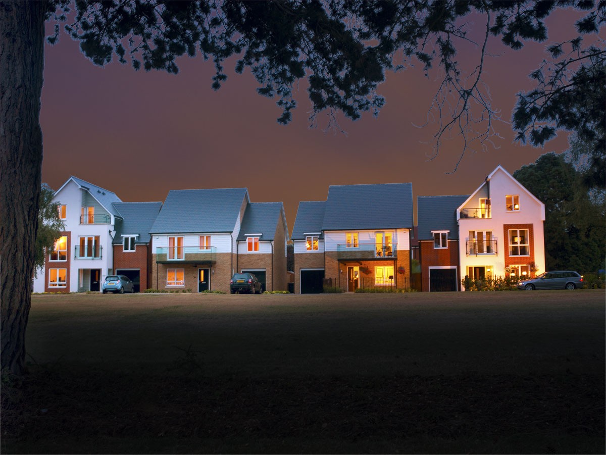
Is it worth adding a night sky?
Adding a sky to a night or evening shot is usually achievable, but the sky and main shot need to match and can look very bad if done poorly. There are many rules for what makes a good match, sometimes with a certain amount of trial and error by the retoucher. The light values and colour of the main shot may need to be changed so it fits with the added sky.
Here’s an un-retouched evening shot;
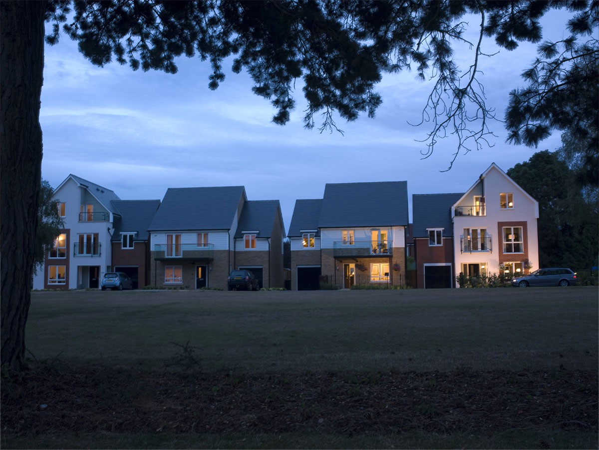
Evening shot before retouching
Here’s a sky that looked great in the original shot taken from a balcony view in London:

Night Sky
As you can see below the two added together are a bad match giving an unnatural looking result:
Bad match
The sky doesn’t fit for many reasons. Most importantly it is a very warm sky and the colours from a warm sky tend to effect the colours in the main image.
Here’s how a good sky should look:
Good Match
If you want an architectural retoucher to do a good job of adding a night sky you have to let them have a certain amount of artistic license. colours and light values may vary hugely from the colours in the original as they are effected by the added sky, but done properly the results can be stunning!
What other ways can a retoucher improve an image?
Correcting verticals is appropriate in a lot of cases. Here’s an un-retouched image which needs the verticals correcting:
Converging Verticals
You will notice the walls on the far left and right both lean in towards the middle of the image.
Here’s the retouched version which, among other things has had the verticals corrected:
Verticals Corrected
All upright lines are now parallel to each other and are true verticals.
Barrel distortion is another common problem caused by wide angle lenses. Here’s an image in need of correction:
Barrel Distortion
The effect of barrel distortion can be seen more easily near the edges of the image. The vertical lines curve out towards the sides.
Here’s the retouched version with, among other things barrel distortion corrected:
Barrel Distortion Corrected
Do you have a landscape shot that needs to fit an upright format for an ad? Many shots can be cropped or added to so they can fit a specific format. Here’s an example of a shot that has had sky added to convert it into an upright:
Landscape Version
Upright Version
The landscape version has already had the sky added. For a retoucher to then change the sky to make an upright version is a very quick and therefore cheap job.
Colour and tonal changes.
If your not happy with colour, contrast or brightness of an image make sure you are looking at it on a regularly calibrated, high quality monitor designed for photo editing work. Eizo and NEC are both good makes, but you can expect to spend £1,000 or more. If this is beyond your budget then you may be better off trusting your photographer or retoucher who should be working on a calibrated monitor.
Removing objects.
You may want a retoucher to remove any objects that are ugly, detract from the focus of the image and are not permanent fixtures. This can be anything from dirt on the road, to bins, signs, plot boards, fencing or railings. If you are using the image to sell a specific property rather than a house type you may need to be careful you don’t remove permanent objects such as that ugly factory next to the property, as this may be seen as dishonest.You can also contact car accident claim attorneys as they can help you out in dealing with the matters related to property.
I hope you find this useful in deciding wether to have an image retouched and what you may ask to be done by a retoucher.
If I can be of any help with a retouching project you can contact me via the e-mail address on my “Get in Touch” Page; https://www.adshotsdigital.com/contact-us/
Most of my work can be carried out remotely. If you e-mail me a low res file I will be happy to give you a no obligation quote.
Photoshop 3D beginners Tutorial (Part 3)
Photoshop 3D Beginners tutorial (Part 3)
This post follows on from Photoshop 3D beginners tutorial (Part one) and Photoshop 3D beginners tutorial (Part two) . We will start with the object created previously and I will be assuming that you are familiar with Photoshop outside of the 3D environment.
Here’s the image as we left it at the end of Part 2:
Starting image
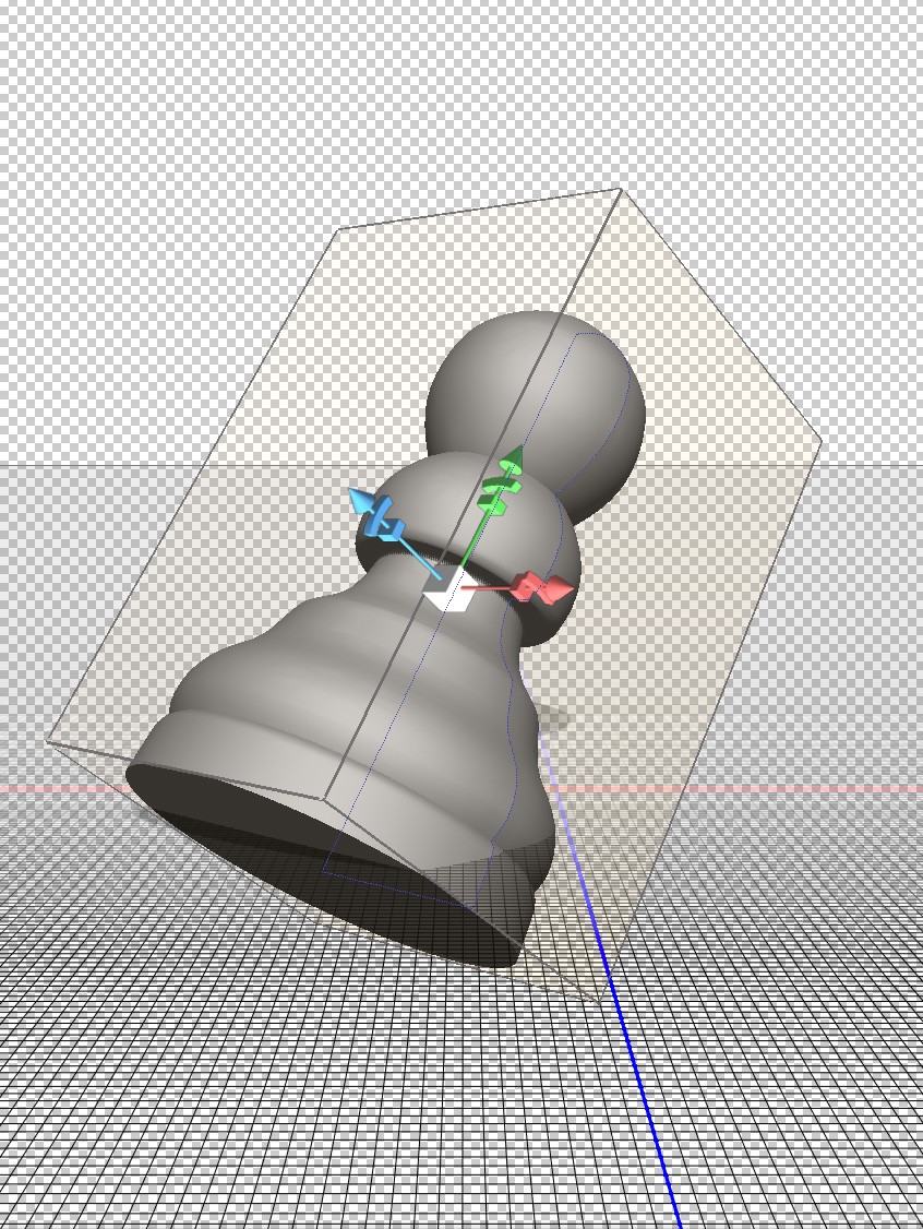
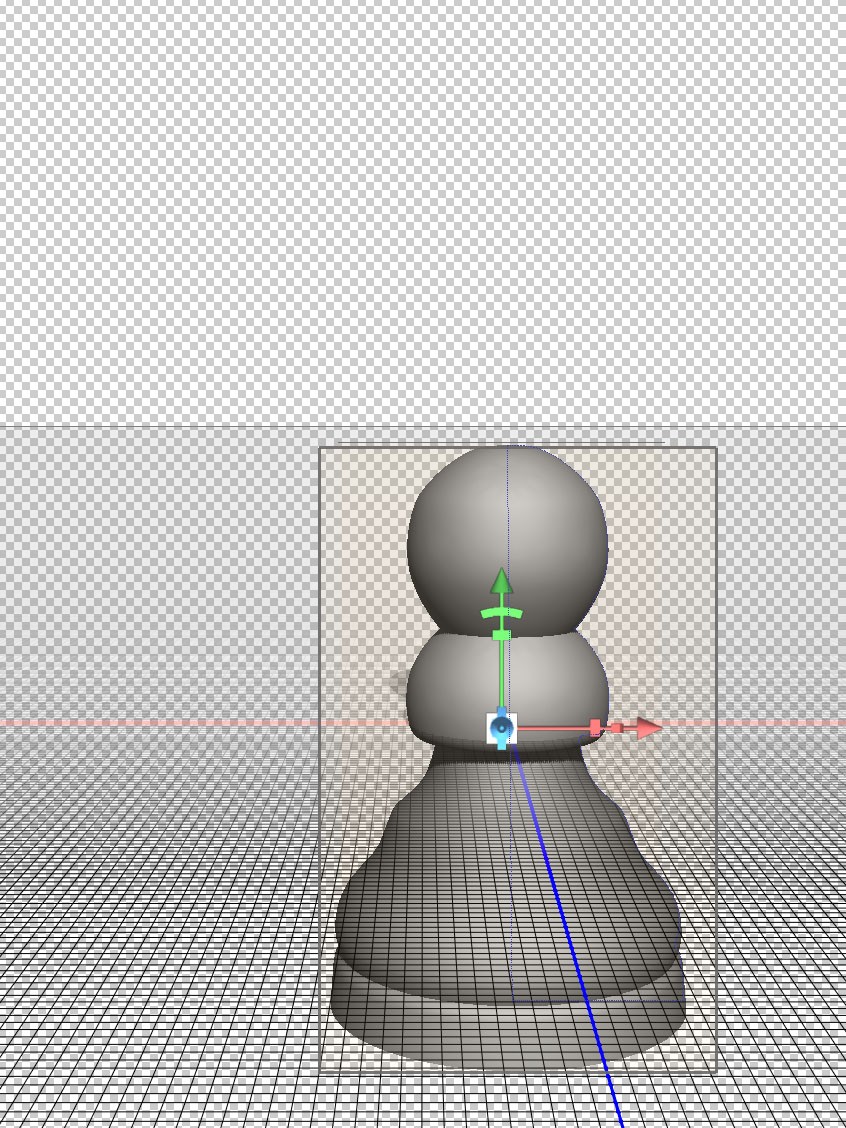
The object is resting on the ground plane at the intersection of x and z axes. If your object does not look like this you can reset it via the co-ordinates pallet as described in the previous blog.
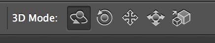
Firstly let’s look at moving around within the 3D environment. This is very different from moving the object, which is what you were doing in the last post. You will be using the same move tools found at the top of the page when in Photoshop’s 3D mode. They will only be visible when the move tool is selected in the tools pallet on the left hand side of the screen. You will also notice that the object stays on the ground plane at the intersection of the x and z axes and that the shadow always falls on the same area of the ground plane. You will just be changing the viewing position. The light source object and ground plane remain fixed in relation to each other.
To move around the 3D environment you need to de-select the object. To do this make sure the move tool is selected and click anywhere outside the object. The box will disappear from around the object and there will be minor changes to the move tool options:
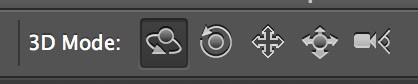
Move Tool Options
The far right hand move option now appears as a camera icon. We will come back to this later.
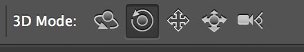
Rotate Camera Option
The rotate camera option is found on the far left hand side:
Rotate Camera.
Click and drag on the background to get a feel for this. It allows you to move freely and look at the object from any angle. You may think this is all you need when first trying it, but there are several things you cannot do:
1.You will notice that the horizon line stays at the same angle, which is set as horizontal in this case.
2.You cannot go closer or further away from the object.
3.You are always looking directly at the object.
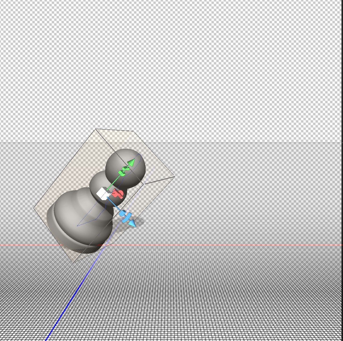
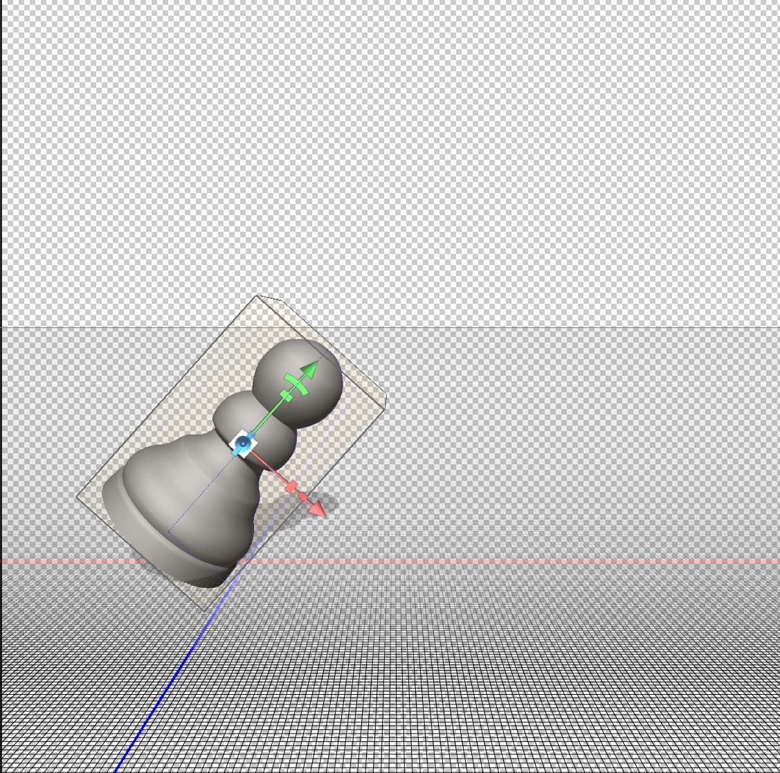
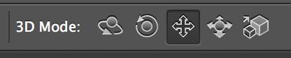
Roll Camera Option.
Moving to the next option along you access the roll camera option:
Roll Camera Option.
Imagine you are holding a camera and you tilt it at an angle. This is the effect of the Roll Camera option. Click and drag and you will notice the horizon change angle. Here’s the effect of using the Roll Camera option:

Effect of Roll Camera Option.
Pan Camera Option.
Moving along, the next option is Pan camera:
Pan Camera Option.
Imagine you are moving the camera on a plane parallel to your monitor when using this option. This is the plane defined by the x and y axes. You can therefore move up, down, left and right.
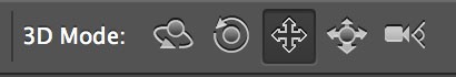
Slide Camera Option.
Now lets look at the Slide Camera option:
Slide Camera Option
Imagine you are moving the camera on a plane perpendicular to the monitor, or parallel to the ground plane. This is the plane defined by the x and z axes. You can therefore move left, right, closer and further away. You may find this tool particularly useful when needing to look at close up details or zooming out to view the whole scene.
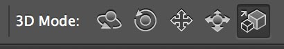
Zoom Camera Option.
This is the option on the far right and has a different icon to when moving a selected object.
Zoom Camera Option.
This is fairly self explanatory as it has the effect of zooming in on an object. It is similar to the slide option, but does not allow left and right movement.
The three blogs so far should have given you a good understanding of how to create a 3D object with rotational symmetry, how to move that object around and how to view it from any angle.
Working with multiple objects.
You are now going to look at creating a scene such as the one below:
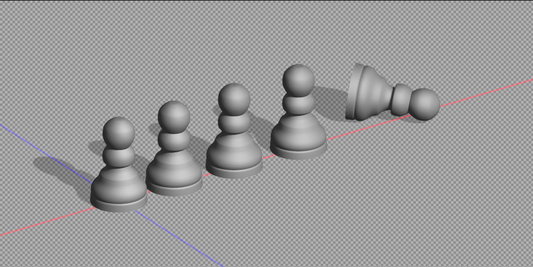
Photoshop 3D Multiple objects.
To Start, increase your canvas size to allow extra space to the right where you are going to put the duplicate objects and change your viewing angle to something more pleasing if you wish. Increasing canvas size is done in the same way as when working in normal two dimensional mode.
Increase Canvas Size.
Now make three copies of your layer so you have four objects in total. This is done in the same way you would duplicate a layer when working normally in Photoshop, i.e. Layer>Duplicate Layer or the Mac shortcut Cmd⌘ and J keys. Your layers pallet should now look like this:
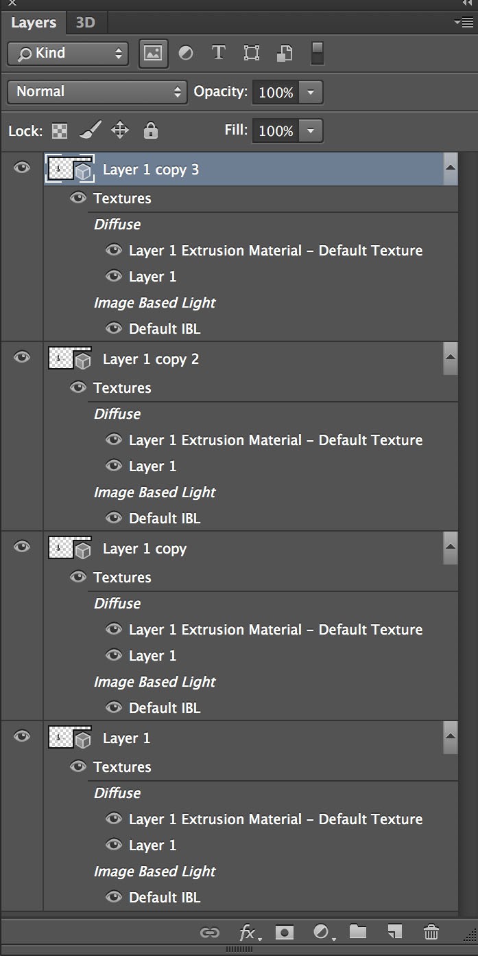
Layers pallet
What you have here is not only four identical objects, but also four identical backgrounds and four identical light sources. Each layer acts independently, which means the objects will only cast shadows on the background and not on each other. Also the objects take up the same space so they will appear as one object at the moment. What you want is four objects moved to different locations on one background with one light source.
Logically you would think that you could position the four objects where you want them to be, merge the layers and the job would be done. that’s how you would work with two dimensional objects normally in Photoshop. There are several problems with this when working in 3D: Firstly your layers may have different light sources and the ground plane may be viewed from different angles meaning Photoshop has to choose which ground plane and which light source to choose; secondly, as in this case, even when the backgrounds and light sources match exactly Photoshop doesn’t place the objects accurately; lastly you will lose a lot of 3D data if you merge layers via the standard Layer>Merge Layers command.
Here’s the easiest way of combining these layers and positioning them. Shift select all four layers in the layers pallet and merge the layers by going to 3D>Merge 3D Layers:
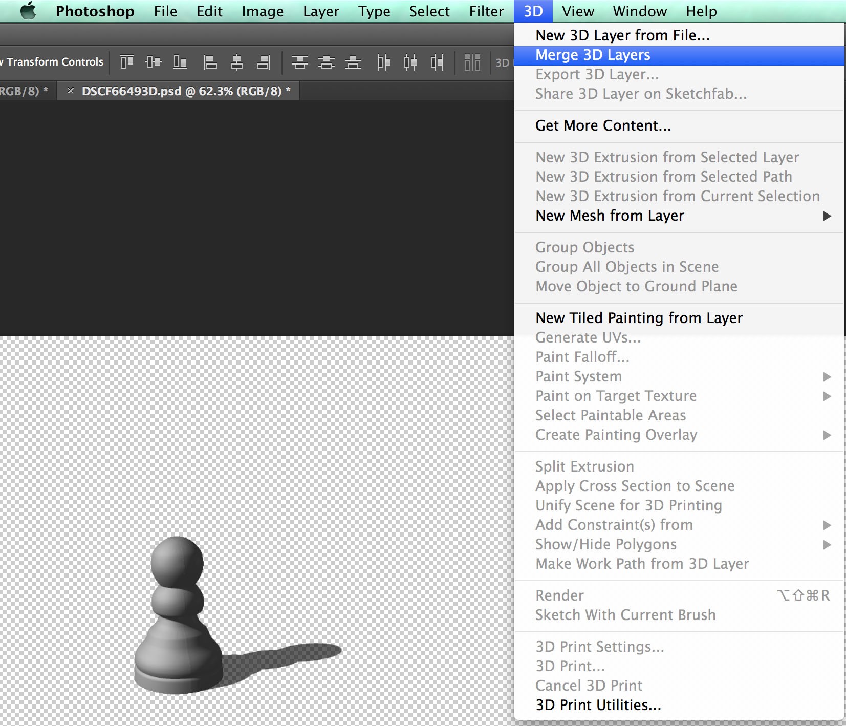
Merge 3D Layers
I’m working in Photoshop cc 2014 here, but pre cc versions of Photoshop only allow you to merge two layers at a time. This means you will need to work in stages until you have just one layer in the layers pallet. You now have four objects that appear to be one, as they are directly on top of each other. There is only one ground plane and one light source.
Now look at the 3D Pallet. The four objects can be seen and manipulated here.
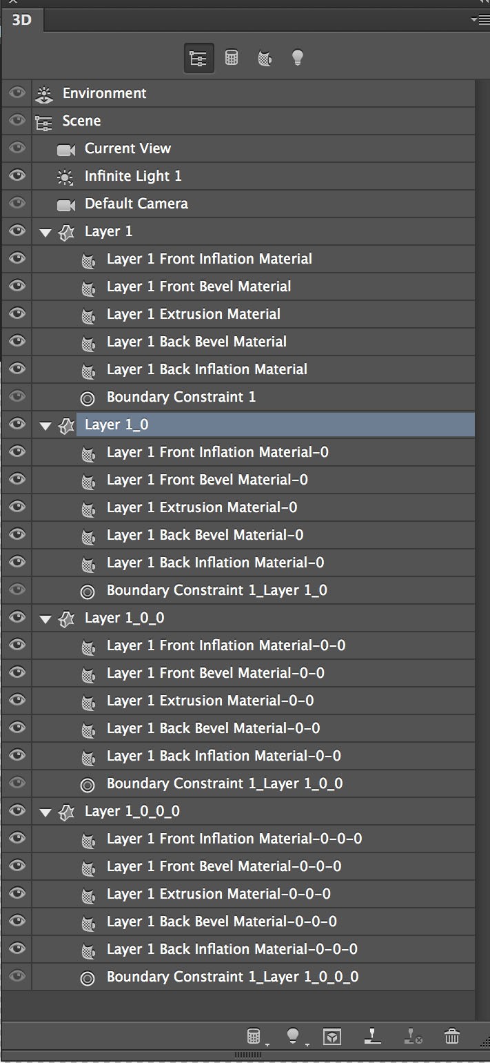
3D Pallet.
The four objects are labelled Layer 1, Layer 1_0, Layer 1_0_0 and Layer 1_0_0_0. A closer look at the co-ordinates area of the properties pallet may show that all four objects are not aligned on the ground plane and at the intersection of the x and z axes. I’m not sure why this should be, but Photoshop seems to shift things around in the merging of layers. I like to reset all the co-ordinates and move the objects onto the ground plane to start with.
I want to leave the original, which is labelled “Layer 1”, in it’s original position. The image of the 3D pallet above shows Layer 1_0 selected. This object can now be moved using one of the methods described in the previous blog. If you want even spacing between objects, typing in coordinates may be the easiest method. I used the move tool options to lay a pawn on it’s side. Also useful was the “Move to Ground” option in the co-ordinates tab on the properties pallet and the use of the secondary view window. If the secondary view window isn’t visible you can open it by going to View>Show>3D Secondary View.
You should now have the knowledge to create a scene with several objects. My example uses duplicate objects, but you can make several different objects using the methods described to make up a scene of your own.
Photoshop 3D Beginners Tutorial (Part 2)
Photoshop 3D Beginners Tutorial (Part 2)
In this second part of my Photoshop 3D beginners tutorial I will assume you have created the object in Part 1 and that you are reasonably proficient in other functions of Photoshop outside the 3D working space.
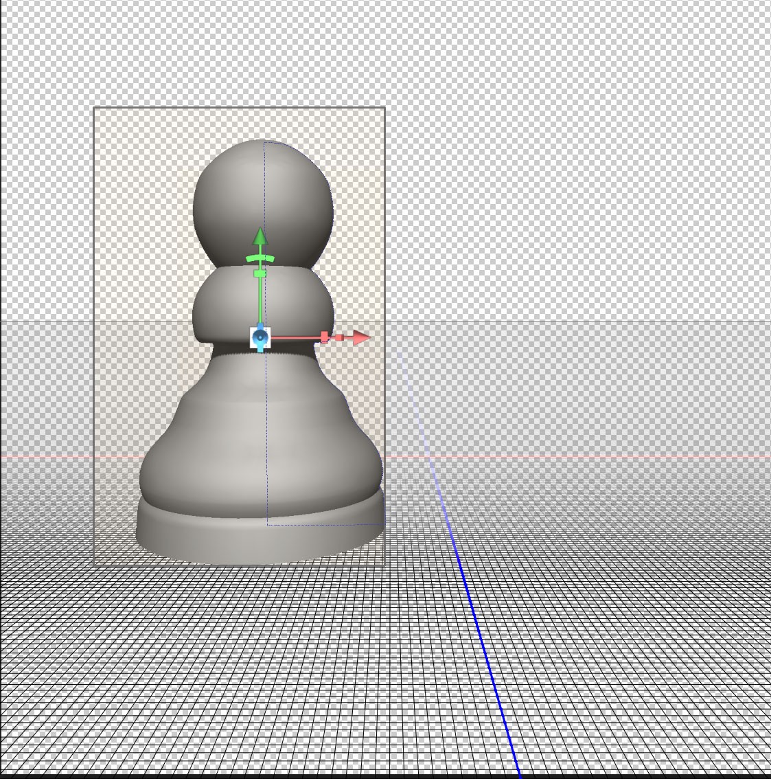
Moving objects within the 3D workspace.
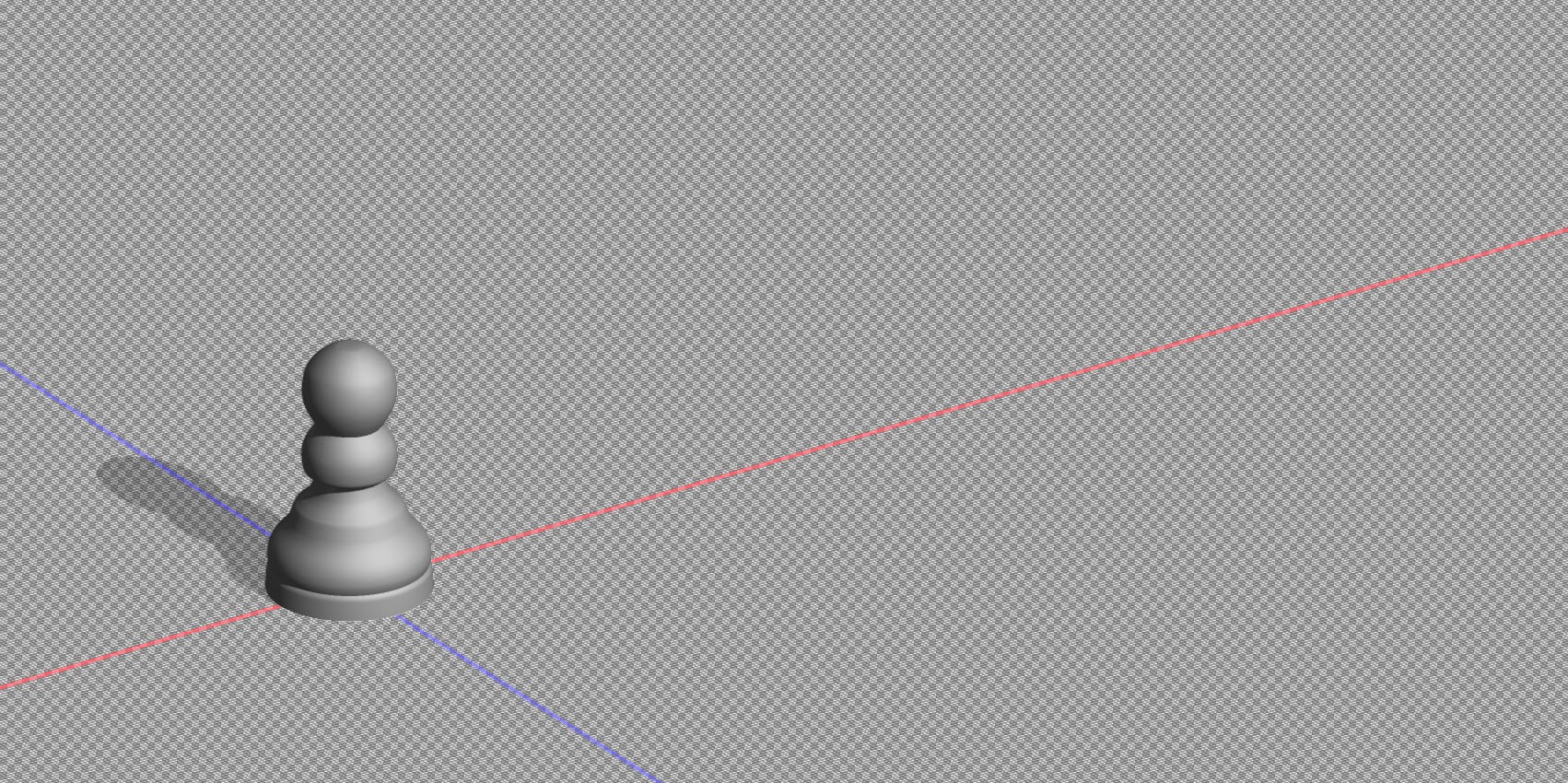
Here’s the object created in the last tutorial. If you prefer, you can use any other object you have created. The principles in this tutorial will be the same.

Starting Image
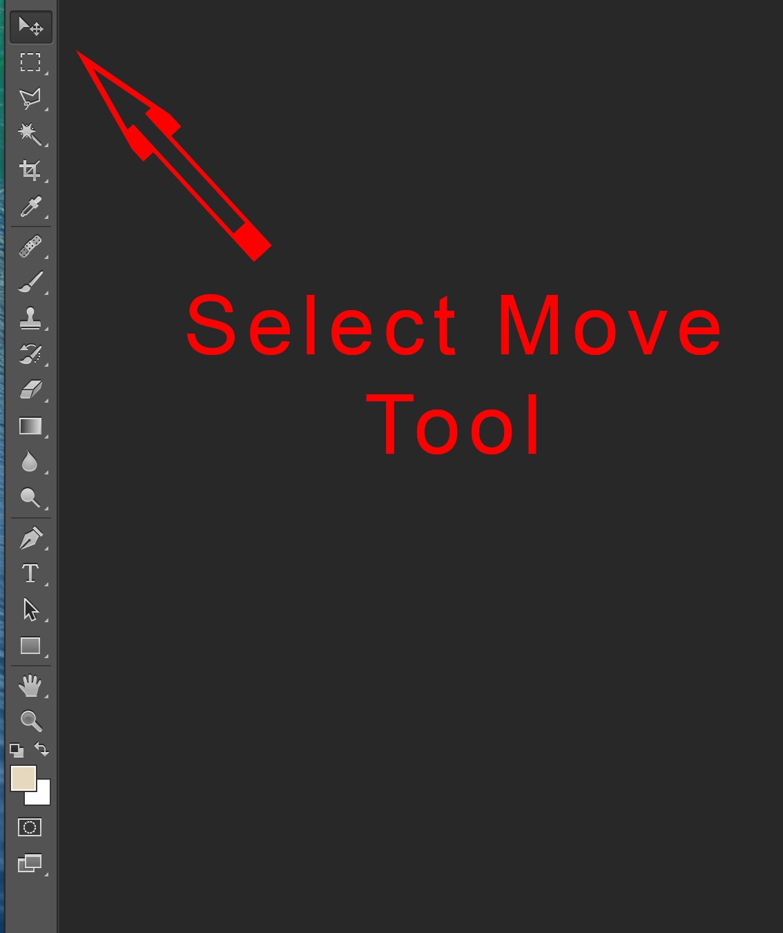
I’ve moved the object around intentionally to illustrate how you can re-set to a starting position. Firstly you need to select the move tool (shortcut “V”):
Select Move Tool
Click on the object you want to move. You should then see the ground plane and a box around the object as shown:
Object Selected
To set your object centrally on the intersection of the blue and white axis so that it is resting on the ground plane, you need to click on the last icon at the top of the Properties pallet:
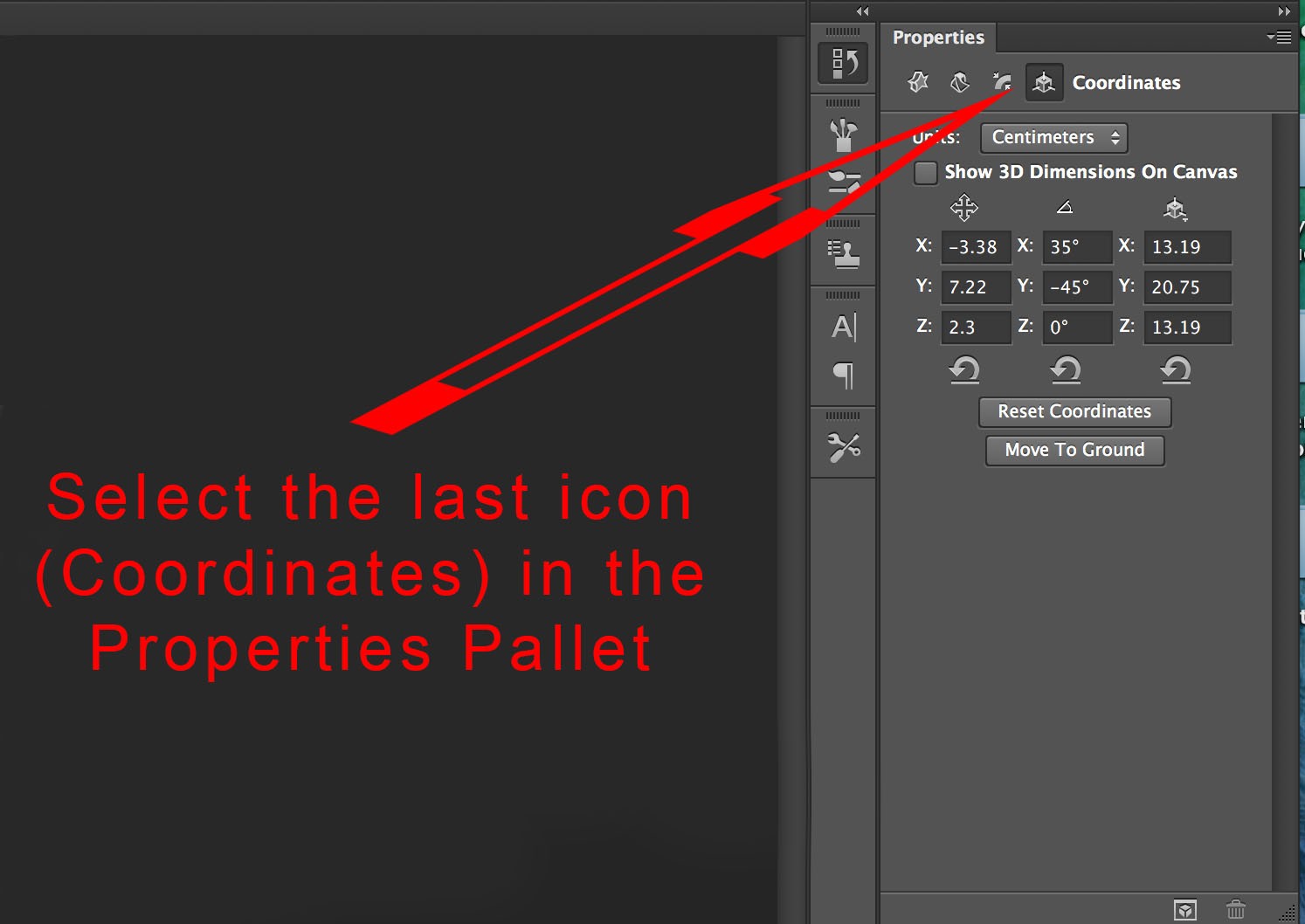
Select Coordinates from properties Pallet
Click on the “Reset Co-ordinates” button. This will set the first two columns all to “0”. The third column will stay the same as these numbers are the height, width and depth of your object. You will notice at this point that the ground plane intersects the object exactly half way up:
Coordinates reset
Click on the button labelled “Move to ground”, which is directly below the “Reset Co-ordinates” to shift your object up so it is resting on the ground plane:
Move to Ground
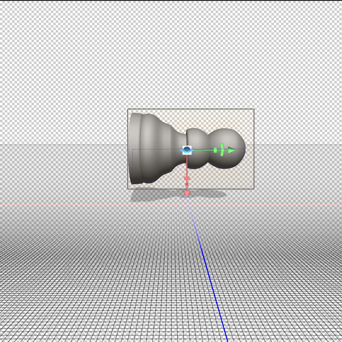
The above object can be moved anywhere in the 3D space. There several ways of doing this. Working in the Co-ordinates area of the properties pallet is a good place to start as this will help you understand exactly what’s happening. First here’s an explanation of the 3 axes;
The “x” axis is marked in red on the ground plane, going from left to right. You will also notice a red arrow with a couple of other symbols on it within the box showing the image is selected. This is for controlling movement in relation to the “x” axis, and we will take a closer look at this later.
The “y” axis is not marked on the background, but is the up/down axis marked by a green arroow on the 3D object.
Lastly the “z” axis is marked in blue on the background layer and is used to move the object closer or further away. Again there is a blue arrow on the object when it is selected. It is pointing straight forward and is therefore not easy to see in the example above.
Moving and scaling 3D objects using the Properties Pallet.
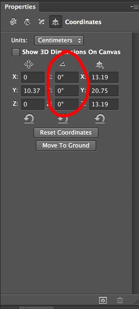
Looking at the coordinates on the far right you will see 13.19cm for both the x and z axes. This shows that the object has rotational symmetry. If you changed one of these you would have more of an oval shape, which is not what’s needed here but may be relevant for different objects. The reading of 20.75cm for the y axis shows the height of the object. These are just the dimensions of the object and do not change if the object is moved about within the 3D space.
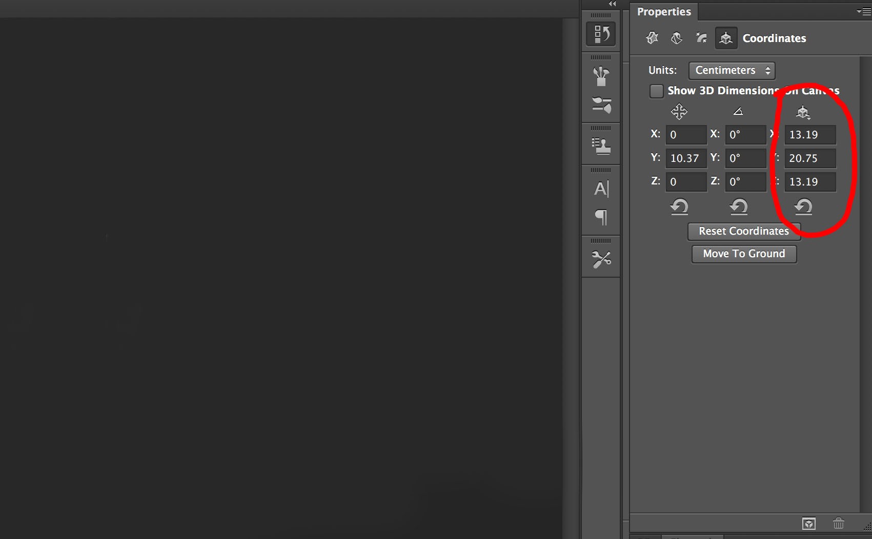
Dimensions of object.
You can use the right hand column to change dimensions on any of the three axes. As an experiment here’s the object showing the height increased on the “y” axis:
Increase size on y axis
The central point of the object has not changed. This means that it still lies on the intersection of the red “x” axis and blue “z” axis. Because it has increased in height from a central point the lower part now goes below the ground plane.
Step back in the history pallet so you have the original dimensions (x at 3.19, y at 20.19 and z at 3.19).
Now look at the far left column of numbers:
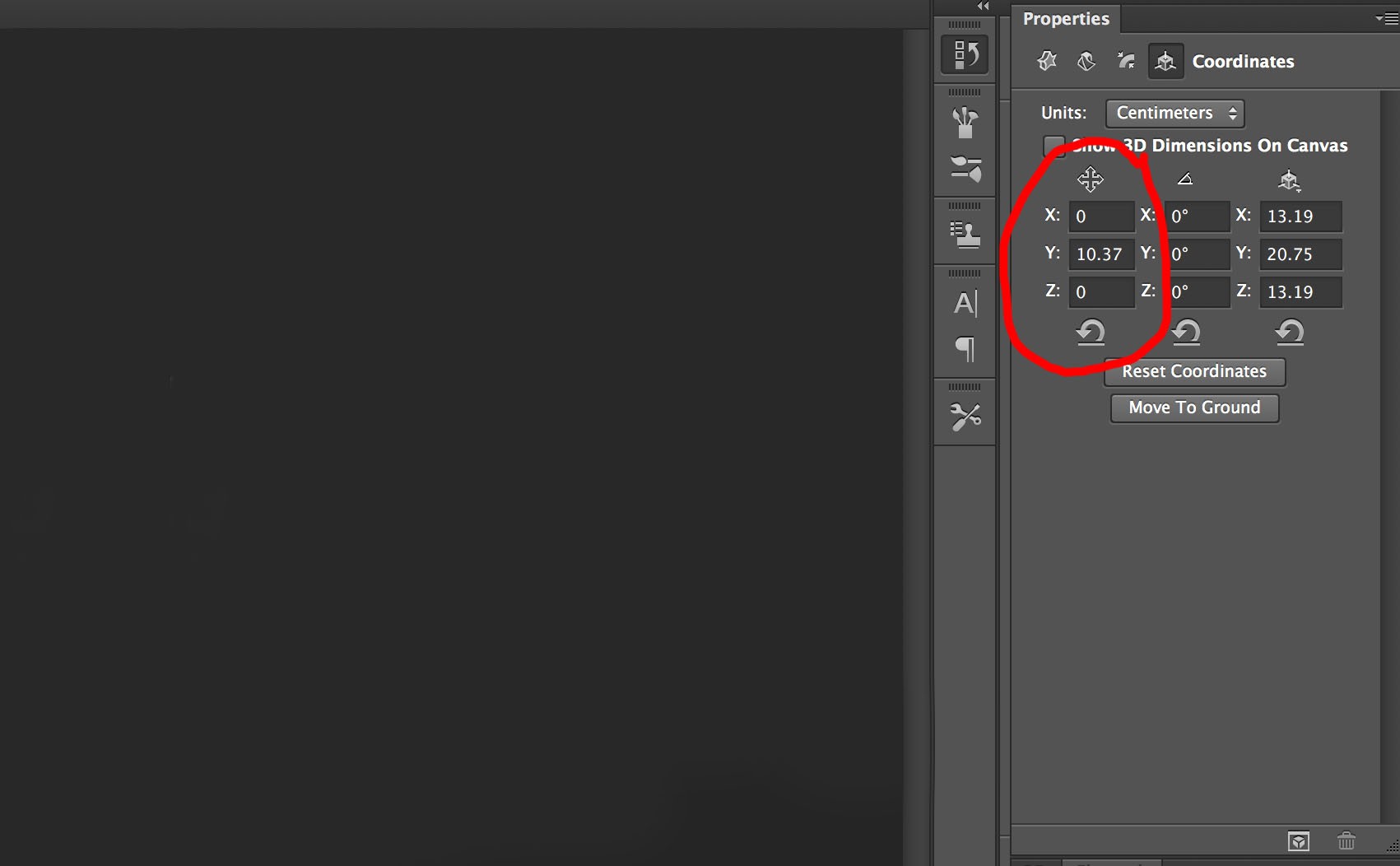
Position of object.
x has a reading of 0cm. This shows that the central point of the object is on the red line.
z has a reading of 0cm showing the object is also on the blue line.
As x and z both have a reading of 0cm the object is on the intersection of the 2 lines.
Now for the y axis. This shows a reading of 10.37cm. This may seem strange at first. The y axis is the up/down positioning of the object. If you reset the coordinates this reading becomes 0cm. You then see half the object above the ground plane and half below. If you then click on the “Move to Ground” button the y axis reading will show half the height of the object.
I have made some changes to the positioning of the object in the next few examples which involves altering figures in the first column. Have a look at the captions under each image to see what alteration has been done to each. I have also increased the canvas size, which you do exactly the same way you would when working on a two dimensional image.
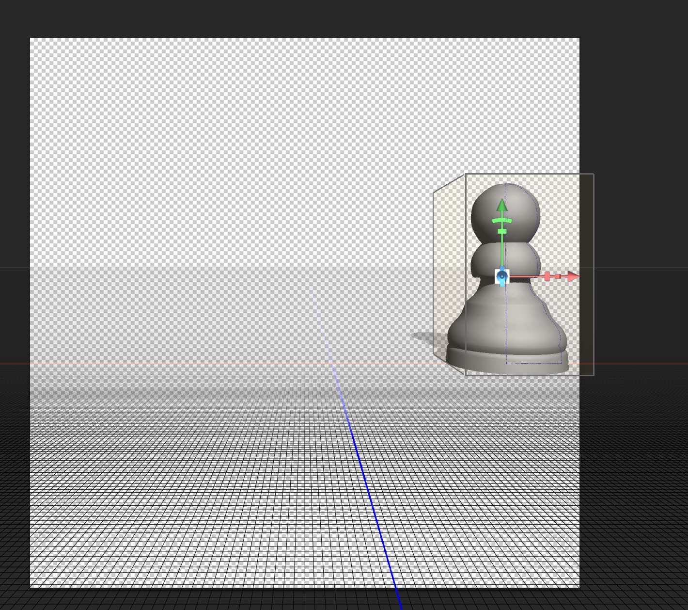
“x” Coordinate set at 20cm
The object has been moved along the red “x” axis. It has moved to the right because a positive value has been entered. A minus value would have moved it to the left of the blue “z” axis.
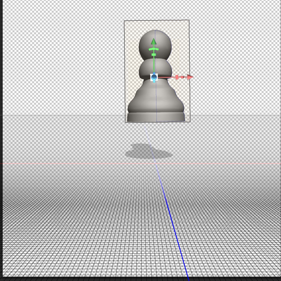
“y” coordinate set at 20cm
A positive value in the “y” coordinate setting will float the 3D object above the ground plane. It is also possible to enter a negative value to put the object below the ground plane.
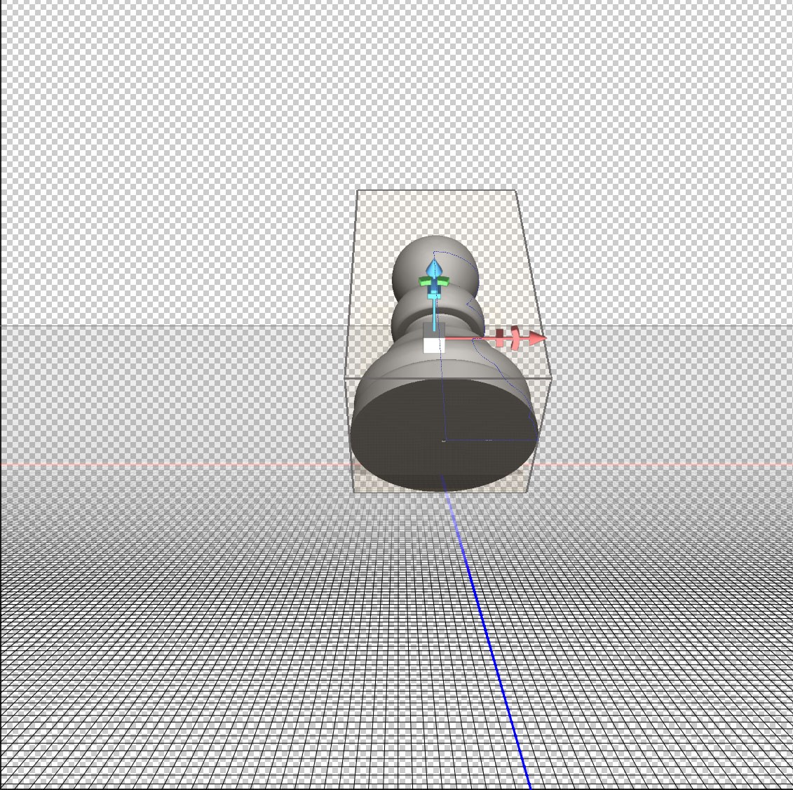
“z” coordinate set to -20
I have entered a negative value on the z axis, moving the object away from the viewer along the blue line. A positive value would have moved the object to a position in front of the red “y” axis.
“x” set to -10 “z” set to 20
A minus setting on the “x” axis means the 3D object has moved to the left. A positive setting on the “z” means it has also moved forward to a position in front of the red “x” axis.
Looking at rotational angles.
The 3D object can also be rotated about any of the x, y and z axes. The amount of rotation can be set in the middle column shown:
Rotation about axis
Here are three images to show how rotation about each axis looks. The caption under each image gives the settings.
45 rotation on x axis
45 rotation on y axis.
Rotation about the “y” axis makes no difference to the object, as it has rotational symmetry about this axis. You will notice that the box around the 3D object now appears with it’s corner pointing towards us.
90 Rotation on z axis
Notice that rotation “x” and “z” axes will result in the object no longer being on the ground plane as rotation is always about the central point.
Entering numbers in the Properties pallet is useful for accurately positioning 3D objects. However there are quicker more intuitive ways of working.
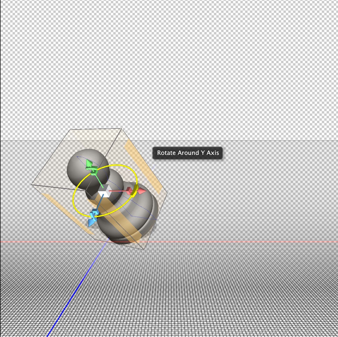
Moving and scaling a 3D object using the controller axes
The image below shows the object viewed from a different angle so you can see the red green and blue arrows that appear when a 3D object is selected. The red arrow corresponds to the “x” axis marked in red on the ground plane, the “y” axis corresponds to the green arrow, and the “z” axis corresponds to the blue arrow. You will notice that if you hover over the tip of each arrow it will be highlighted as shown below. You can then click and drag along the relevant axis.
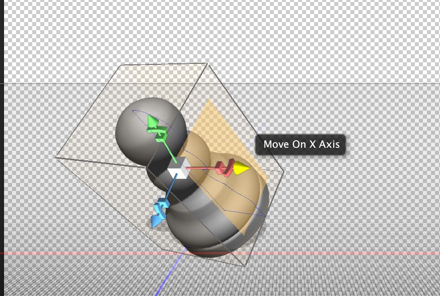
Move on X Axis
When the above arrow is highlighted you can move the object from left to right. Notice the tip of the arrow is highlighted in yellow.
Now Move the cursor slightly to the left. The rotational symbol will now be highlighted as shown.
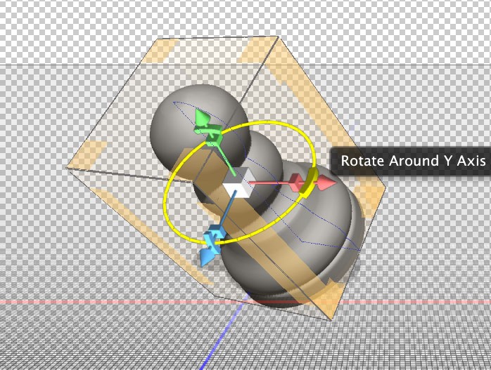
Rotate around Y Axis
Notice how the above image shows the red “x” rotational symbol highlighted, however the text reads “Rotate Around Y Axis”. If you think about it, it would be difficult to rotate on the “x” axis by using the red handle. The rotation needs to be at right angles to the axis for ease of use.
Moving the Cursor in a bit further to highlight the box will allow you to change the dimensions along the “x” axis.
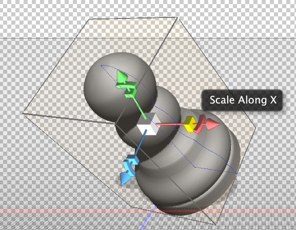
Scale along x axis
Once you have got the feel of making movement, rotational and scale alterations using this method on all three axes there is just one more alteration to look at. That is the white box in the middle. This is a click and drag alteration, same as the others. The difference is that it increases or decreases the size of the object while maintaining the correct proportions between x, y and z axes.
Moving a 3D object using the selection box
This method may well be your preferred method for quickly moving an object around. The small controllers on the axes are sometimes difficult to pinpoint, especially if you are using a pen and tablet.
If you move your cursor over any side of the selection box it will be highlighted in yellow:
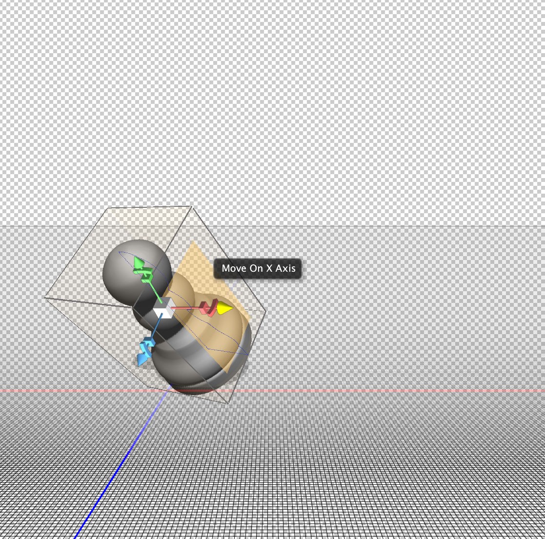
Move on x axis
As the message that appears indicates, you can click and drag to move the object left to right on the x axis.
Now move your cursor closer to the edge of the box. Again you get a message indicating the direction of movement and the three visible edges are highlighted in yellow.
Rotate on y axis
Now position your cursor directly onto the edge rather than just close as in the last example. This will allow you to move the object on two axes simultaneously.
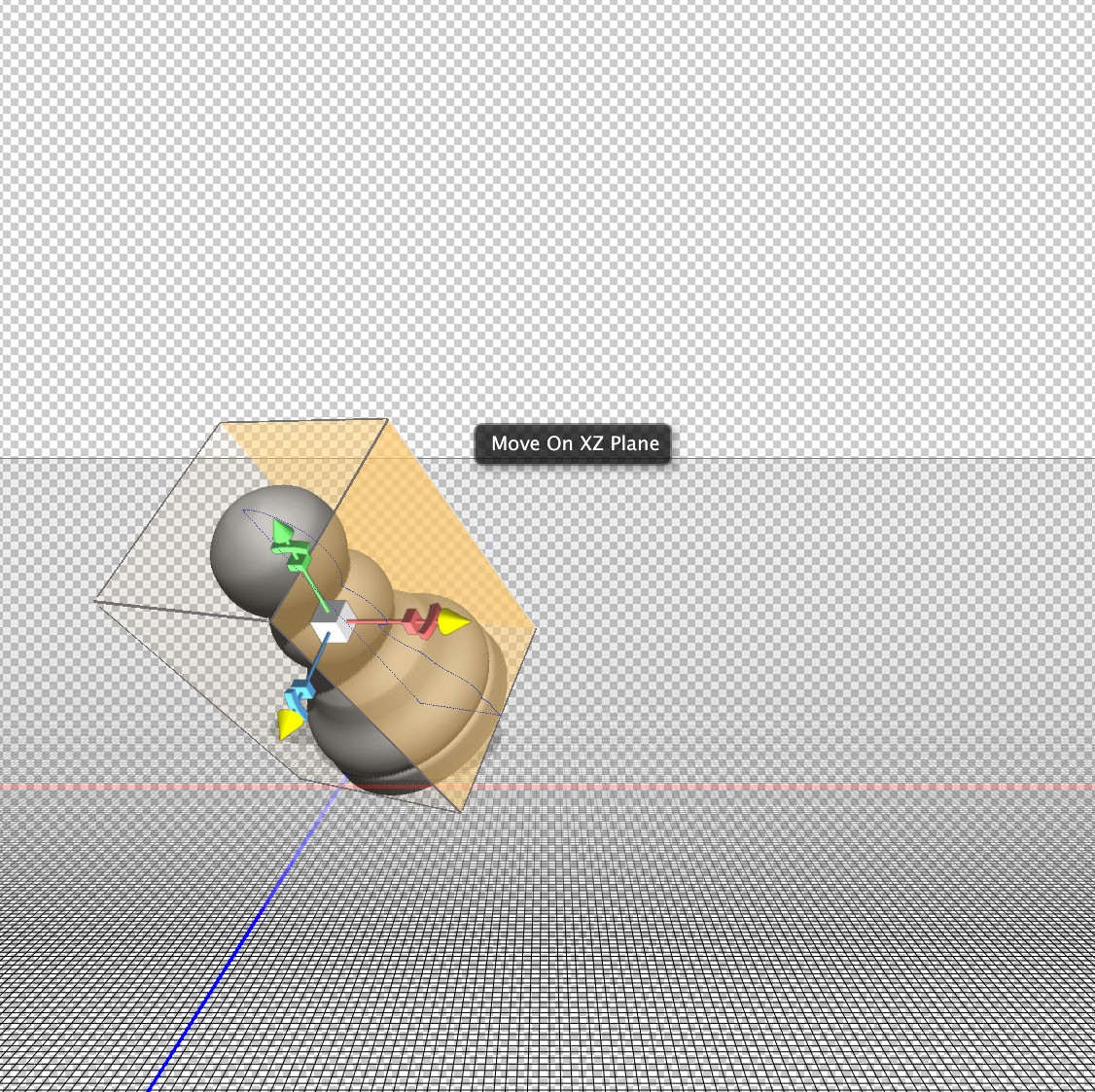
Move on X and Z Plane simultaneously.
The above example is very useful as it is possible to move an object around on the ground plane without accidentally moving it up or down.
Moving using the sides and edges of a box may at first seem like a much better solution than using the control axis. There are however situations where the side of the box is at right angles to the viewing position and not accessible. In this instance using the control axis would be a better solution.
Using the Move Tools
The 3D move tools options can be found at the top of your screen, but only when you have the move tool selected in the tools pallet:
3D move tools, Rotate tool selected.
When using any of these tools make sure you don’t accidentally click on the control points of the box that indicates the object is selected as this will confuse things. Clicking and dragging anywhere outside the objects box will allow you to do this, but make sure you don’t accidentally deselect the object.
The image above shows the Rotate tool selected. Click and drag to experiment with this tool. You can rotate about any axis but the central point remains in the same position.
Using Rotate tool
Notice how the white box at the centre of the image lies directly above the intersection of the red “x” axis and blue “z” axis. This cannot be changed using the rotate tool.
Now look at the next tool along:
Roll Tool Selected
This is the roll tool. It is similar to the rotate tool, but will only rotate in a plane parallel to your monitor.
Effect of roll tool
Because the object was reset before using the roll tool it would be impossible to see the top or bottom of the object without using any of the other tools.
The next tool is the drag tool:
Drag Tool selected.
The drag tool allows you to move the object up, down, left and right. You cannot move the object closer or further away. In other words you are moving on the “x” and “y” axes only.
Next is the slide tool:

Slide Tool Selected.
The slide tool allows you to move an object left, right, forwards and backwards. If you start with your object on the ground plane the slide tool will not allow you to move off the ground plane. In other word you use this tool to move in a plane at right angles to your monitor.
The last tool is the scale tool:
Scale tool selected
The scale tool allows you to uniformly enlarge or shrink the object around it’s central point. Clicking and dragging up will increase the size, whereas down will decrease the size. The relationship between x,y and z dimensions will stay the same when using this tool.
Summary
We have looked a four different ways of moving an object within a 3D space:
1.Using coordinates in the properties pallet.
2.Using the red, blue and green control axes in the object’s box.
3.Using the sides and edges of the objects box.
4.Using the 3D move tool options.
Next post we will look at moving around within the 3D scene. The object will stay in the same place but be viewed from different positions. With the understanding of move tools gained in this post you will find this quite easy to understand.
We will also look at creating more of a scene with several copies of the same object moved to different positions. This will allow you to practice what’s been learnt in this post.
Photoshop 3D Beginners Tutorial (Part 1)
Photoshop 3D Beginners Tutorial (Part 1)
There are many people who have been working in Photoshop for years, but with the emergence of Photoshop 3D capabilities there is a whole new area to learn. I will run a series of blogs starting with the basics, which will help you gain more knowledge and experience in this area. I will assume throughout this series of blogs that you are reasonably proficient in Photoshop and are using Photoshop cc.
The Importance of 3D in retouching
There was a time when I hadn’t even considered using 3D objects in retouching. Having access to a huge collection of two dimensional samples to use in my projects I came to realise that a sample shot at the wrong angle and with different lighting was very difficult to fit into the original image if not impossible.
If you can create a good 3D object you can alter the lighting, viewing angle, texture and colour so that it will fit perfectly into your image. Photoshop will not replace dedicated 3D software as it is more basic. Having said that, it has a lot of good practical uses.
If Photoshop is not capable of creating the object you have in mind it is possible to manipulate 3D objects made in more complex 3D software. Other 3D software can be a lot more complex. I believe Photoshop offers a relatively easy introduction into the world of 3D.
In this first Photoshop 3D blog, you will learn how to create a simple shape that has rotational symmetry then learn the basics of moving this shape around and become familiar with the 3D workspace.
Here’s the image I will use in the tutorial.
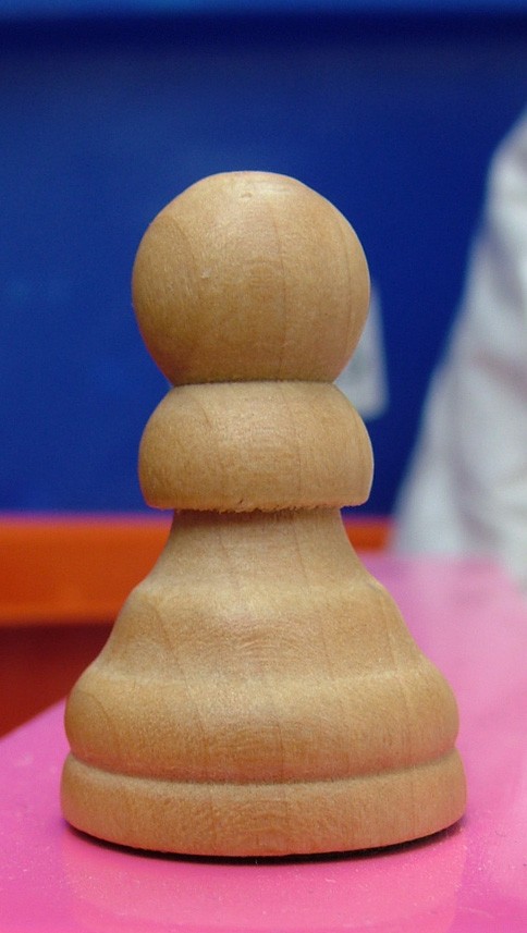
Starting image
If you click on this image to see an enlarged version then right click (or Control click) you are welcome to download it for your own use. The creation of the 3D object relies on a path so you can also choose to use the principals in this tutorial to draw your own shape and create a 3D object from it.
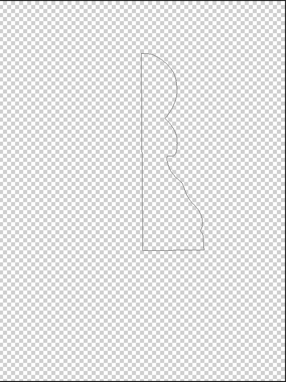
Step One
Open your image in Photoshop and draw a path around either the left or right half of it with the pen tool. I have shown the shape of my path in green. This is for illustrative purposes only, as a path is difficult to see. Notice how I have squared off the bottom with a horizontal line rather than following the curve of the base. Also make sure the path is closed i.e. you have to click on your starting point at the end.

Path Shape
Unlock the background layer by double clicking on it then click on the eye in the layers pallet so you only see a transparent canvas with the path visible. If the path is not visible you need to select it in the Paths pallet.
Path Selected in Layers Pallet
Click in the top right hand corner and select “3D” to enter the Photoshop 3D workspace area. This opens up the pallets you are most likely to use and closes ones that are not likely to be needed.
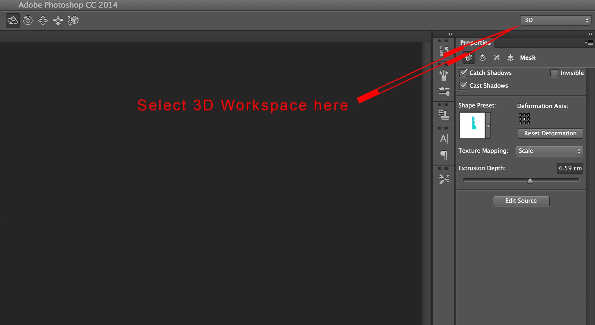
Select Workspace.
In the 3D pallet select “Work Path” as source and make sure “3D Extrusion” is selected.

Create 3D Extrusion.
Click on Create at the bottom of the Pallet. You will now have a 3D object as shown:

Extrusion.
A Brief Exploration of the workspace.
In the top left hand corner is the Secondary view. Click on the camera icon to change the secondary view as shown:

Change Secondary View.
Click in the top right hand corner of the secondary view window to swap the secondary and main views. A second click will swap them back again.

Swap main and secondary views.
You can close the Secondary View window by clicking on the cross in the top left hand corner if you prefer a less cluttered workspace. If you wish to show the secondary view window again go to View>Show>Secondary View.
Moving in 3d space
Moving within a 3D space can be quite confusing if you are not used to it. Start by pressing “V” on your keyboard to select the move tool as normal. Now click anywhere outside your 3D object. This allows you to move your whole 3D world. Below is an example of the whole 3D world having been moved:

Moving 3D World.
Notice how the 3D object lies on the ground plane on the intersection between the red and blue lines. Also the default light has been moved. The light itself cannot be seen, but the shadow has not changed in relation to the background.
Now click on the 3D object itself. This selects the object, which is indicated by a box shown around it. It is now possible to move the 3D object independently of the background and light source. Here’s how the object may look when moved:

3D object moved.
The 3D object is no longer on the intersection of the red and blue lines, and is floating above the ground plane.
The important point is that the same tools are used to move the 3D world and objects within that world. You need to make sure you know if it’s the object or whole world that is selected.
Moving within a 3D space is a lot more complex than normal. The various options needed for moving can be found in the top centre area of the screen, but these will only be visible when the move tool is selected in 3D mode:

3D Moving options.
I would encourage you to experiment with these. We will have a more detailed look at them in next weeks blog.
Step 2
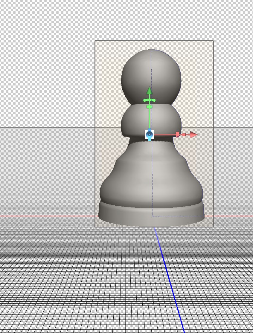
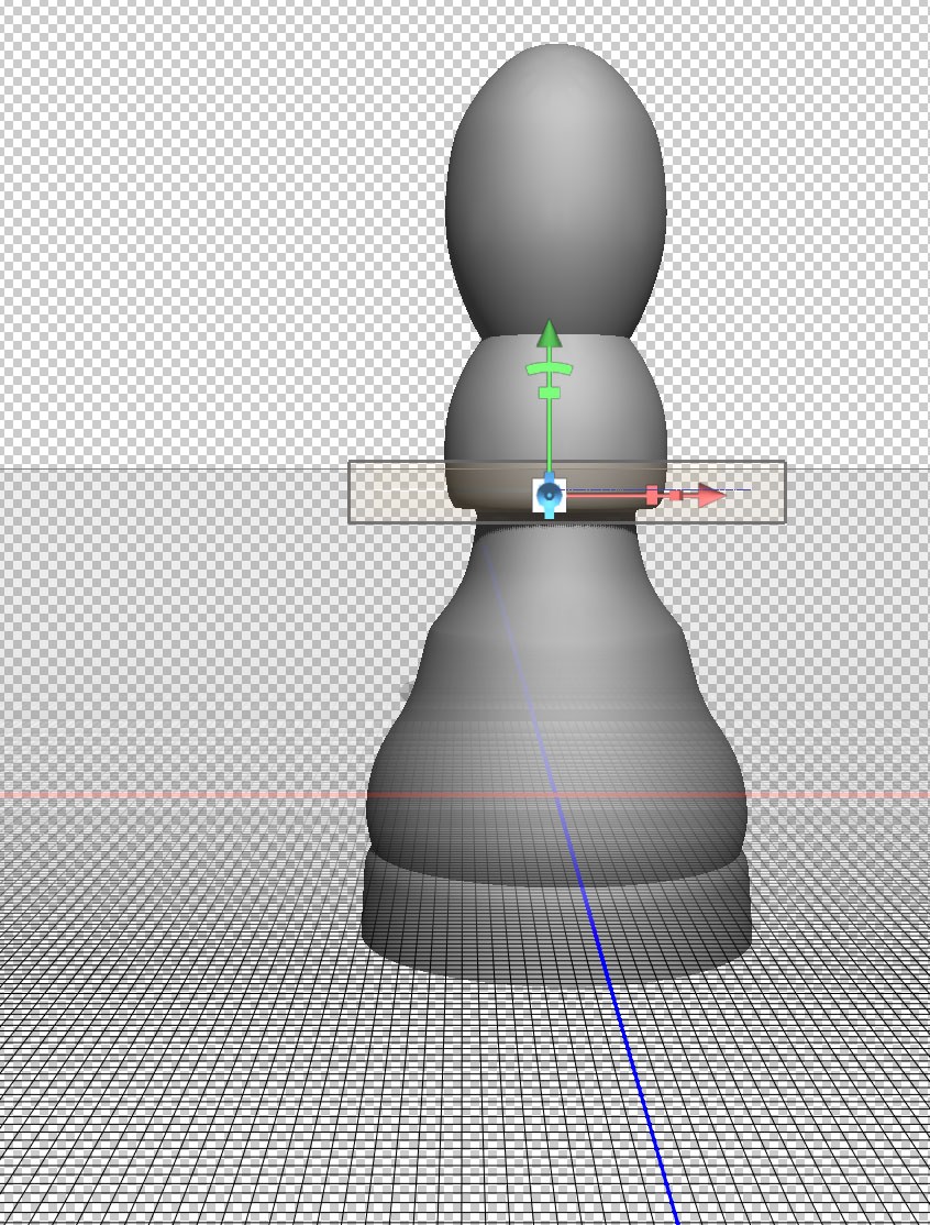
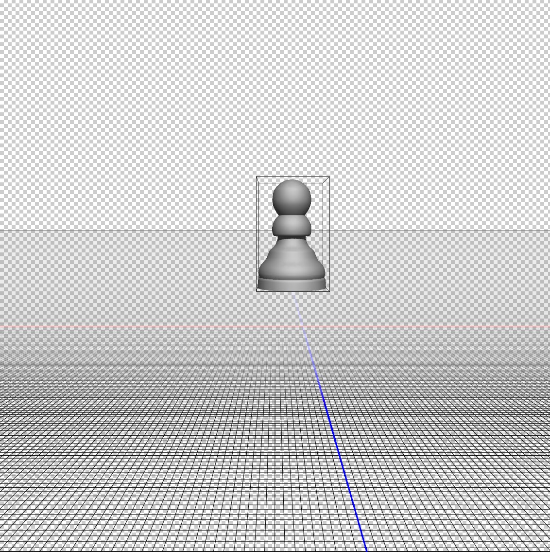
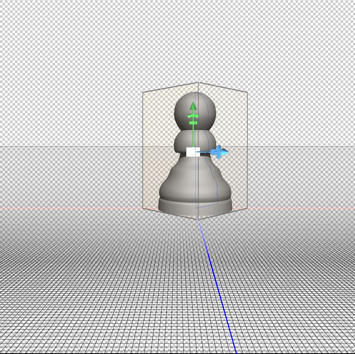
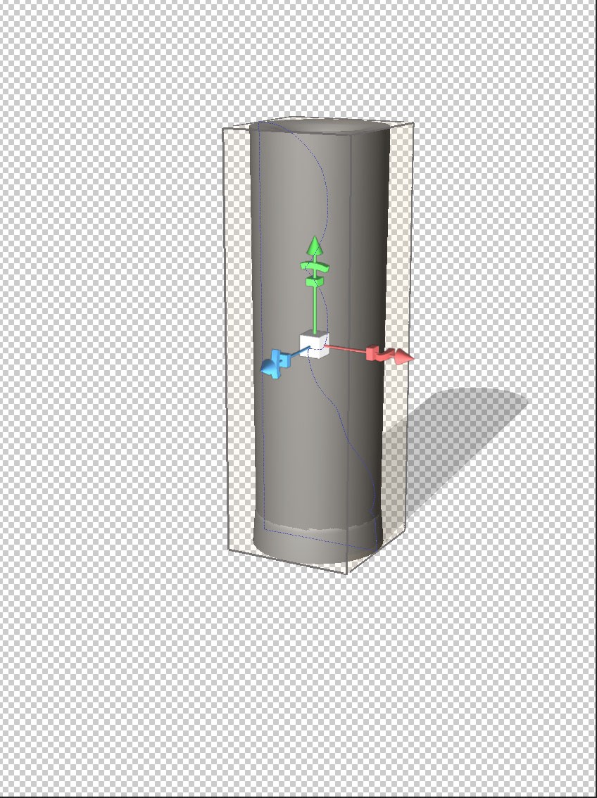
You will now create a 3D pawn as it would appear on a chess board. This may be simpler than you think.
Here’s how the object looks at an angle. I have also hidden the ground plane via View>Show>3D Ground Plane which toggles the ground plane visibility on and off:

3D Object Selected.
Notice the object has a box around it with move options indicating that it is selected.
Now look at the “Properties” pallet which should be in the top right hand corner by default:

Properties Pallet.
Your properties pallet will not look like this if you do not have your 3D object selected.
You can select various options in the properties pallet by clicking on the icons at the top:
Properties Pallet Detail.
The above shows the far left set of options selected. This is where you can change the Extrusion depth. This refers to the thickness of your 3D object. Set the extrusion depth to “0”:
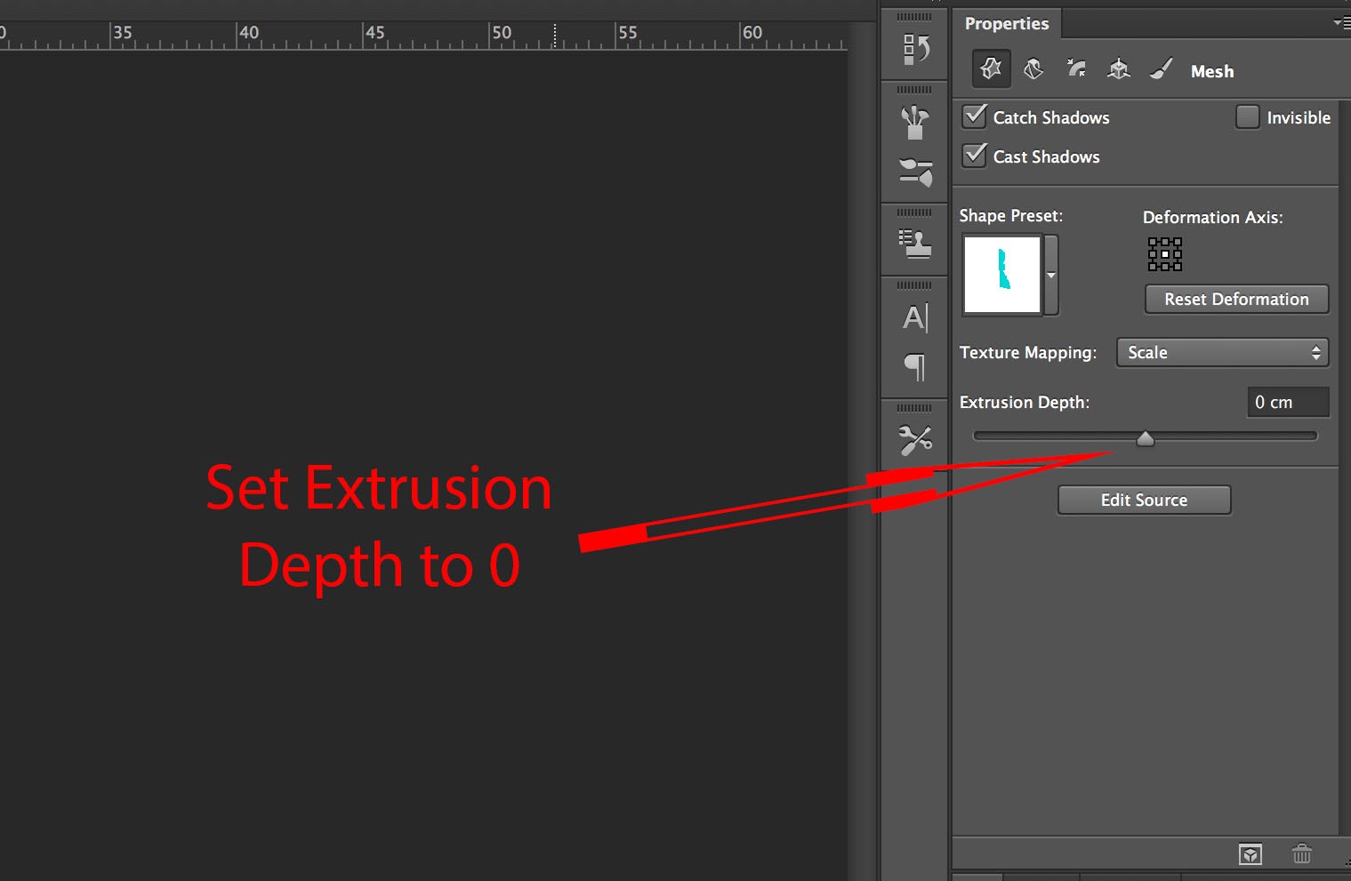
Extrusion set to 0.
Your object will now look paper thin as shown:
Effect on 3D object.
Step 3
You now need to make a 3D object by rotating about an axis.
At the top of the properties pallet click on the second icon in from the left as shown:

Second set of options in properties pallet.
Notice that you can alternatively change the extrusion depth here.
In the lower half of the Properties pallet select “Bend” and change the “Horizontal axis (x)” to 360.
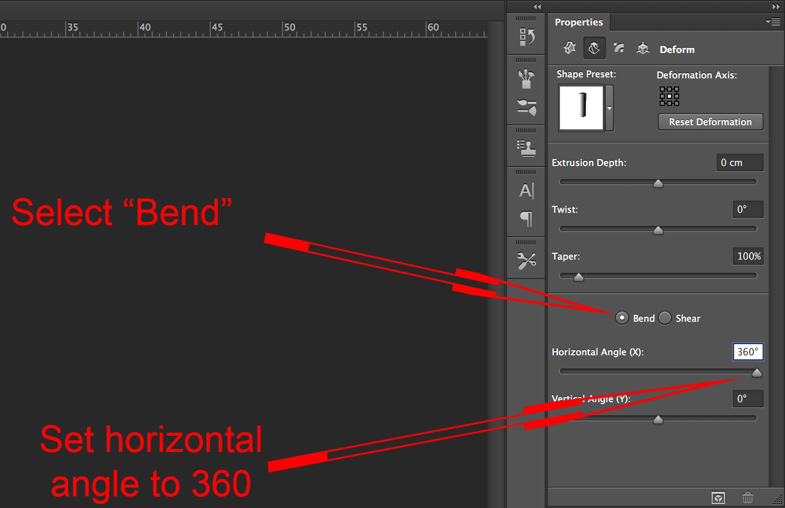
Set Horizontal Rotational Axis.
This is how your image looks now:
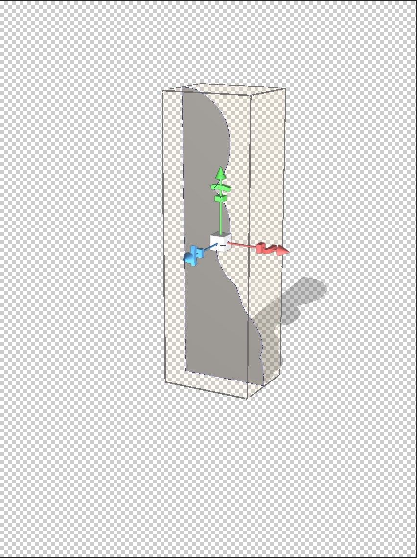
Central Rotational Axis
This object is created by rotation about a central point. You need to change the point of rotation to the left hand side.
Step 3
Go back to the first set of options in the properties pallet as shown:
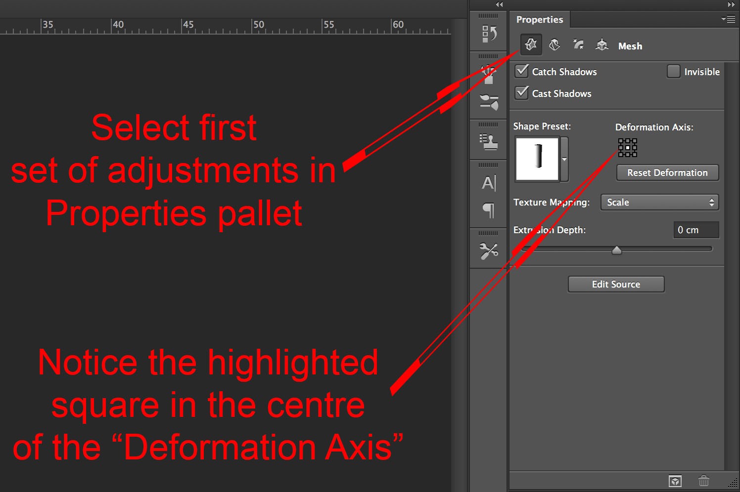
First set of Property pallet options.
Notice the highlighted central square in the “Deformation Axis” area.
Click on the square shown.
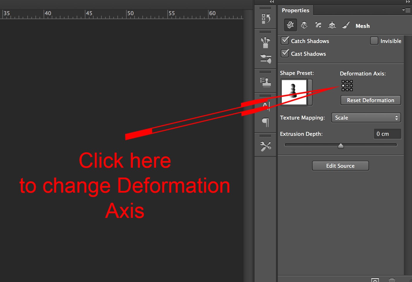
Change Deformation Axis
You have now changed your rotational point to the left hand side, and your image will look like this.
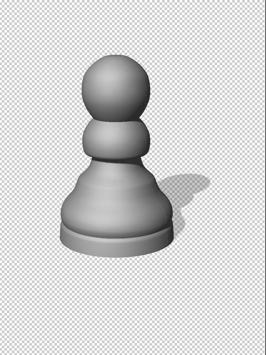
Rotation about left hand axis.
Using the move tools mentioned earlier you can see that this is truly a 3D object that can be viewed from any angle:

3D pawn.
When creating objects in this way think of things that have rotational symmetry. Other possibilities are bottles, plates, wine glasses or bowls.
There’s a lot more to learn on the subject of Photoshop 3D. I think there is a lack of ready available knowledge of the basics. It is very important to learn these before moving onto more complex ideas. If you use the ideas here to create your own objects you will become more familiar with the concepts.
Next week we will look at moving in the 3D space.
I hope this has been of help if you are new to Photoshop 3D and have fun using these ideas!
Creating Photoshop Reflections.
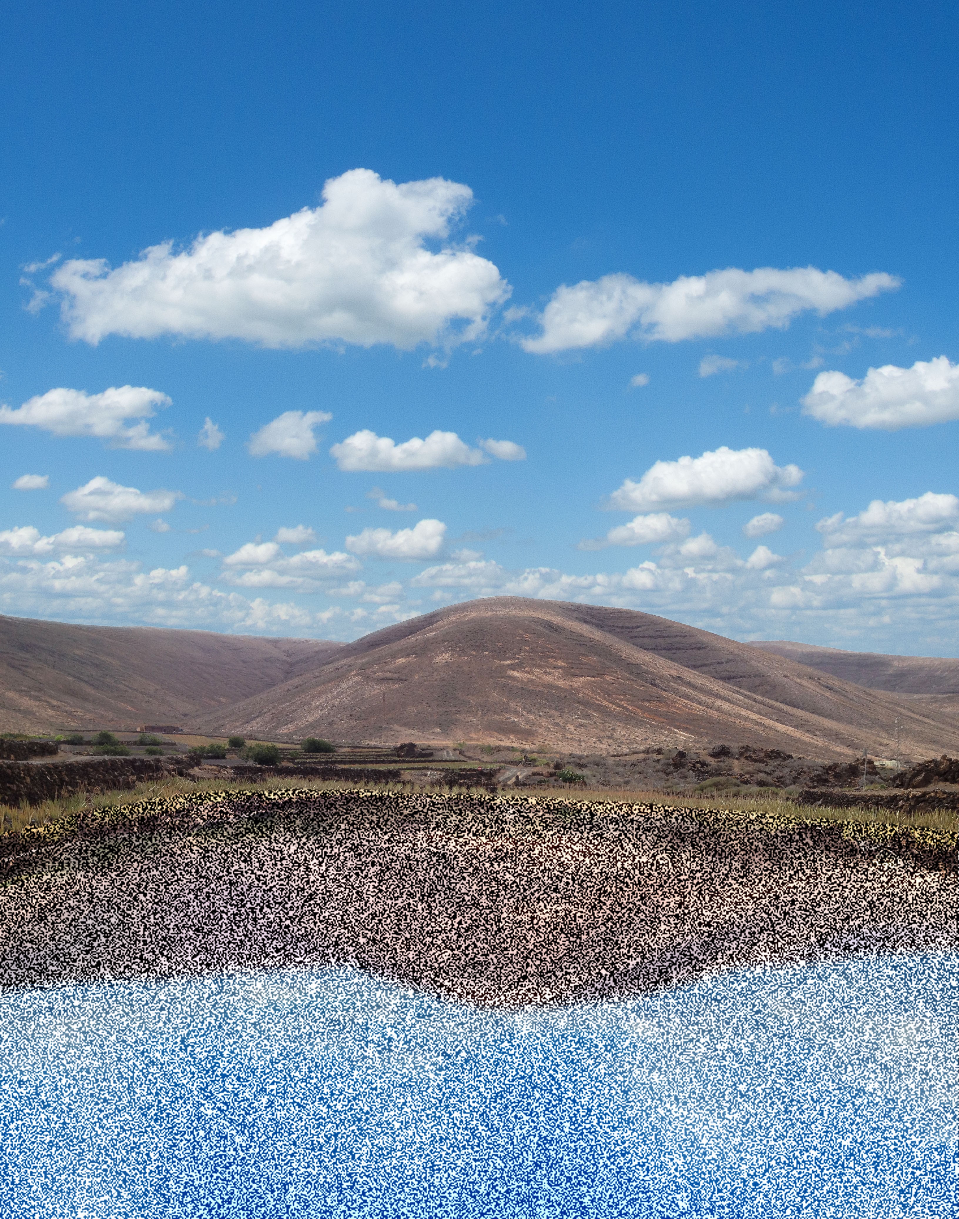
Creating Photoshop reflections in water.
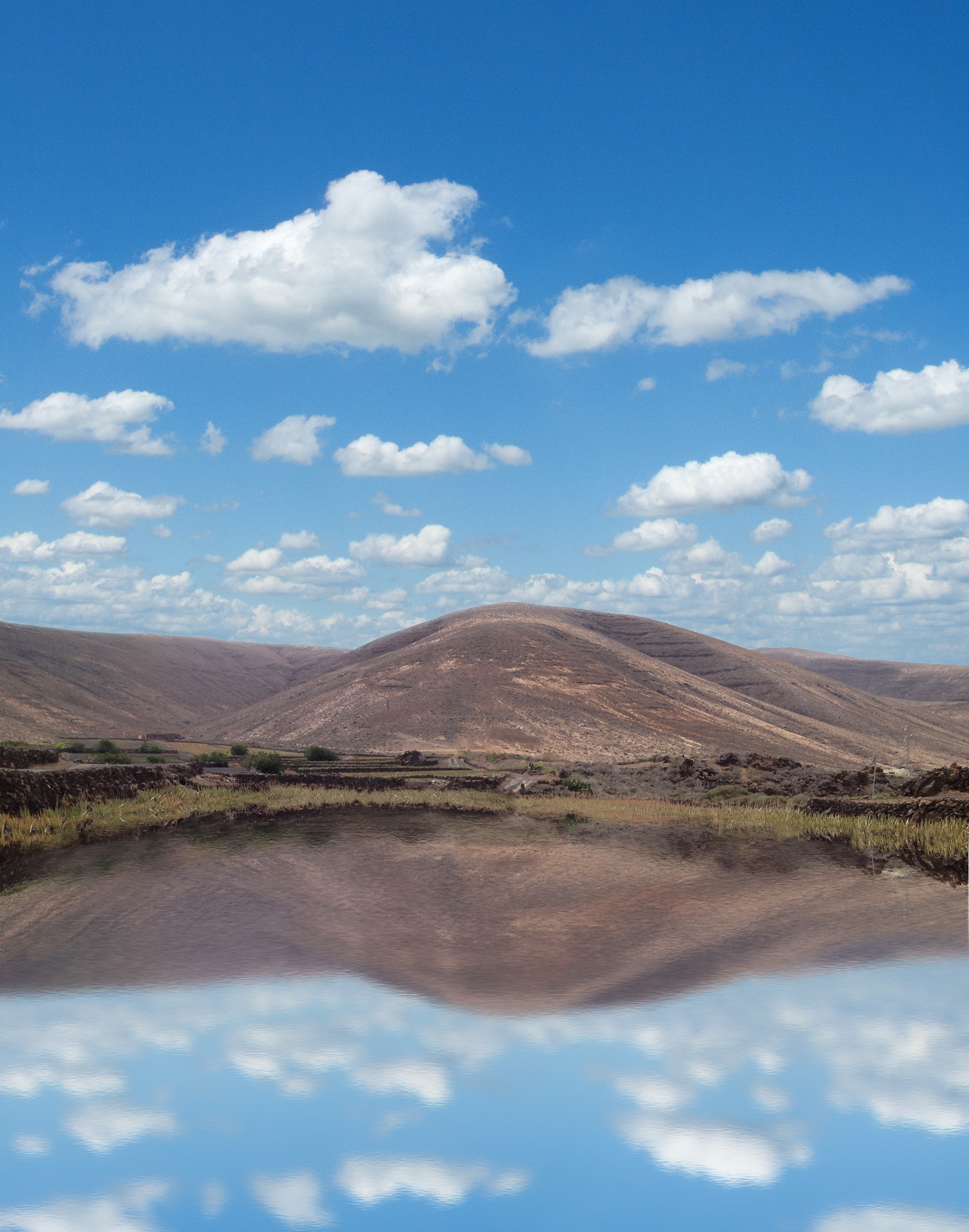
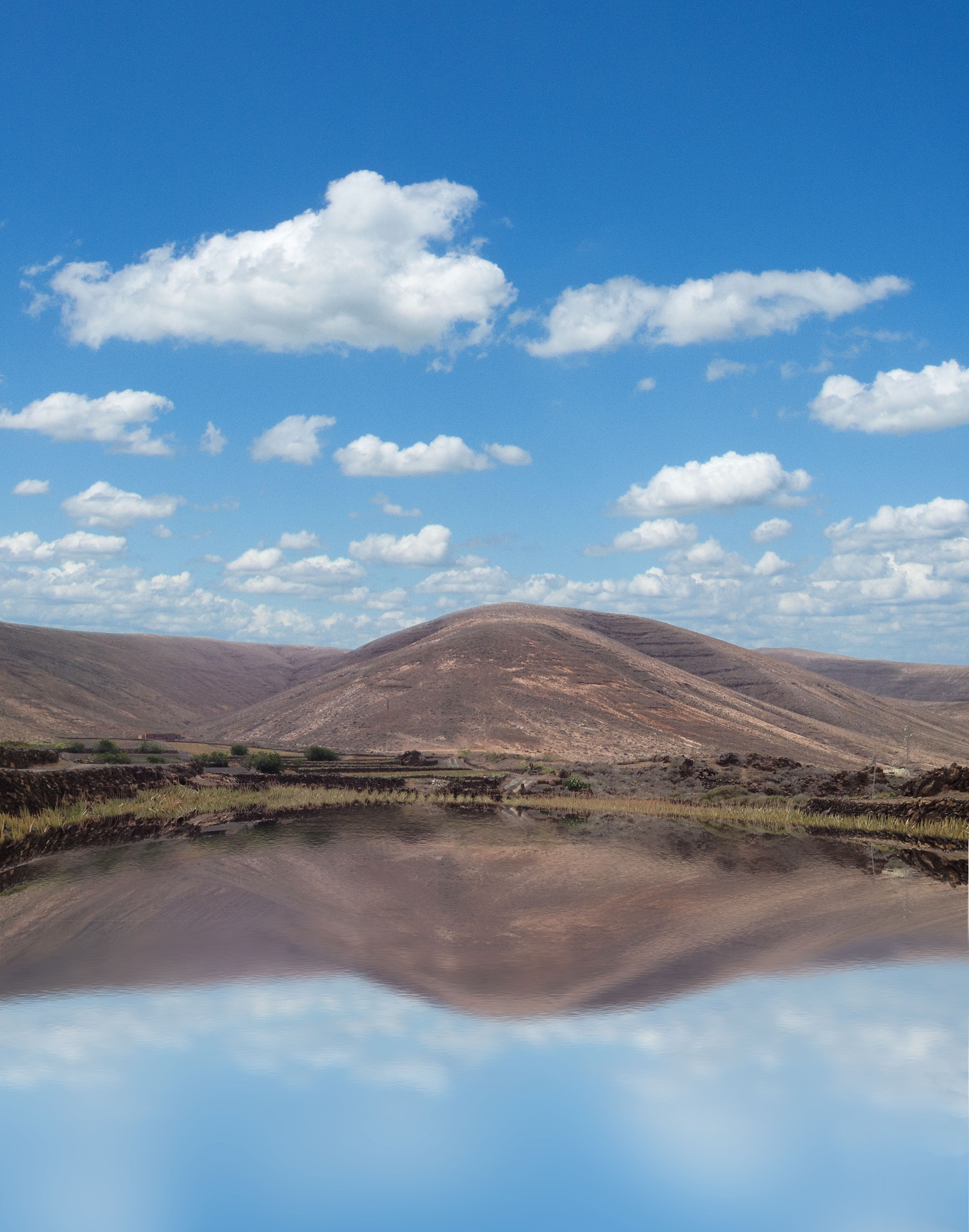
In this post I will be showing you how to create realistic Photoshop reflections, as shown below.
Before

After
As you can see I have also added a sky. I will not be discussing this as I have covered how to do this in a previous post.
What you will learn is two separate methods for creating Photoshop reflections: first, using filters and second, using an “Overlay” layer with a texture added to it.
Starting Point
Here’s the image with sky already added:
Starting Point (with sky added)
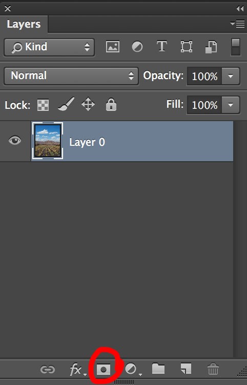
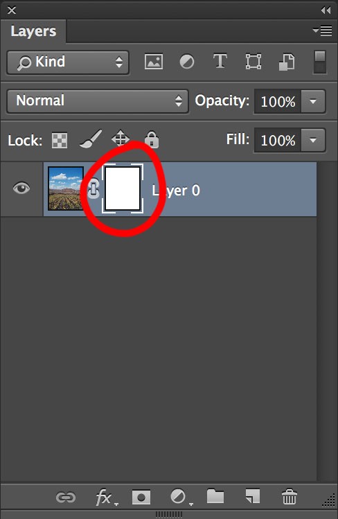
The first step is to make sure your background layer is unlocked. This will allow you to add a layer mask and hide the foreground areas. If the background layer is locked you will see a padlock next to the Background layer in the layers pallet as shown.
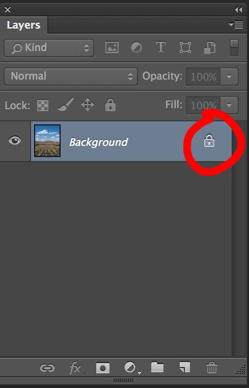
Locked Layer
If you double click on the word “Background” then click “OK” in the box that appears you will have an unlocked layer which by default is now called “Layer 0”.
Apply a layer mask by clicking in the area shown:
Applying Layer Mask
You will now have a layer mask icon appear on Layer 0:
Layer Mask Applied
With a large black brush paint on the areas you want to hide. Reduce the brush size when you want to be more accurate. If you make any mistakes you can reveal hidden areas by painting white. You should end up with the following results:
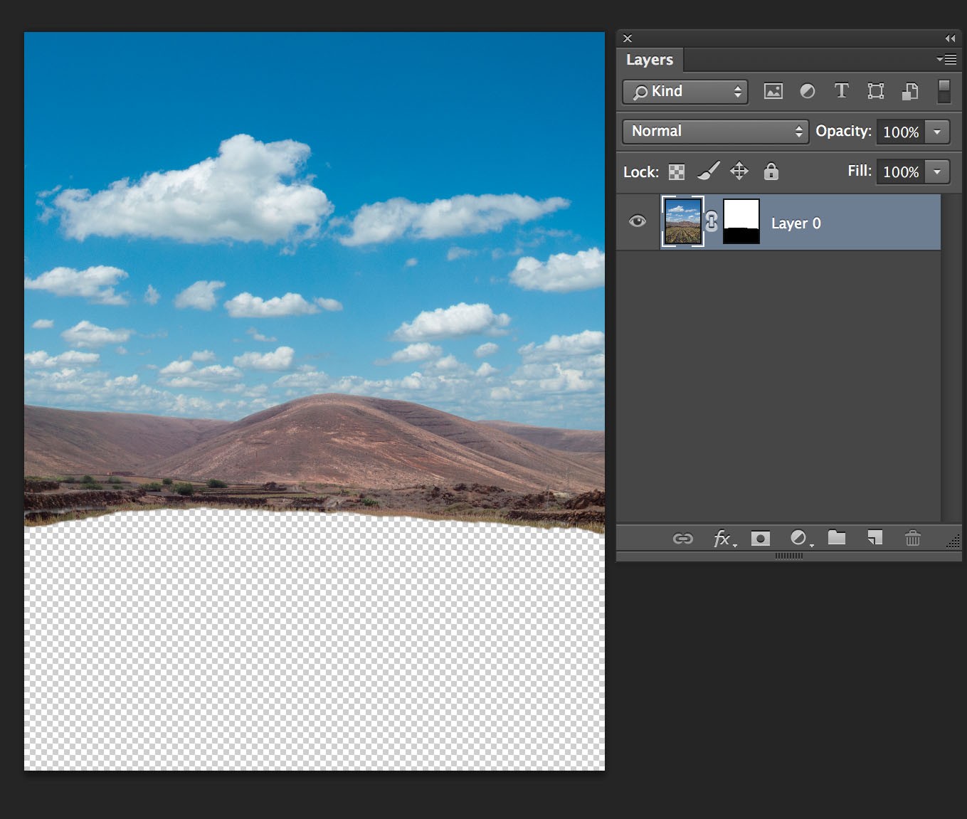
Foreground Hidden by Layer mask
Press ⌘Cmd and J keys if you are on a mac. If you’re on Windows the Control key replaces the ⌘Cmd key. You will now have a copy of your layer visible in the the layers pallet. Click on “layer 0 copy” in the layers pallet and drag it down so it is below “Layer 0”.
Press ⌘Cmd and T keys to enter transform mode. Click and drag the top of the transition box down towards the bottom of the canvas, or flip the vertical axis, then press the return key. You should now have the following result:
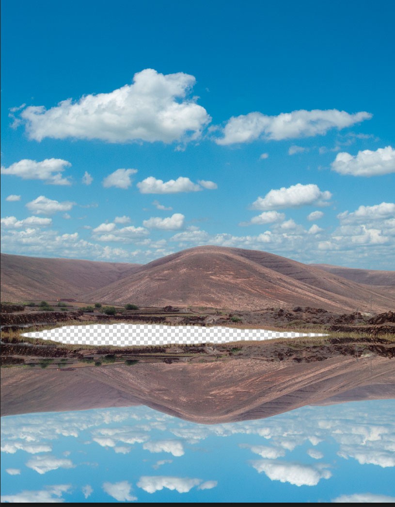
Flipped on Vertical Axis
You now need to transform the reflection again, so the edges meet. Go to Edit>Transform>Warp. Distort the reflection layer like this:
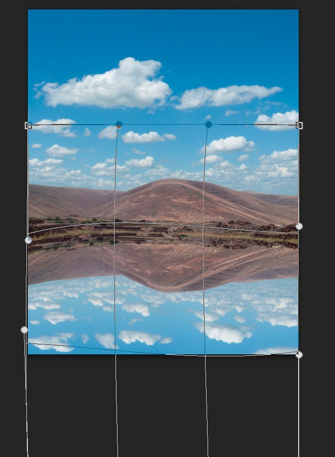
Warp Transform
Press the return key to set the transformation into place.
Go to Filter>filter gallery>. Under the “distortion folder select the Glass filter and apply the following settings;
Distortion – 11
Smoothness – 2
Texture – Frosted
Scaling – 200%
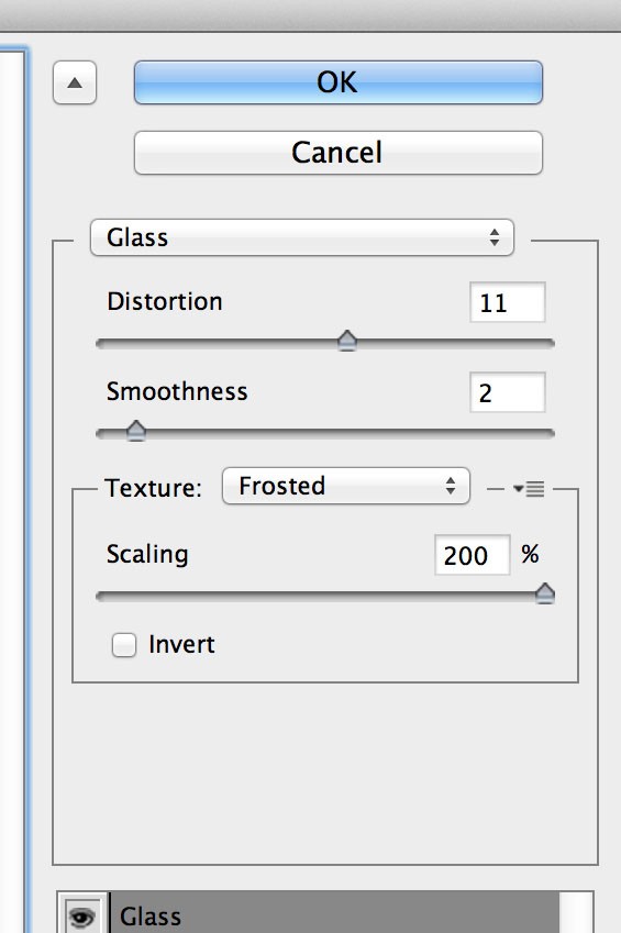
Glass filter settings
Apply motion blur to the reflection. Set the angle to 0 and the distance to about 18 pixels.
Here’s a close up of the reflection:
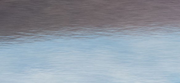
Reflection Detail
This is looking good, but there are still a few problems. The cloud reflections in the foreground are too clearly defined and the ripples too small in the foreground area.
Clouds too well defined.
To deal with this, make sure the reflection layer is selected and press the ⌘Cmd and J keys to duplicate it. Apply Gaussian Blur with a high setting of about 60 pixels. Click on the layer mask of your duplicate layer and brush out the mountain area with a large soft edged black brush. You don’t need to be too accurate here as sharp clouds just above the horizon line still look good.
Here’s the image now:
Blurred Clouds
The next step is to add ripples to the foreground water. If you do this in two stages you can have a different size for each to give a feeling of perspective.
Start with the area of water closest to the reflected horizon. You are going to create a custom texture layer. To do this create a new layer above your reflection layer. The shortcut to create a new layer is Shift+⌘Cmd + N keys. Select “Overlay for the blending options and label the layer something logical like “small water ripples”. Go to Edit>Fill and select “50% grey”. At this point you will not see any change in the image. Next go to Filter>Noise>Add noise and apply the following settings;
Amount – 400%
Distribution – Gaussian
Monochromatic – Ticked.
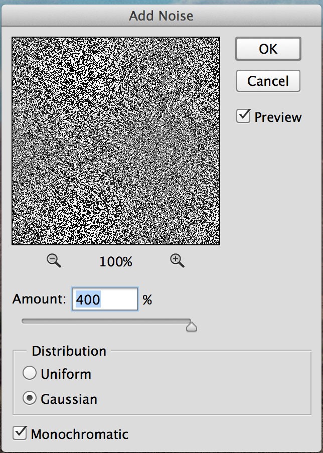
Add Noise
Apply a small amount of motion blur, with the angle at 0 and amount about 20 pixels (Filter>Blur>Motion Blur).
Next go to Filter>Distort>Wave and apply the following settings:
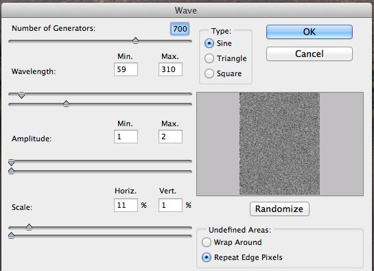
Wave Filter Settings
In the top right hand area of your layers pallet click on opacity and take the value down to about 20%, or what looks visually best to you. Apply a layer mask to your texture layer and paint out the ripple effect with a large black brush on the mountain reflection, which has the blurred glass ripple effect on it and from the foreground where you will add larger ripples.
Here’s an enlargement of the reflection.
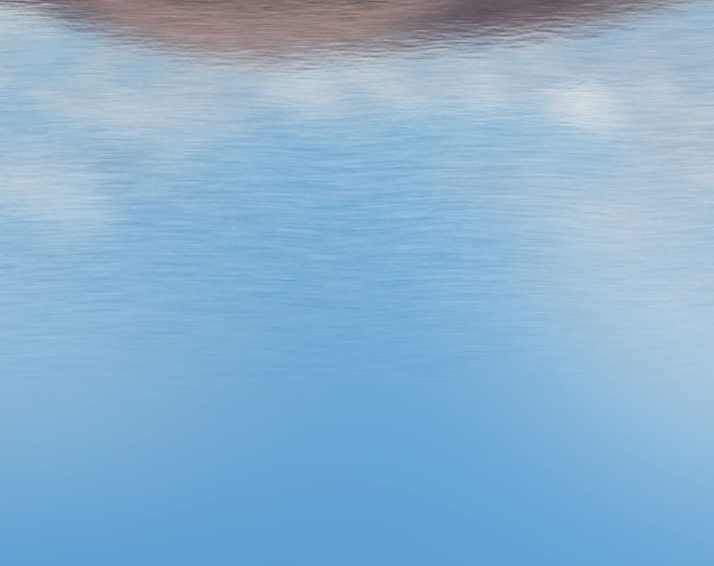
Medium sized ripples
At the very top you can see the effect of the glass filter with motion blur applied. In the middle is the effect of the overlay texture just described. Note the gradual fading out of the texture ready to apply the larger ripples.
Applying large ripple effect
Create a new layer as described above and select overlay again as the blending mode. Make a small selection with the rectangular marquee tool as shown:
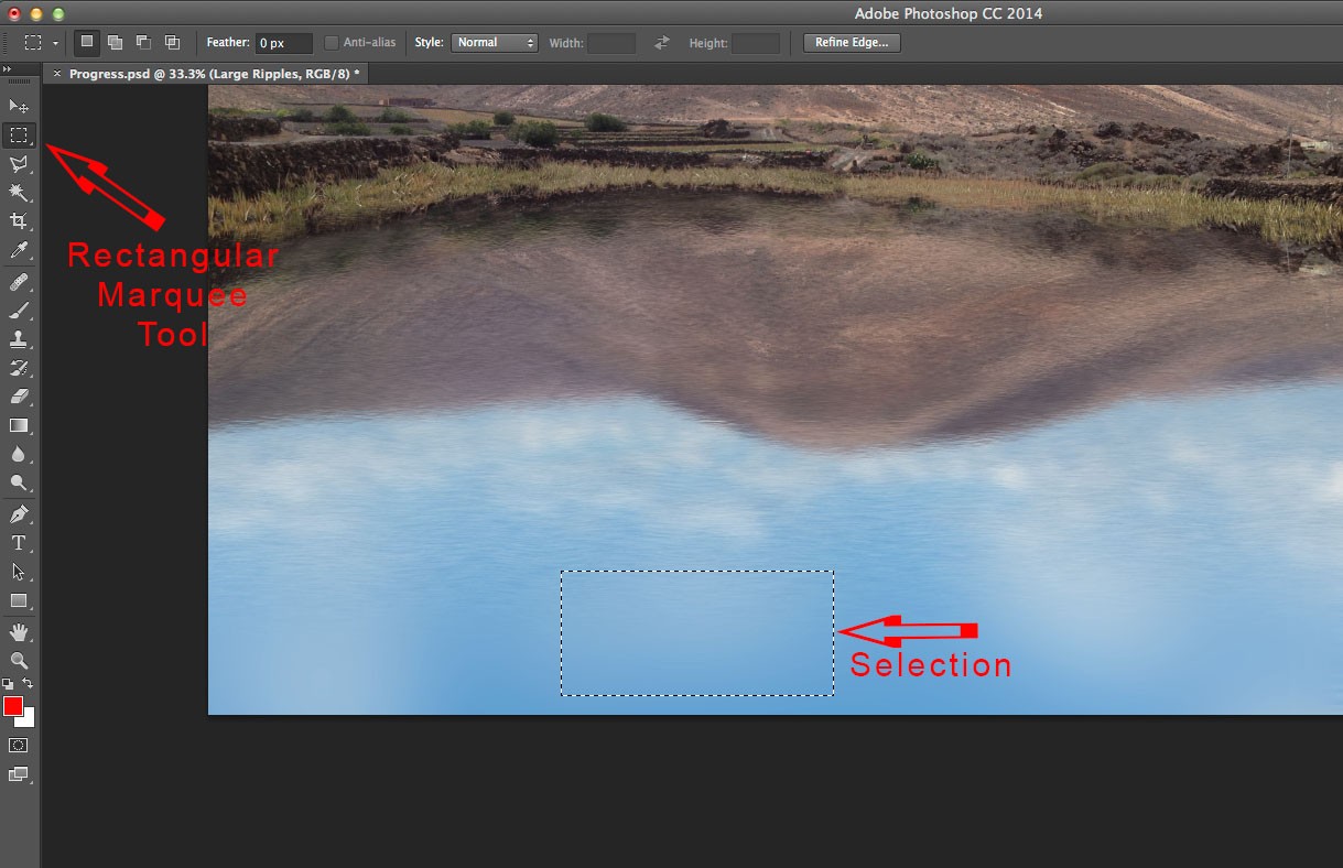
Selection.
Fill the selection with 50% grey as before (Edit>Fill>50% Grey) and apply the same amount of noise as before.
Press ⌘Cmd and T keys to enlarge the overlay area to fill the width of the image. This is how things should look now:
Noise Added & Enlarged
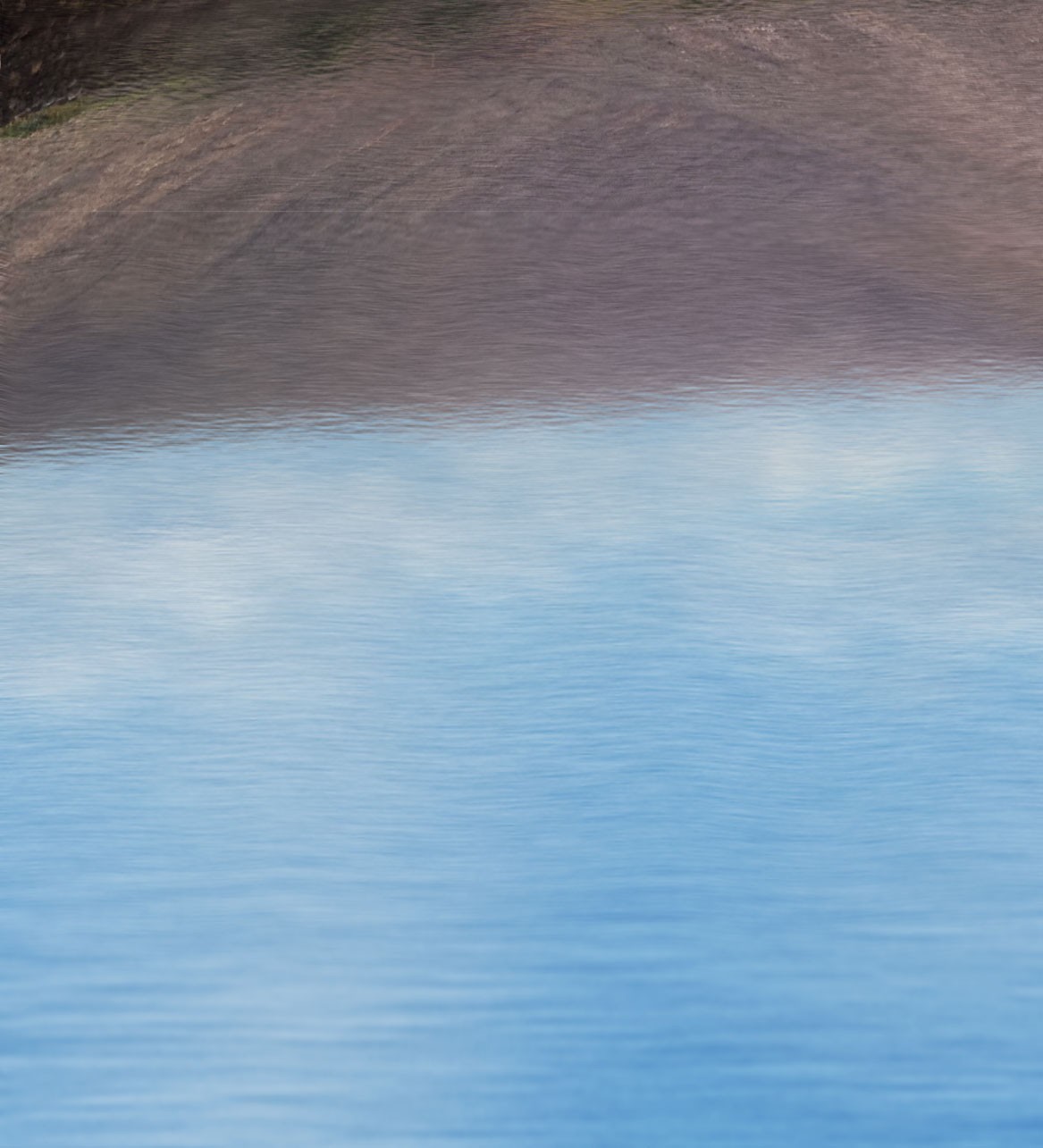
Add motion blur with angle at 0 again, but this time up the amount to about 130. After doing this increase the width of the layer using ⌘Cmd and T keys to hide the unwanted edges.
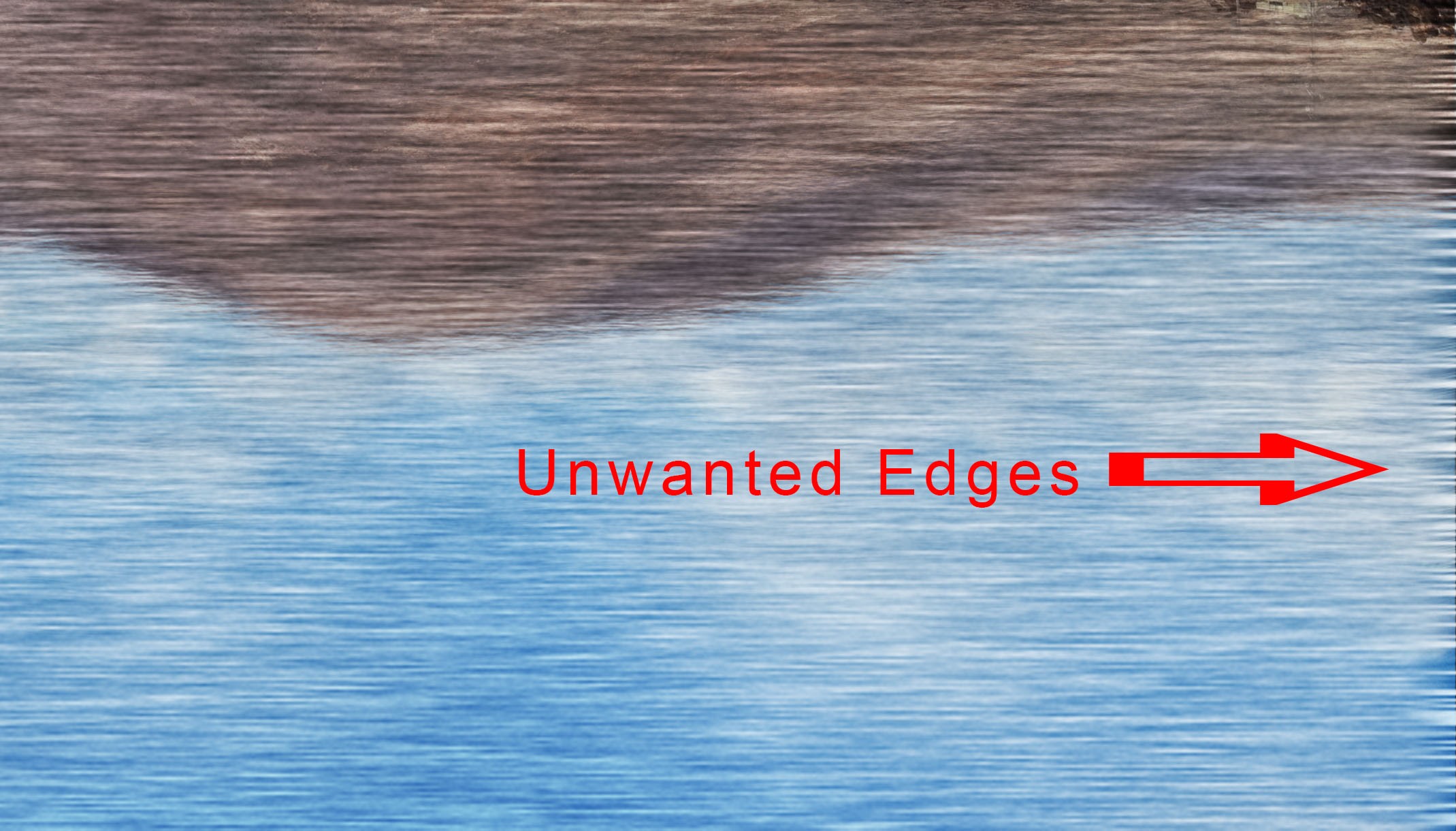
Increase width to hide unwanted edges.
Apply the wave filter with the same settings as before, lower the opacity to about 25% and use a layer mask to hide the unwanted areas and just leave the foreground area. If you use the linear graduation tool going from black to transparent you will get a pleasing result. Here’s an enlarged area showing the transition of size in the ripples:
Transition of Ripple Size.
Finishing Touches
Where a lot of retouching of this kind falls short, is in the reflection of objects close to the water’s edge. Looking at the enlarged section below you can see that the reeds are not reflected in the water:
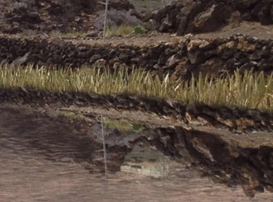
Reeds Not Reflected.
This can be sorted with the clone tool. To clone a mirror image you need to open the “Clone Source” pallet (Window>Clone Source). Click on the area shown to make a downwards mirror image:
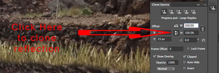
Clone a Reflection.
If you are on an older version of Photoshop you may not be able to do this. You can enter a height value of -100% instead. You will need to regularly re-select your cloning source to keep things lined up. Once you have finished refining the waters edge you can add a ripple effect using the glass/motion blur method or just leave a clean reflection. Either looks good.
Here’s how it looks with the reeds cloned:
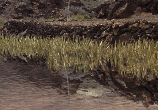
Reflected Reeds.
Here’s the finished image again with just a touch of colour enhancement. If you would like to see more detail click on the image to enlarge:
Finished Image
Photoshop a sky in ten minutes using blending options
Photoshop a sky in ten minutes using blending options
There are many ways of adding sky in Photoshop and that’s before getting anywhere near third party plugin software. Different methods are suitable for different images with the deciding factor usually coming down to time. Below I will explain one of the quickest methods I know of adding sky where complex shapes, such as trees, need to be dealt with. To Photoshop a sky in ten minutes is not unreasonable once you are used to the concepts here. I have often used this method when I have ten or twenty shots to retouch and only half a day to do them in.
A quick note before reading. If you have problems seeing details on any of these images click on the image to see an enlarged version.
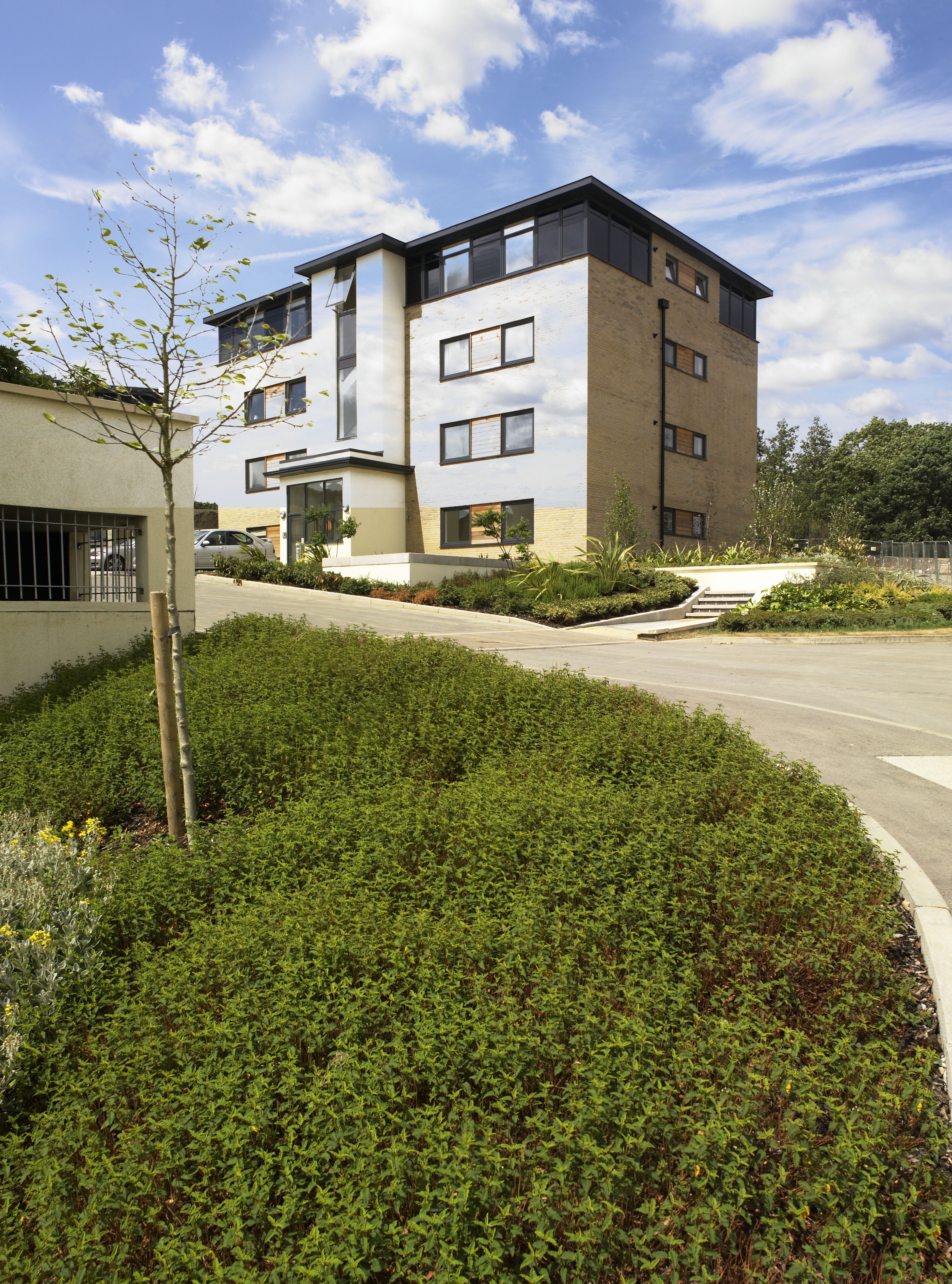
Here are my before and after shots:
- Before
After
Analysing the image
Looking at the before image you can immediately see the foreground tree is going to be a problem. Depth of field means the tree is slightly out of focus with motion blur adding to the chaos. Putting in a new sky means you have to deal with these awkward edges. Here’s a close up of the area to show exactly what needs to be tackled:
Tree Detail
Adding the sky as a separate layer
Open the image to be retouched and the sky image in Photoshop. With the sky image visible copy and paste onto the background image. A quick way of doing this is to hold down the ⌘Cmd key and keep it down, then one at a time press the “A” key, the “C” key, the “W” key and finally the “V” key. These are Mac shortcuts.
Here’s what’s happening.
⌘Cmd A selects the whole image. You will see the dotted selection line around the edge.
⌘Cmd C copies the selection. i.e.the whole sky document.
⌘Cmd W closes the sky document.
⌘Cmd V pastes the sky as a separate layer onto the background layer.
Positioning the sky
Press and hold the ⌘Cmd key to temporarily access the move tool. Click and drag the sky to where it needs to be. Next resize the sky (⌘Cmd and “T” keys) pressing the return key when happy with the results. Here’s the sky in position;
Sky in position
Blending Options
You can use the blending options to hide the sky where there are darker areas on the underlying background layer. To do this double click on the sky layer in the layers pallet to open the Layer Style pallet, which has the blending options selected by default. Here’s how it looks before making any adjustments;
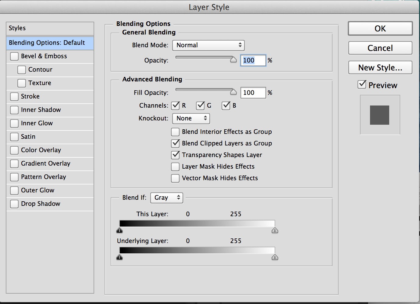
Layer Style Pallet
You need to slide in the bottom left hand slider to the right until the majority of the building and trees are revealed, but stop before the sky from the background layer starts to show through. Then press the ⌥Alt key to split the slider into two halves and drag one half away from the other. This creates a gradual transition between light and dark areas. If you zoom in on the fine tree details while doing this you will be able to see what has the most pleasing results.
Here’s how the adjustments look in the pallet:
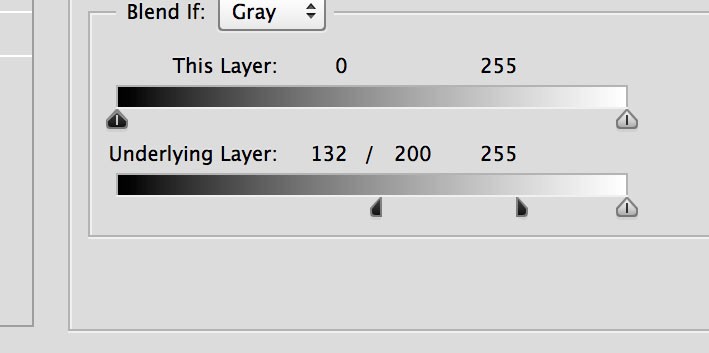
Blending Options Adjustments.
And here’s how the image looks with these adjustments:
Effects Of Blending Options on image.
As you can see the sky still shows through on the lighter parts of the building. You need to use a layer mask to hide these parts. With the sky layer selected in the layers pallet click on the area shown:
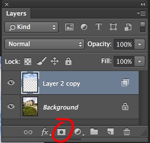
Applying a Layer Mask
You will now see a layer mask on the sky layer as shown:
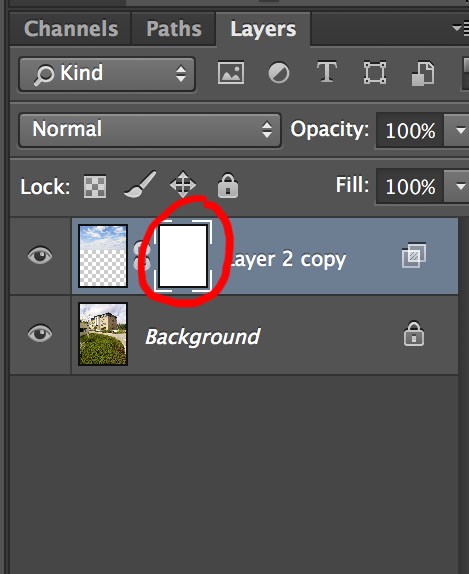
Layer Mask.
Notice the layer mask has a border around it which is white in the corners. This shows it is the layer mask that is selected and not the layer itself. Painting black on the layer mask will hide the sky and painting white will reveal. You will notice that the layer mask just shows white at the moment meaning all the sky is revealed. (Ignoring the effects of blending options for the moment) You could paint black with a brush, but this will take a long time. A much better option is to make a selection and fill that selection with black. Here’s where it is a huge advantage mixing blending options and a layer mask. You only have to select accurately in a few areas. Here’s an image showing my selection made using the polygon lasso. The area circled in red is where you need to be accurate with the selection. The rest can be done more quickly and doesn’t need to go to the roofline of the building as this is already hidden with the blending options.
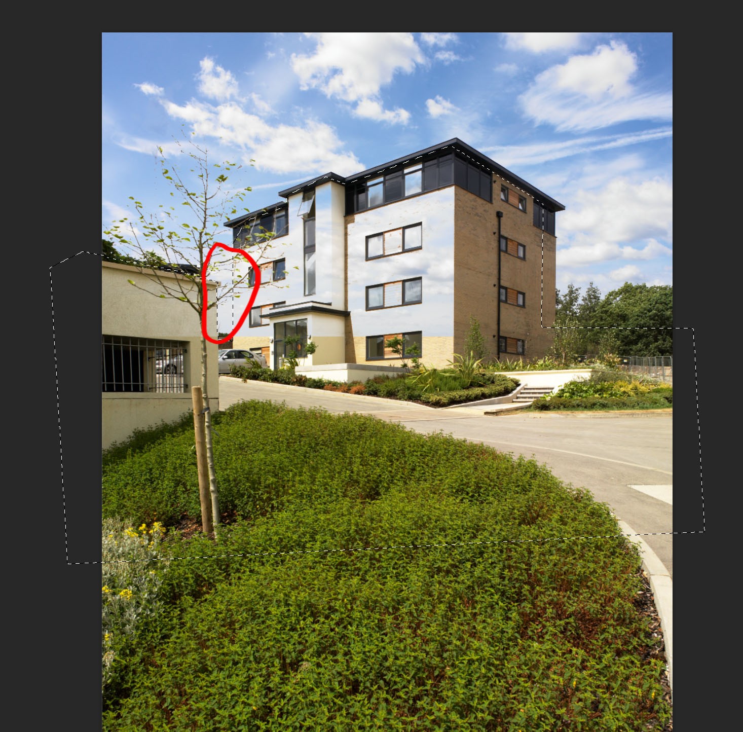
Selection
This may be hard to see so for illustrative purposes only here’s the selection shown in quick mask mode. The red areas show parts of the image not selected:
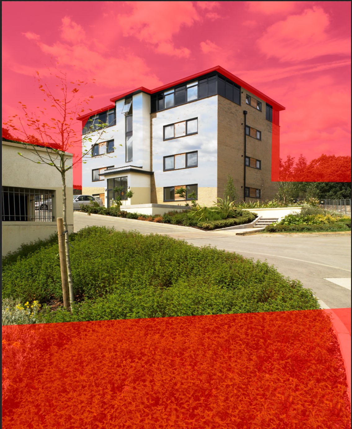
Selection shown in Quick Mask Mode.
Notice how the selection doesn’t need to go to the bottom of the image as there is no sky to hide here. Also where the darker parts of the building meet the sky you don’t need to follow the building edge, but can just select somewhere within the dark area.
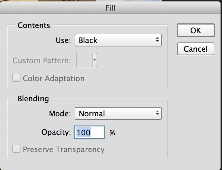
With the selection active (not in quick mask mode) go to Edit>Fill and select “Black” from the drop down menu as shown. Make sure you have the Layer Mask selected in the layers pallet, otherwise you will be painting black onto the actual image.
Photoshop’s fill option
Here’s how the image looks now:
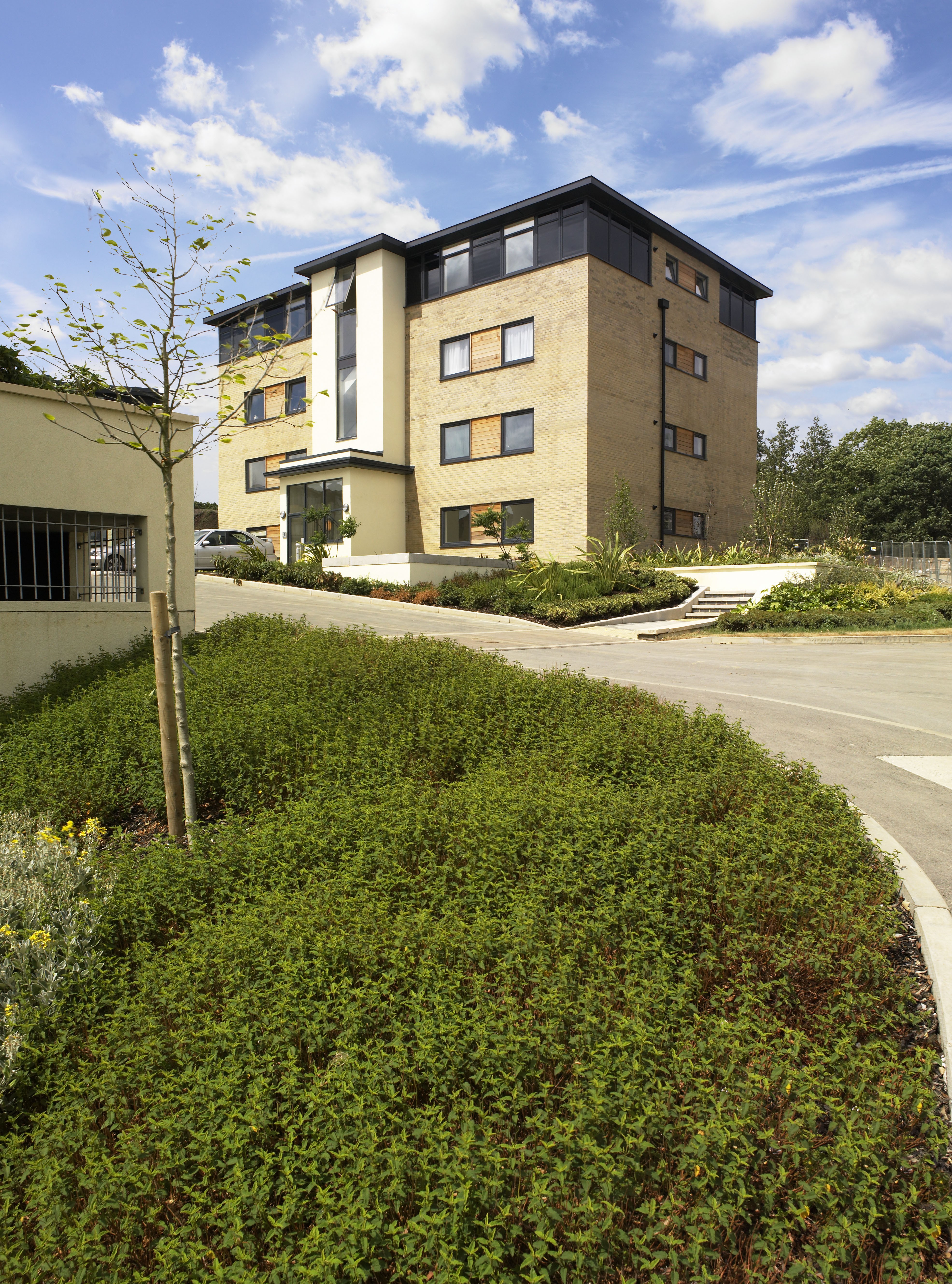
Almost there.
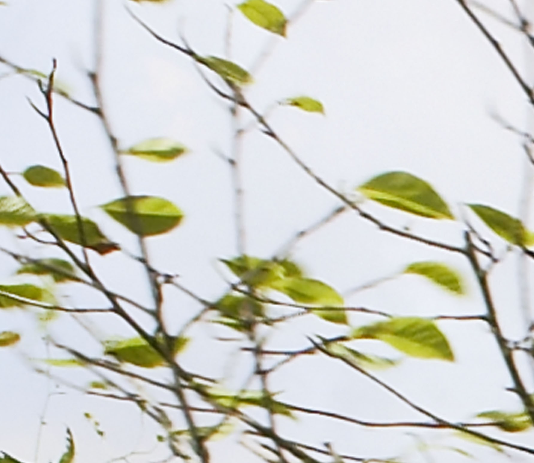
There’s just a bit of tidying up to do now. Taking a closer look at the tree branches there’s a bit of a halo effect:
Blending Options effect on blurred edges.
This may be ok for some people, but it is quite simple to get a more natural look.
Make sure the layer mask is selected on your sky layer. Press the “G” key to select the gradient tool. select the radial gradient going from black to transparent as shown;
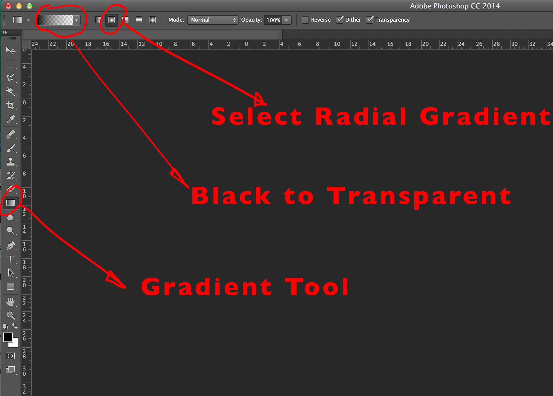
Photoshops Gradient Options
Click and drag from the centre of the tree branches to a small way outside the tree as shown by the red arrow. The direction you drag in is not important, but the distance certainly is.
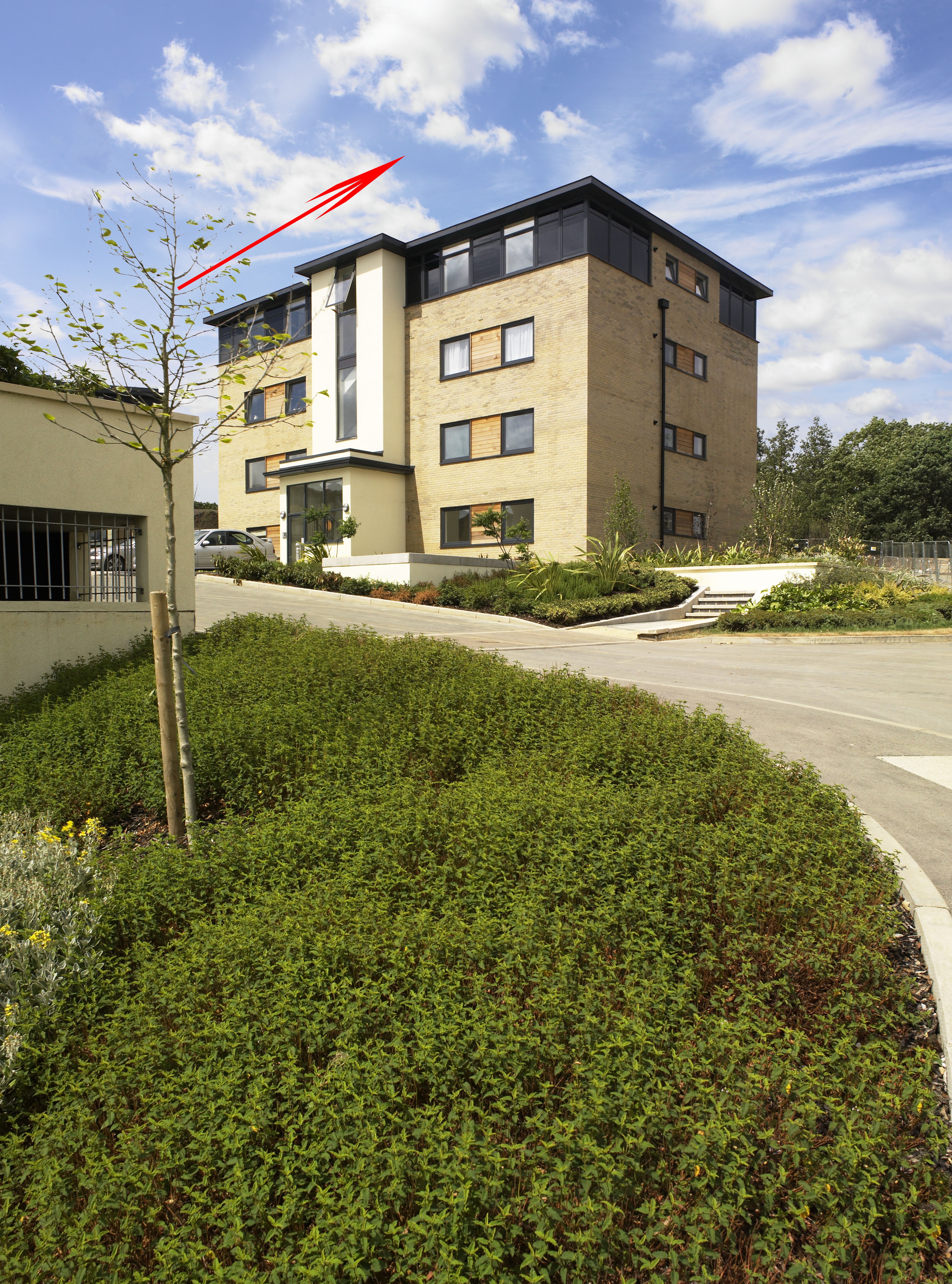
Click and drag gradient
Here’s your final result with a close up showing how the blurred branches look:

Final result
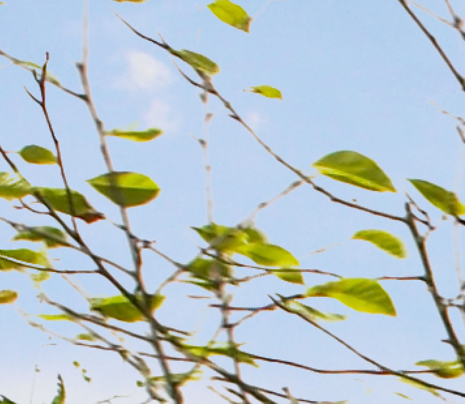
Tree detail after using Gradient tool.
What we have created here is the effect a highlight area in the sky. We are showing the background layer and so seeing the blurred branches as they naturally are. If the light patch is too harsh you can also get a good effect by lowering the opacity of the gradient tool. This is a very simple idea and may feel like cheating, but I prefer the more natural look achieved.
Here’s and image showing the layer mask with hidden sky areas shown in red:
Hidden areas shown in red.
A good point to keep in mind is if you need to fade out a sky to reveal the background layer try to position a highlight patch or white cloud from the sky you’re adding over the relevant area.
This has taken longer to explain than to do, but once you are used to working with these ideas ten minutes is not an unreasonable time to add sky to an image like this.
Of course some images are more problematic. I use OnOne’s masking software a lot which makes very short work of some images. Other images are a lot simpler and a sky can be added using only Photoshops blending blending options in seconds.
In general Photoshop has some great functions for achieving lots of results. If you cannot achieve what you want using one method don’t feel you have to be limited. Quite often using a combination of methods works very well. In this case blending options and layer mask have been used in conjunction with each other.
I hope you have learned a lot from this post. If there are any points you are not clear on please feel free to post any questions.
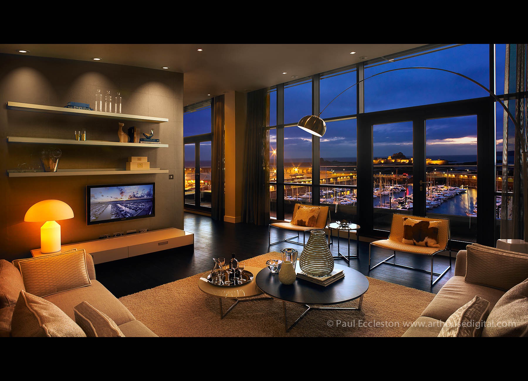
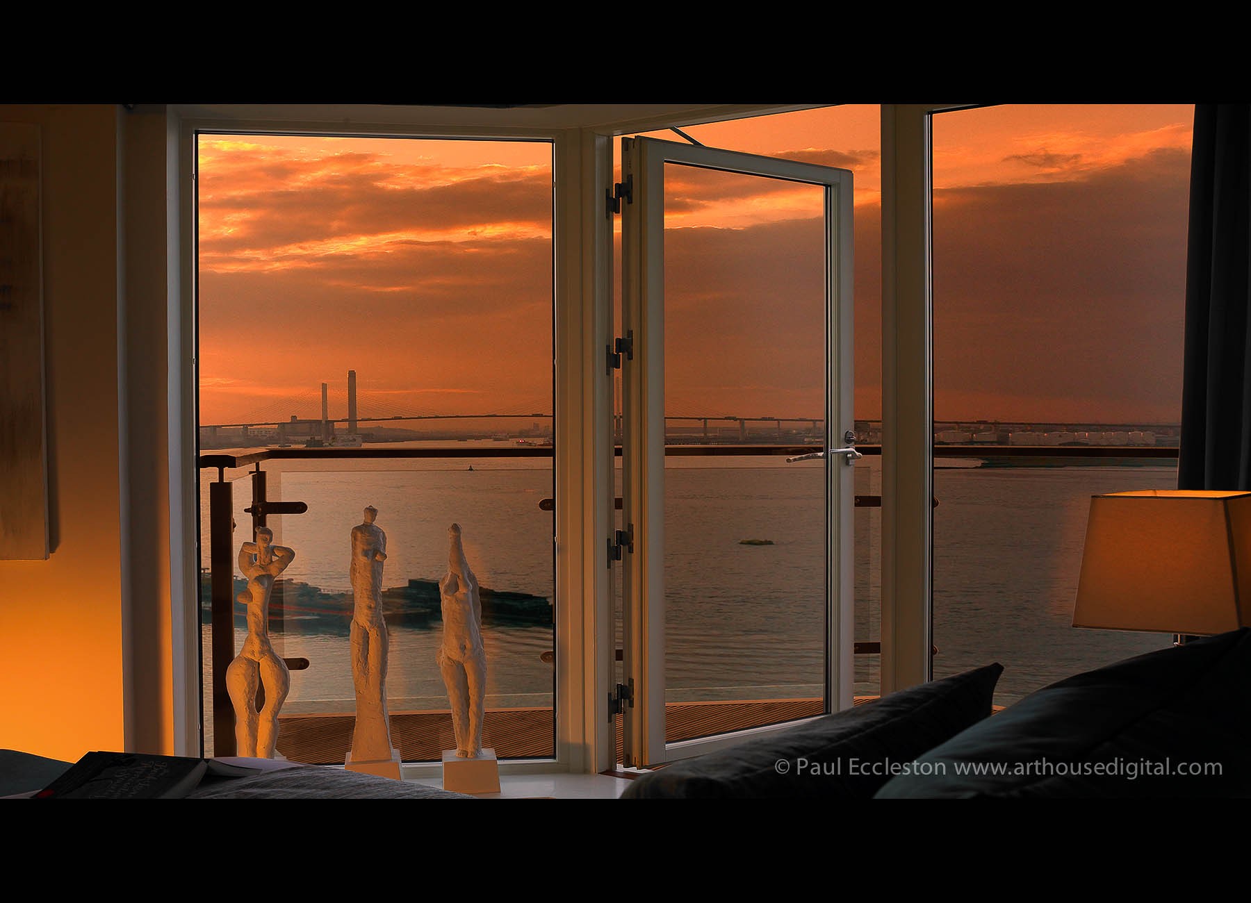
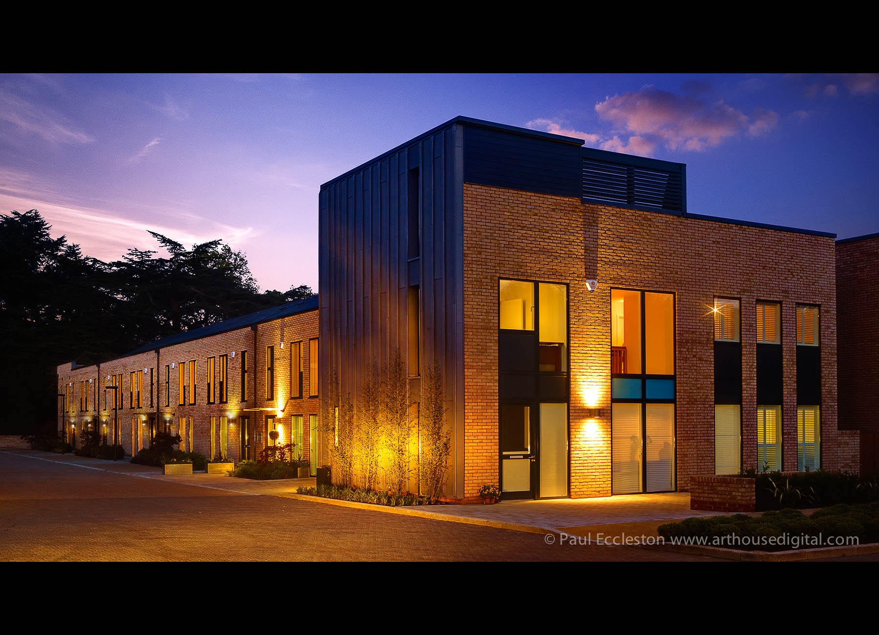
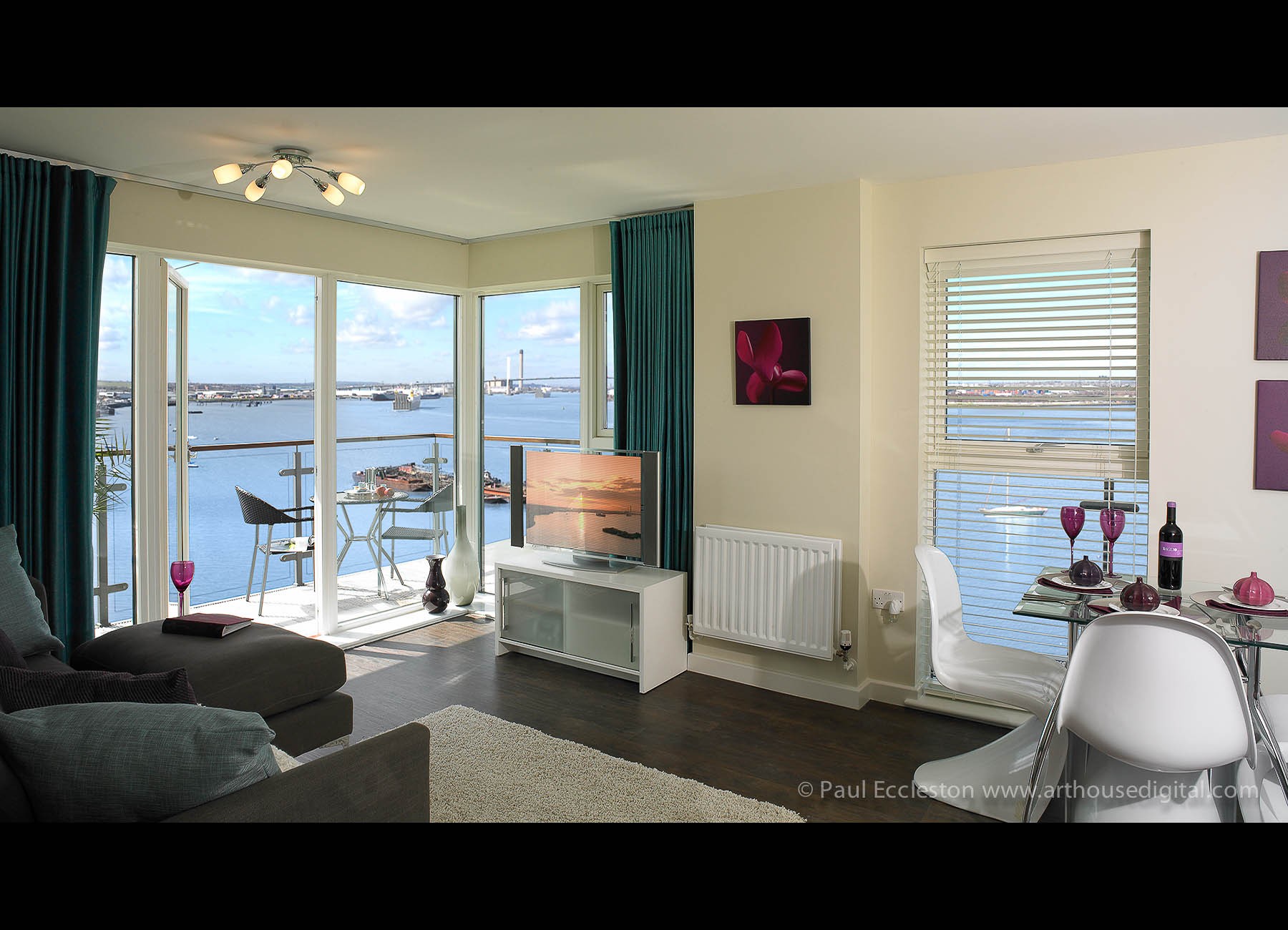
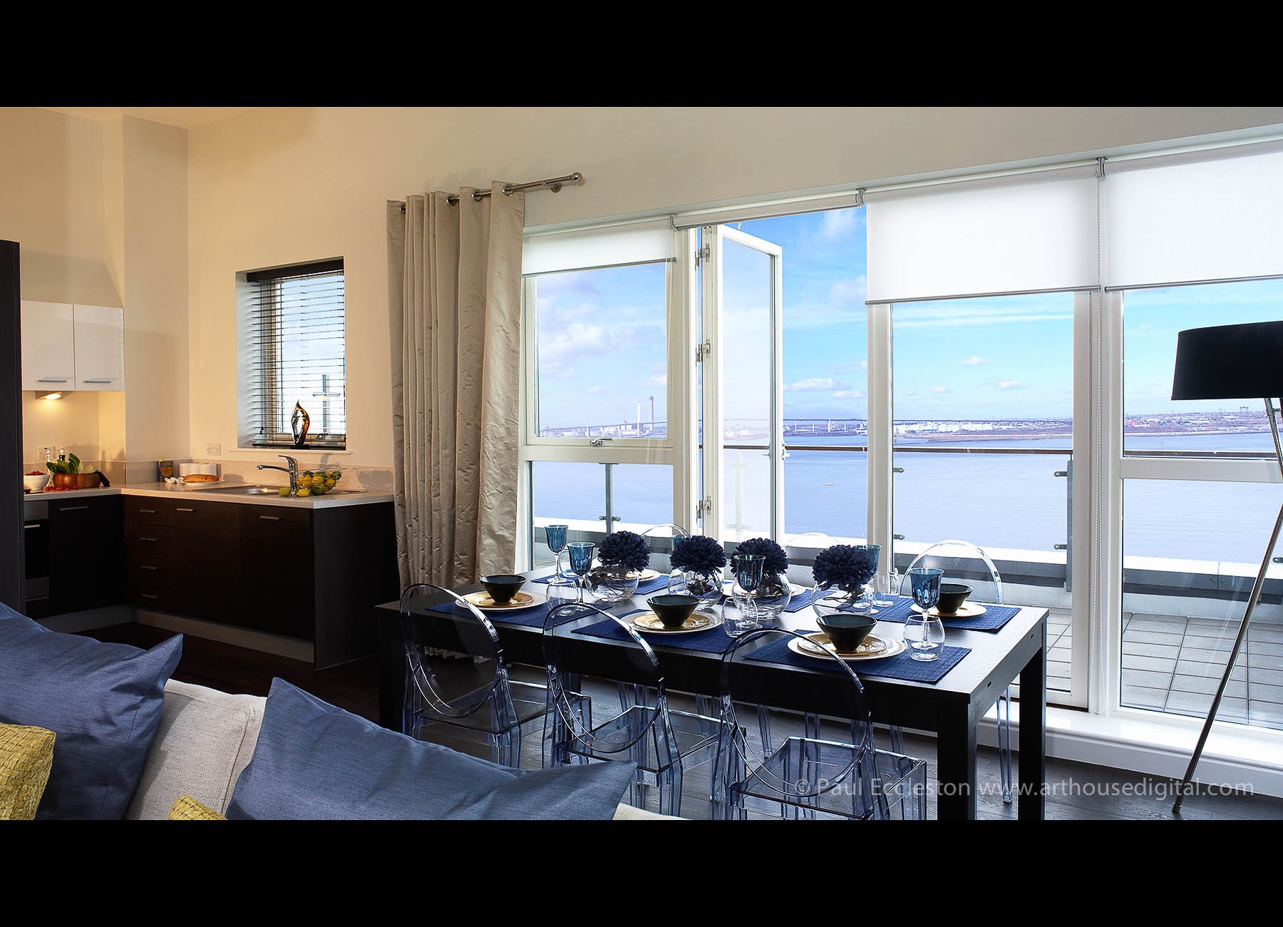
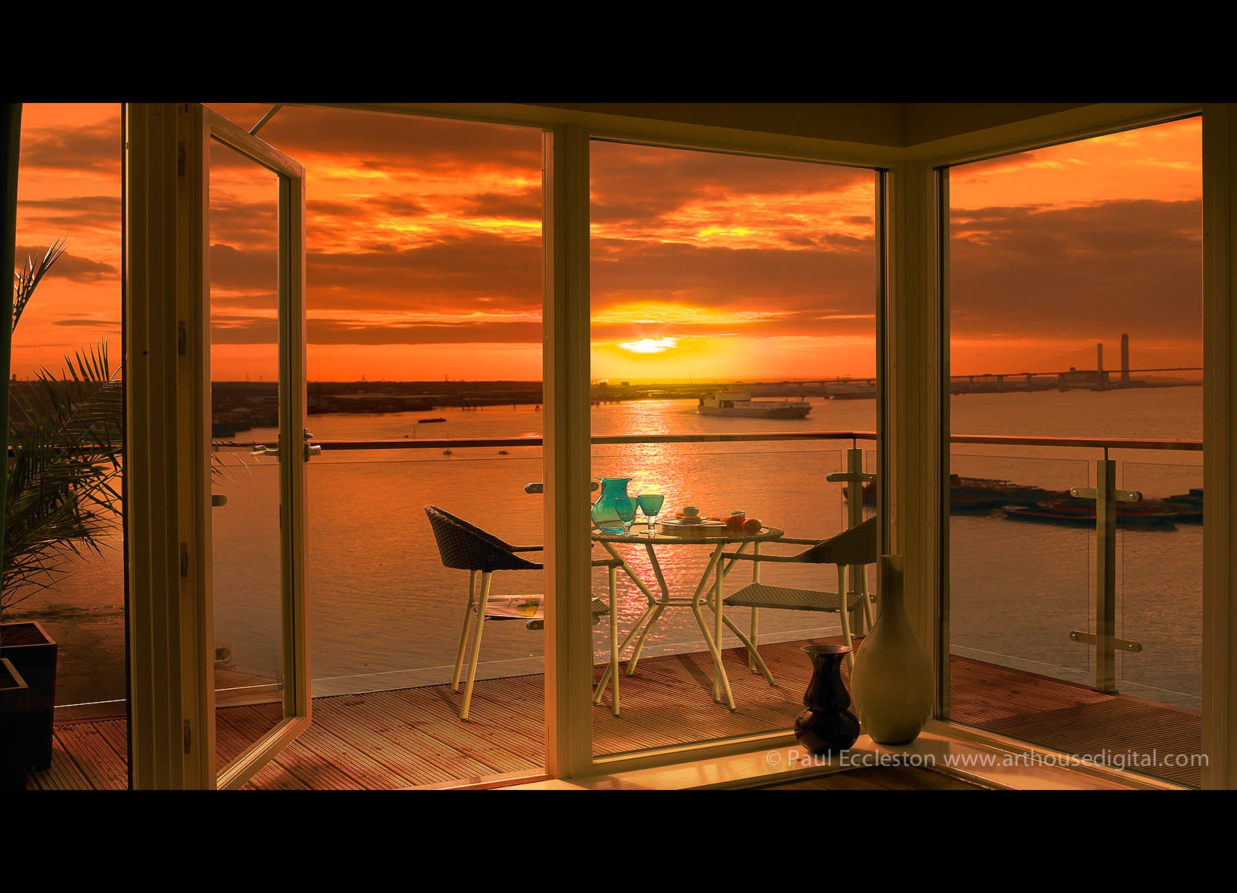