


Author: Jerry@AdShots
Creating Photoshop Reflections.
Creating Photoshop reflections in water.
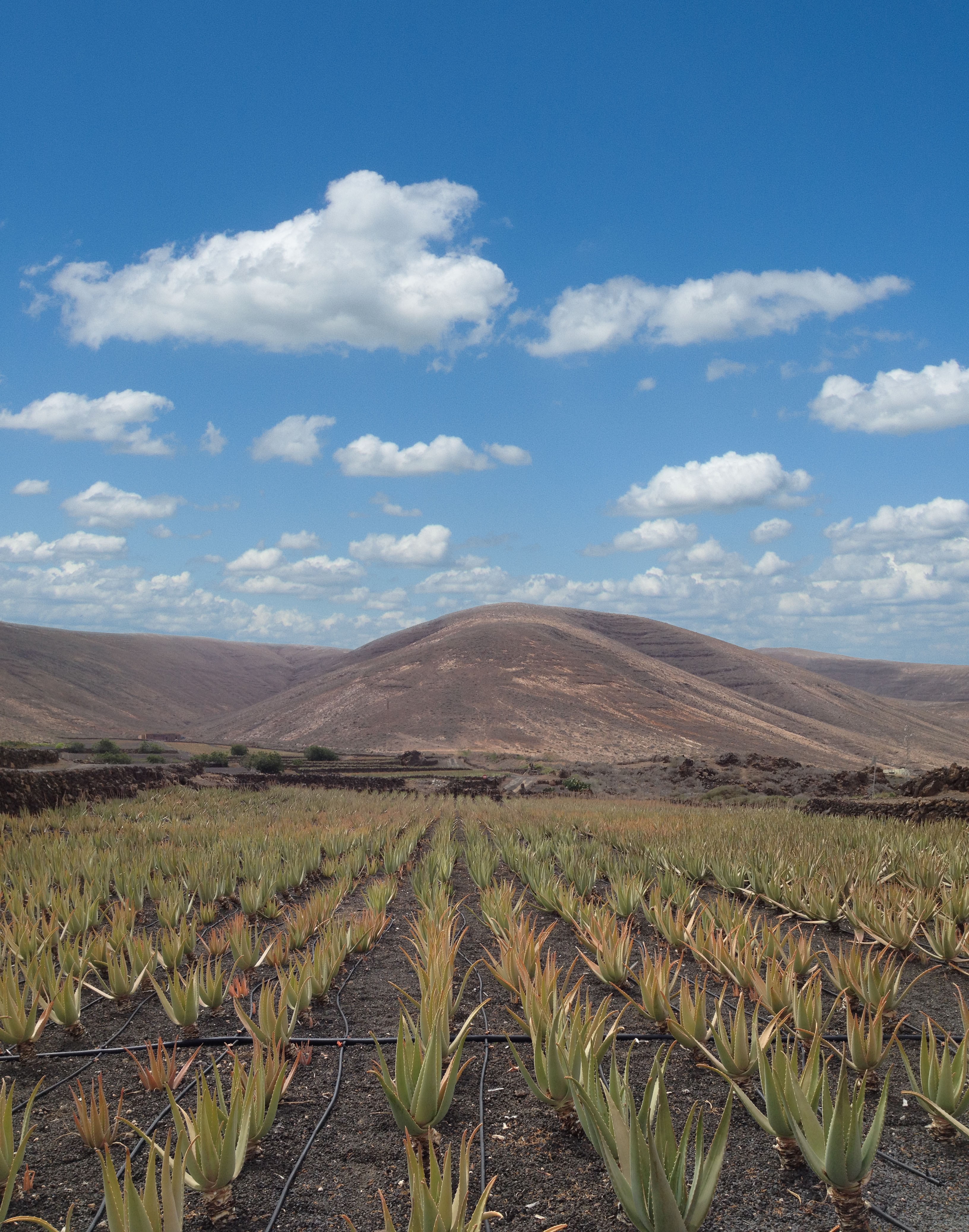
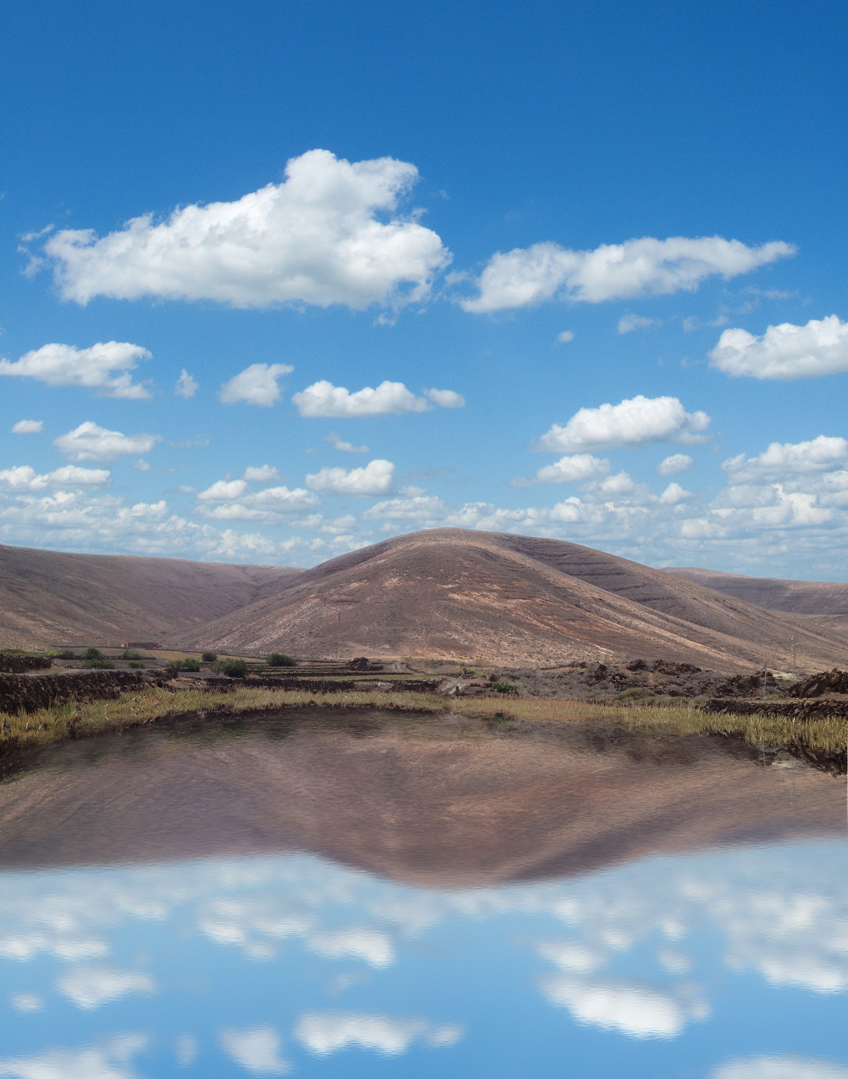
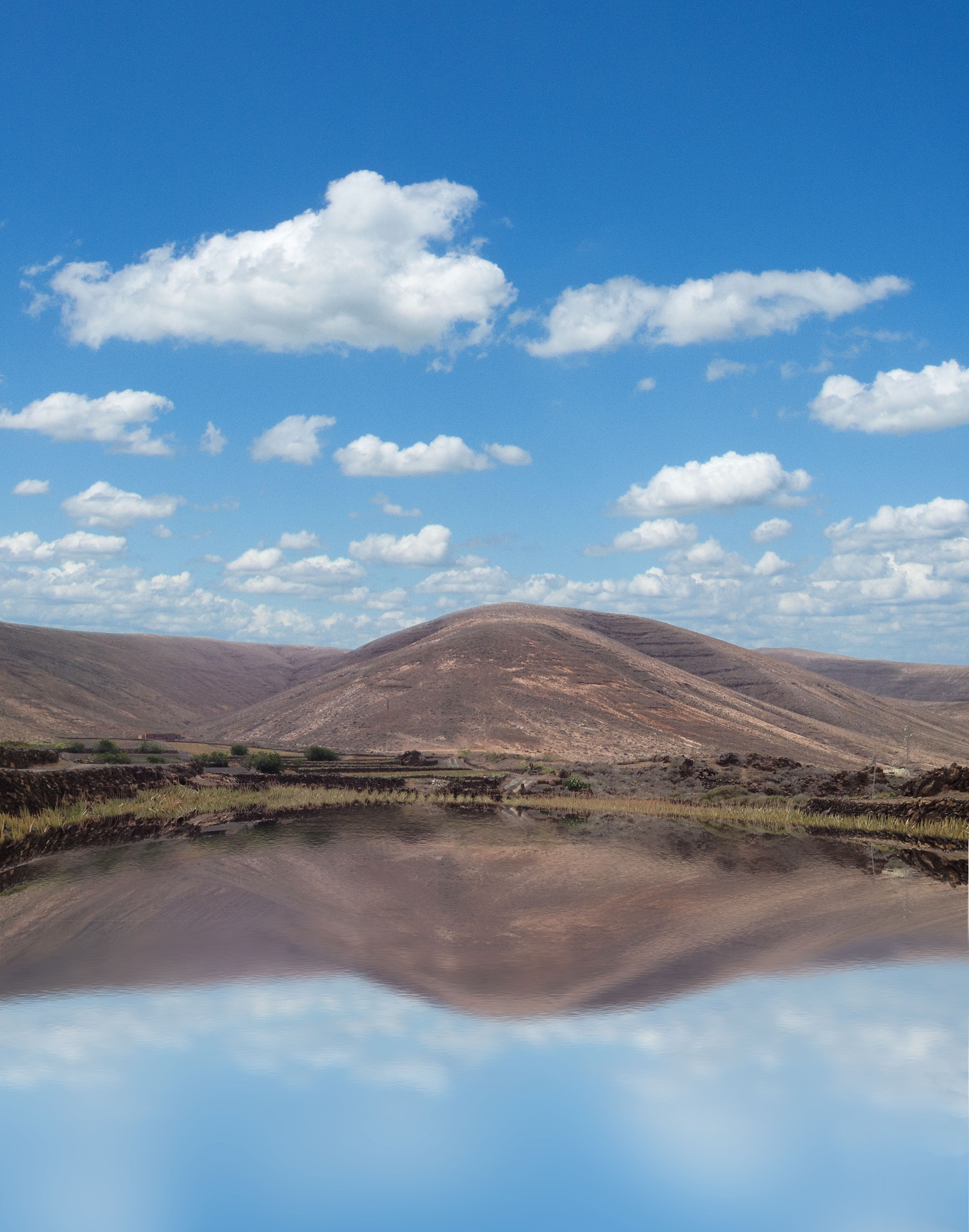
In this post I will be showing you how to create realistic Photoshop reflections, as shown below.
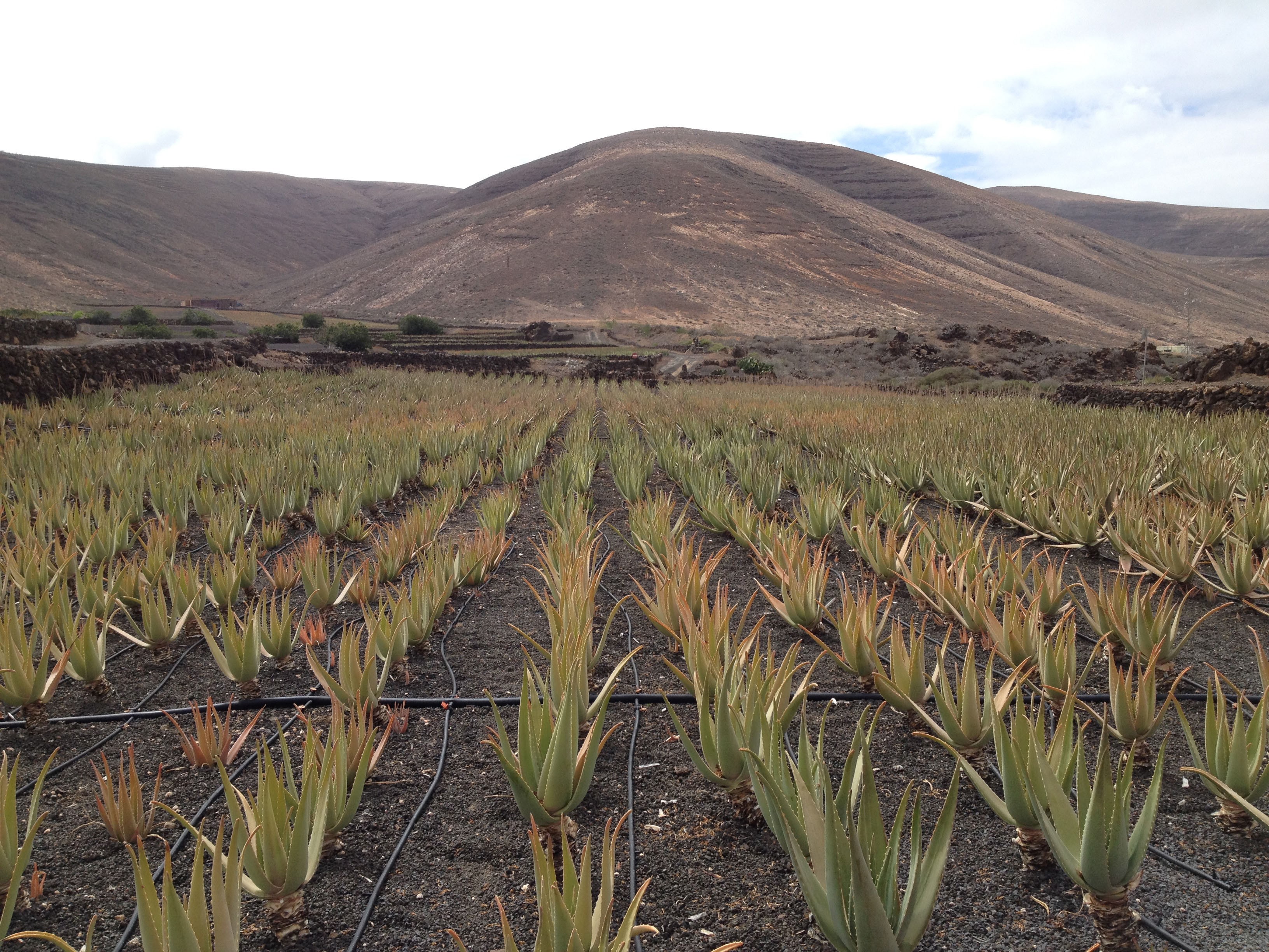
Before

After
As you can see I have also added a sky. I will not be discussing this as I have covered how to do this in a previous post.
What you will learn is two separate methods for creating Photoshop reflections: first, using filters and second, using an “Overlay” layer with a texture added to it.
Starting Point
Here’s the image with sky already added:
Starting Point (with sky added)
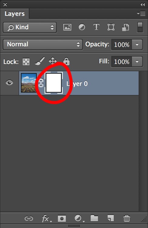
The first step is to make sure your background layer is unlocked. This will allow you to add a layer mask and hide the foreground areas. If the background layer is locked you will see a padlock next to the Background layer in the layers pallet as shown.
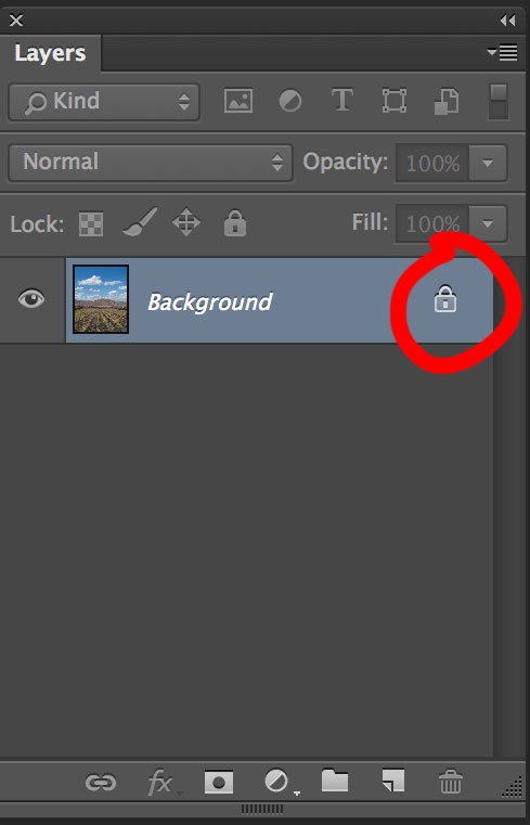
Locked Layer
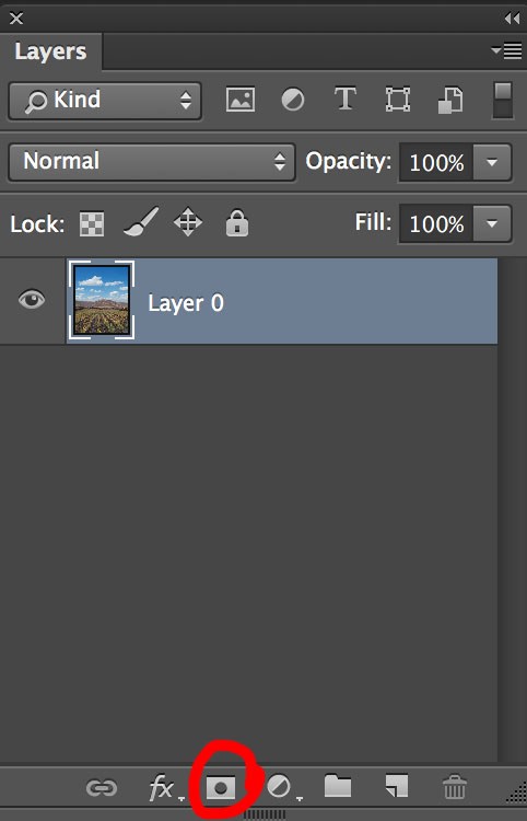
If you double click on the word “Background” then click “OK” in the box that appears you will have an unlocked layer which by default is now called “Layer 0”.
Apply a layer mask by clicking in the area shown:
Applying Layer Mask
You will now have a layer mask icon appear on Layer 0:
Layer Mask Applied
With a large black brush paint on the areas you want to hide. Reduce the brush size when you want to be more accurate. If you make any mistakes you can reveal hidden areas by painting white. You should end up with the following results:
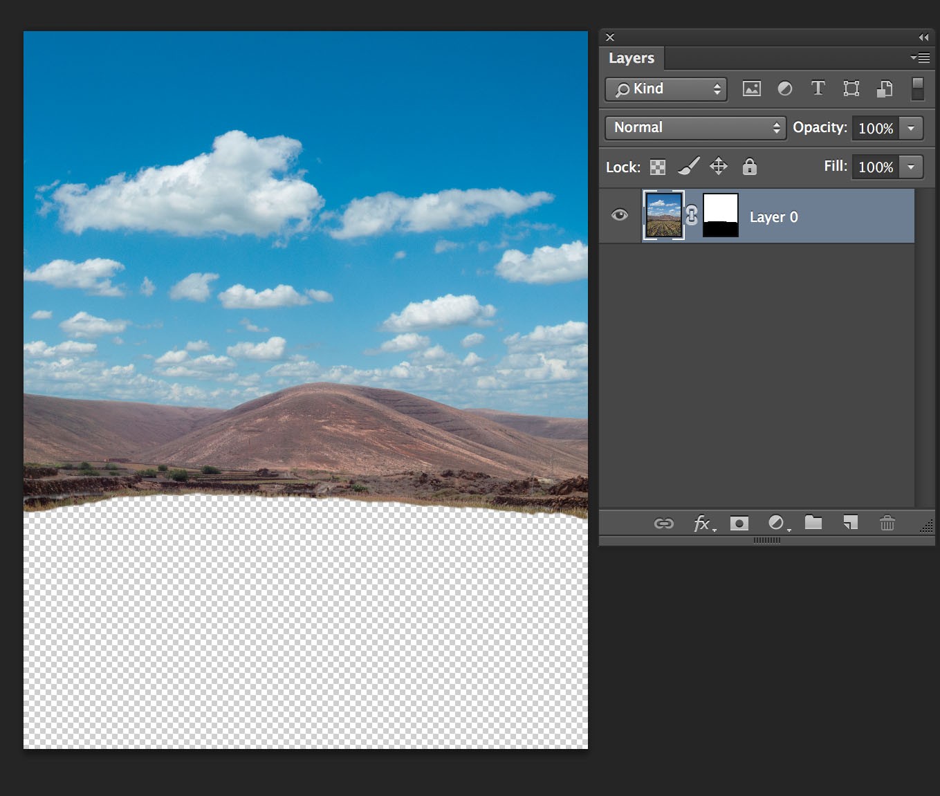
Foreground Hidden by Layer mask
Press ⌘Cmd and J keys if you are on a mac. If you’re on Windows the Control key replaces the ⌘Cmd key. You will now have a copy of your layer visible in the the layers pallet. Click on “layer 0 copy” in the layers pallet and drag it down so it is below “Layer 0”.
Press ⌘Cmd and T keys to enter transform mode. Click and drag the top of the transition box down towards the bottom of the canvas, or flip the vertical axis, then press the return key. You should now have the following result:
Flipped on Vertical Axis
You now need to transform the reflection again, so the edges meet. Go to Edit>Transform>Warp. Distort the reflection layer like this:
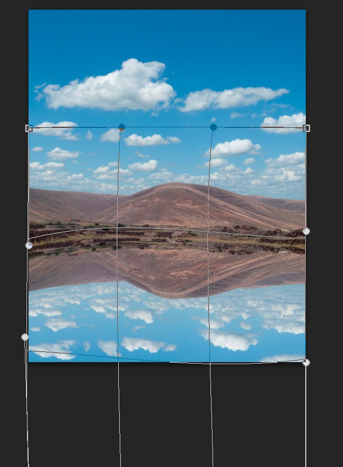
Warp Transform
Press the return key to set the transformation into place.
Go to Filter>filter gallery>. Under the “distortion folder select the Glass filter and apply the following settings;
Distortion – 11
Smoothness – 2
Texture – Frosted
Scaling – 200%
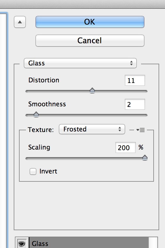
Glass filter settings
Apply motion blur to the reflection. Set the angle to 0 and the distance to about 18 pixels.
Here’s a close up of the reflection:
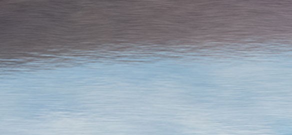
Reflection Detail
This is looking good, but there are still a few problems. The cloud reflections in the foreground are too clearly defined and the ripples too small in the foreground area.
Clouds too well defined.
To deal with this, make sure the reflection layer is selected and press the ⌘Cmd and J keys to duplicate it. Apply Gaussian Blur with a high setting of about 60 pixels. Click on the layer mask of your duplicate layer and brush out the mountain area with a large soft edged black brush. You don’t need to be too accurate here as sharp clouds just above the horizon line still look good.
Here’s the image now:
Blurred Clouds
The next step is to add ripples to the foreground water. If you do this in two stages you can have a different size for each to give a feeling of perspective.
Start with the area of water closest to the reflected horizon. You are going to create a custom texture layer. To do this create a new layer above your reflection layer. The shortcut to create a new layer is Shift+⌘Cmd + N keys. Select “Overlay for the blending options and label the layer something logical like “small water ripples”. Go to Edit>Fill and select “50% grey”. At this point you will not see any change in the image. Next go to Filter>Noise>Add noise and apply the following settings;
Amount – 400%
Distribution – Gaussian
Monochromatic – Ticked.
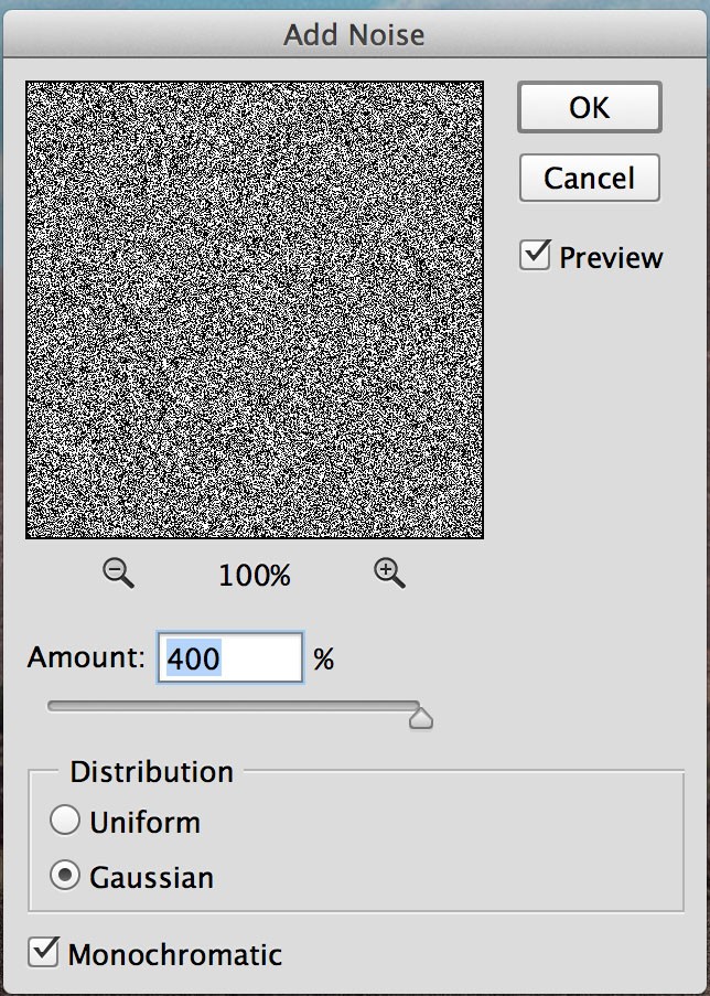
Add Noise
Apply a small amount of motion blur, with the angle at 0 and amount about 20 pixels (Filter>Blur>Motion Blur).
Next go to Filter>Distort>Wave and apply the following settings:
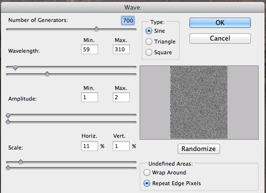
Wave Filter Settings
In the top right hand area of your layers pallet click on opacity and take the value down to about 20%, or what looks visually best to you. Apply a layer mask to your texture layer and paint out the ripple effect with a large black brush on the mountain reflection, which has the blurred glass ripple effect on it and from the foreground where you will add larger ripples.
Here’s an enlargement of the reflection.
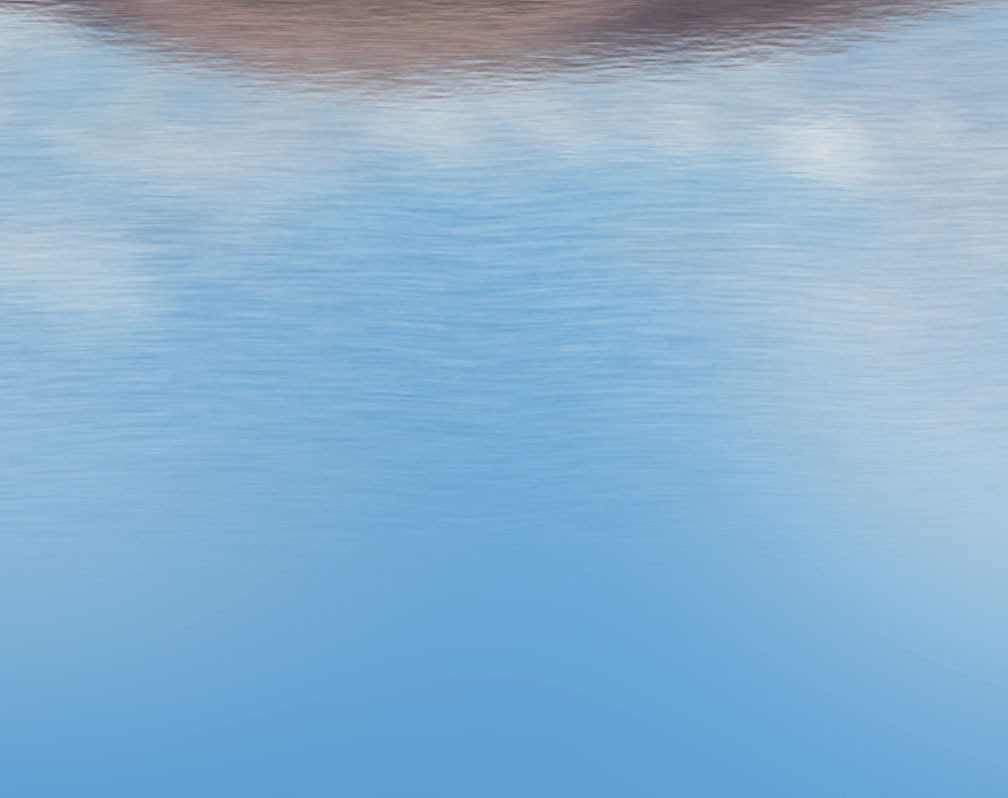
Medium sized ripples
At the very top you can see the effect of the glass filter with motion blur applied. In the middle is the effect of the overlay texture just described. Note the gradual fading out of the texture ready to apply the larger ripples.
Applying large ripple effect
Create a new layer as described above and select overlay again as the blending mode. Make a small selection with the rectangular marquee tool as shown:
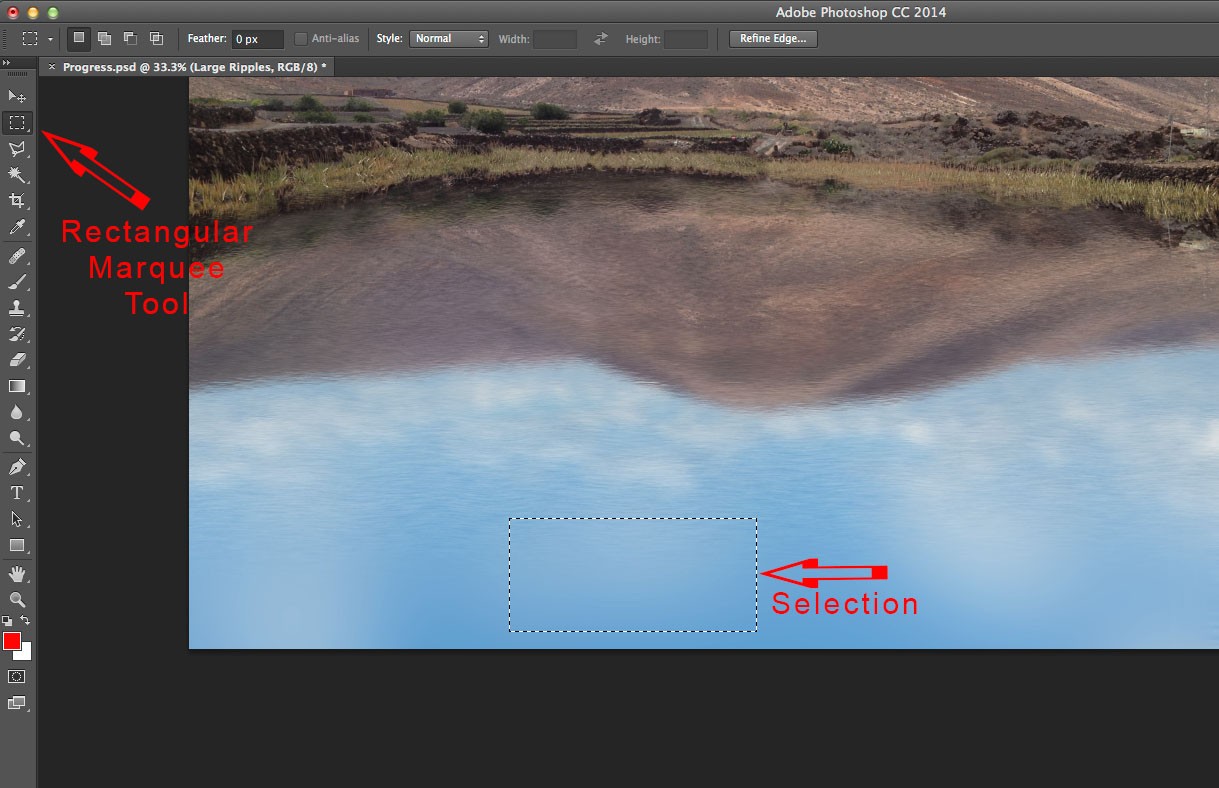
Selection.
Fill the selection with 50% grey as before (Edit>Fill>50% Grey) and apply the same amount of noise as before.
Press ⌘Cmd and T keys to enlarge the overlay area to fill the width of the image. This is how things should look now:
Noise Added & Enlarged
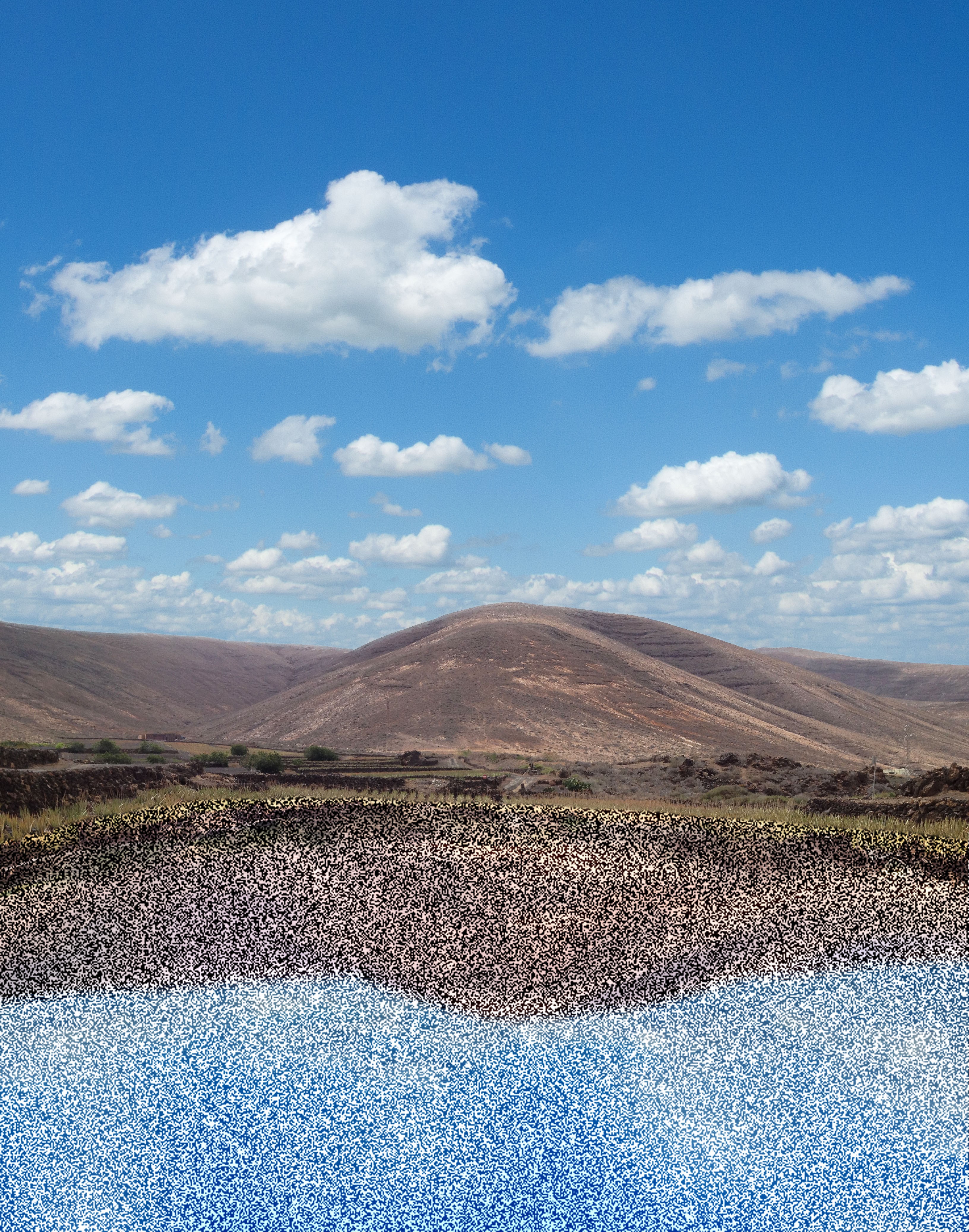
Add motion blur with angle at 0 again, but this time up the amount to about 130. After doing this increase the width of the layer using ⌘Cmd and T keys to hide the unwanted edges.
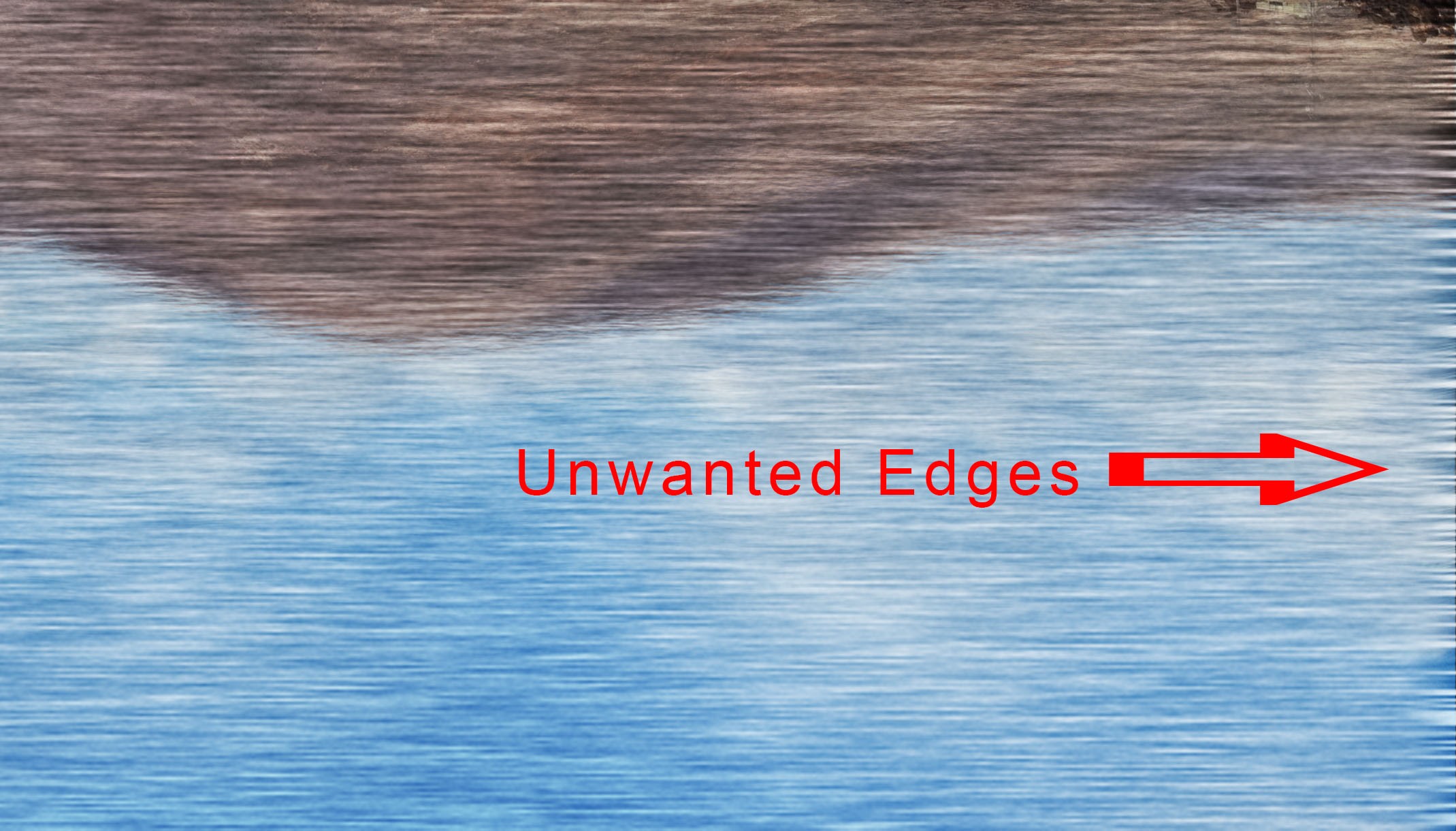
Increase width to hide unwanted edges.
Apply the wave filter with the same settings as before, lower the opacity to about 25% and use a layer mask to hide the unwanted areas and just leave the foreground area. If you use the linear graduation tool going from black to transparent you will get a pleasing result. Here’s an enlarged area showing the transition of size in the ripples:
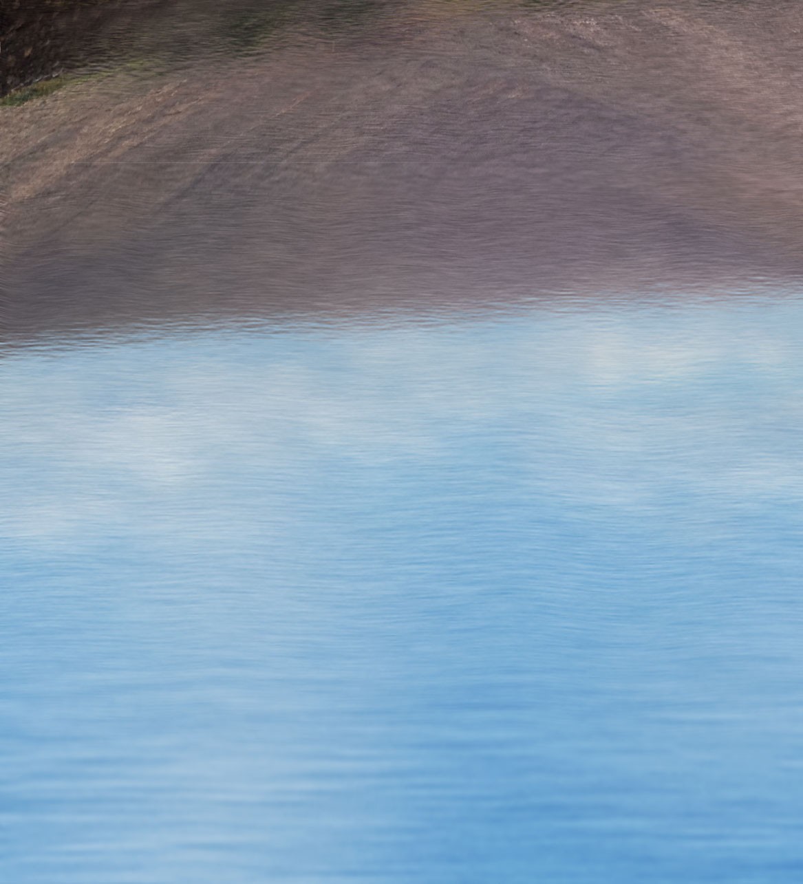
Transition of Ripple Size.
Finishing Touches
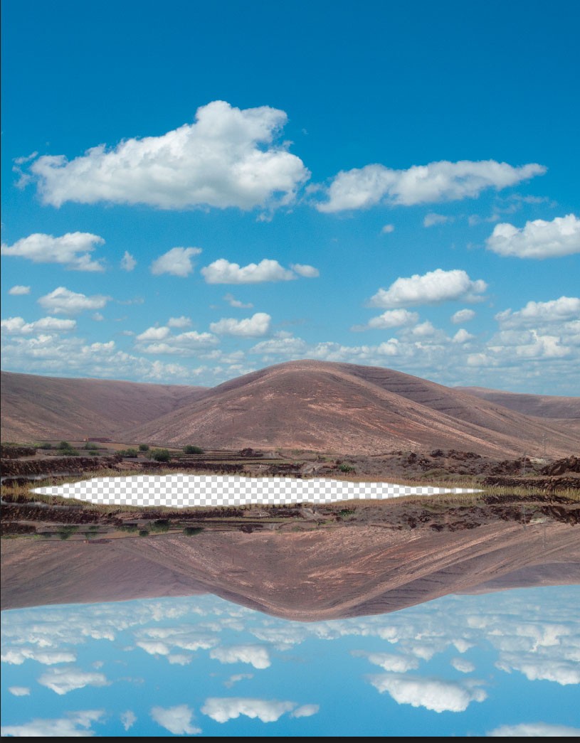
Where a lot of retouching of this kind falls short, is in the reflection of objects close to the water’s edge. Looking at the enlarged section below you can see that the reeds are not reflected in the water:
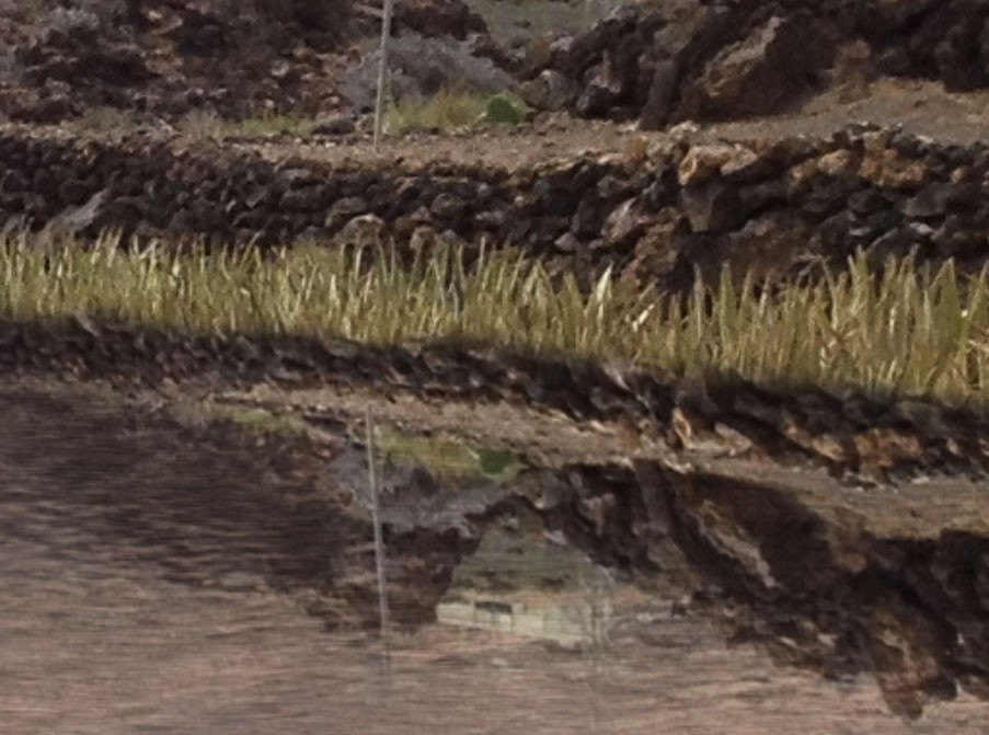
Reeds Not Reflected.
This can be sorted with the clone tool. To clone a mirror image you need to open the “Clone Source” pallet (Window>Clone Source). Click on the area shown to make a downwards mirror image:
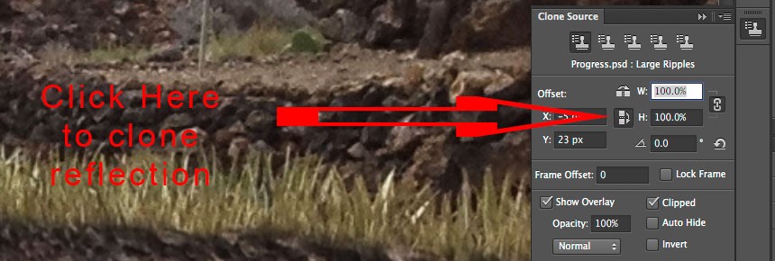
Clone a Reflection.
If you are on an older version of Photoshop you may not be able to do this. You can enter a height value of -100% instead. You will need to regularly re-select your cloning source to keep things lined up. Once you have finished refining the waters edge you can add a ripple effect using the glass/motion blur method or just leave a clean reflection. Either looks good.
Here’s how it looks with the reeds cloned:
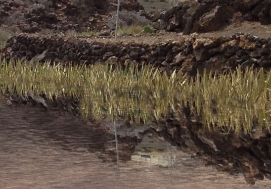
Reflected Reeds.
Here’s the finished image again with just a touch of colour enhancement. If you would like to see more detail click on the image to enlarge:
Finished Image
Photoshop a sky in ten minutes using blending options
Photoshop a sky in ten minutes using blending options
There are many ways of adding sky in Photoshop and that’s before getting anywhere near third party plugin software. Different methods are suitable for different images with the deciding factor usually coming down to time. Below I will explain one of the quickest methods I know of adding sky where complex shapes, such as trees, need to be dealt with. To Photoshop a sky in ten minutes is not unreasonable once you are used to the concepts here. I have often used this method when I have ten or twenty shots to retouch and only half a day to do them in.
A quick note before reading. If you have problems seeing details on any of these images click on the image to see an enlarged version.
Here are my before and after shots:
- Before
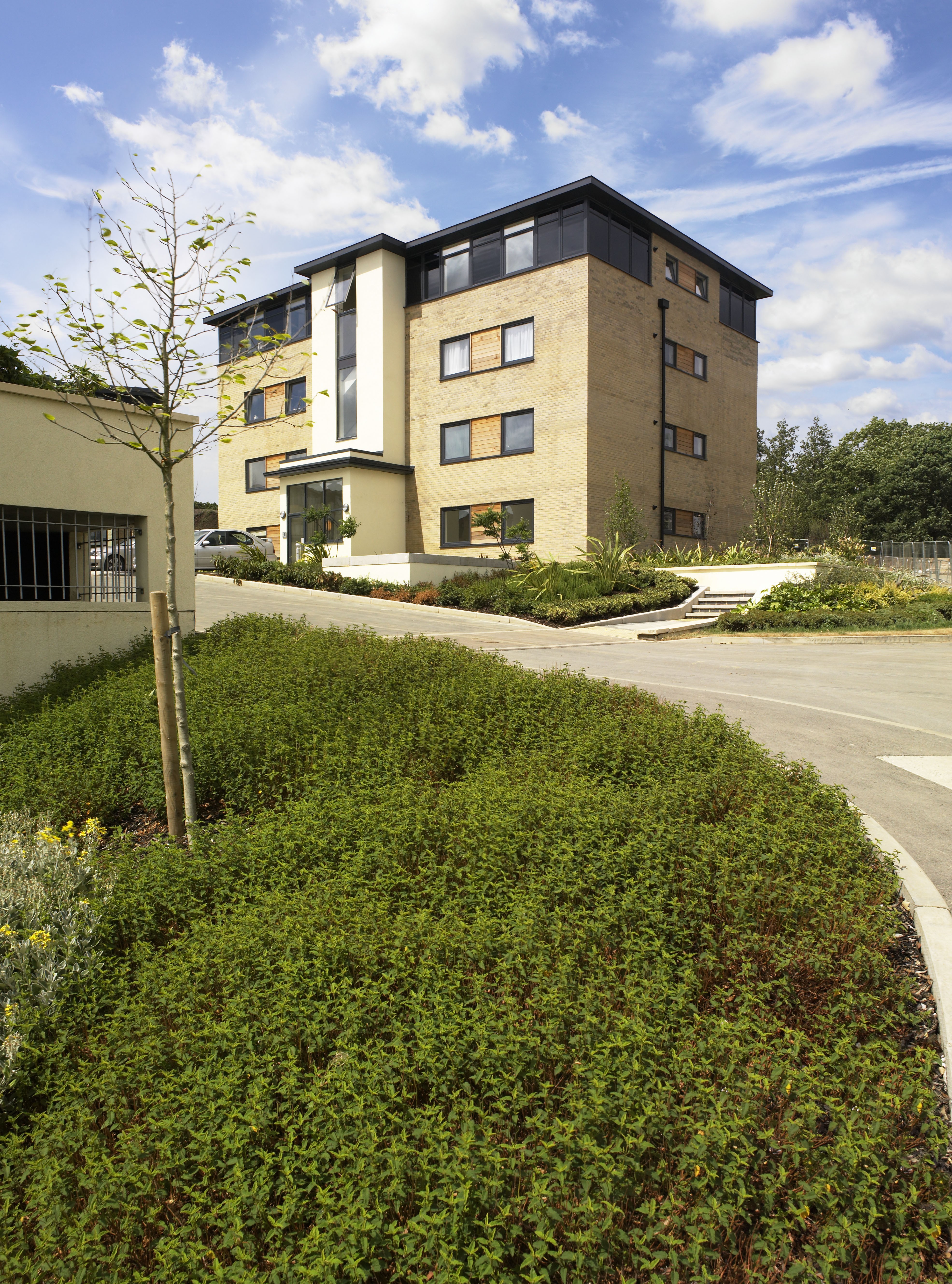
After
Analysing the image
Looking at the before image you can immediately see the foreground tree is going to be a problem. Depth of field means the tree is slightly out of focus with motion blur adding to the chaos. Putting in a new sky means you have to deal with these awkward edges. Here’s a close up of the area to show exactly what needs to be tackled:
Tree Detail
Adding the sky as a separate layer
Open the image to be retouched and the sky image in Photoshop. With the sky image visible copy and paste onto the background image. A quick way of doing this is to hold down the ⌘Cmd key and keep it down, then one at a time press the “A” key, the “C” key, the “W” key and finally the “V” key. These are Mac shortcuts.
Here’s what’s happening.
⌘Cmd A selects the whole image. You will see the dotted selection line around the edge.
⌘Cmd C copies the selection. i.e.the whole sky document.
⌘Cmd W closes the sky document.
⌘Cmd V pastes the sky as a separate layer onto the background layer.
Positioning the sky
Press and hold the ⌘Cmd key to temporarily access the move tool. Click and drag the sky to where it needs to be. Next resize the sky (⌘Cmd and “T” keys) pressing the return key when happy with the results. Here’s the sky in position;
Sky in position
Blending Options
You can use the blending options to hide the sky where there are darker areas on the underlying background layer. To do this double click on the sky layer in the layers pallet to open the Layer Style pallet, which has the blending options selected by default. Here’s how it looks before making any adjustments;
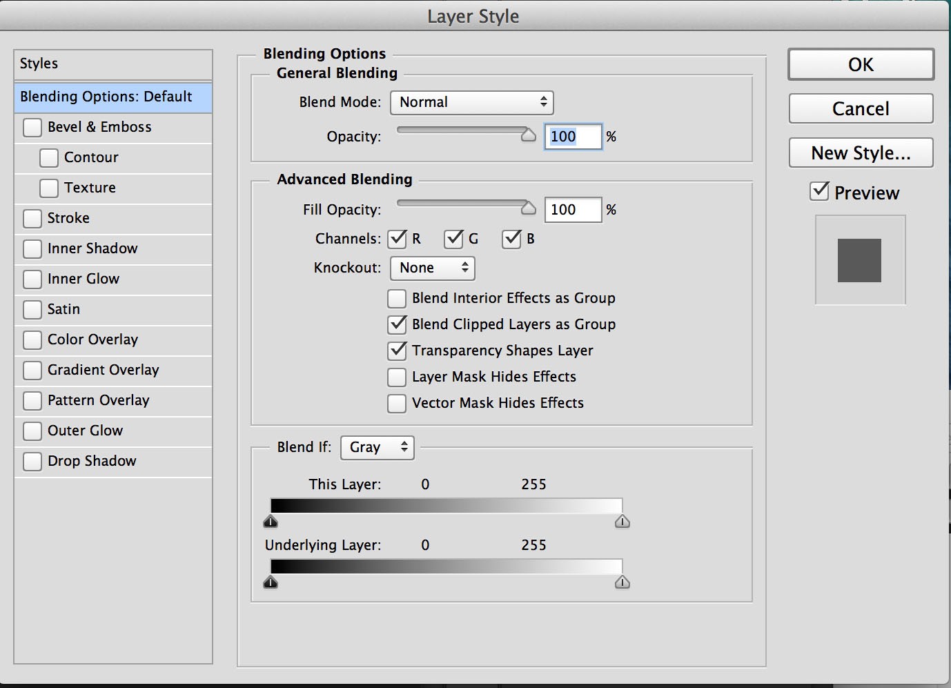
Layer Style Pallet
You need to slide in the bottom left hand slider to the right until the majority of the building and trees are revealed, but stop before the sky from the background layer starts to show through. Then press the ⌥Alt key to split the slider into two halves and drag one half away from the other. This creates a gradual transition between light and dark areas. If you zoom in on the fine tree details while doing this you will be able to see what has the most pleasing results.
Here’s how the adjustments look in the pallet:
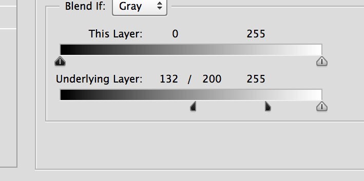
Blending Options Adjustments.
And here’s how the image looks with these adjustments:
Effects Of Blending Options on image.
As you can see the sky still shows through on the lighter parts of the building. You need to use a layer mask to hide these parts. With the sky layer selected in the layers pallet click on the area shown:
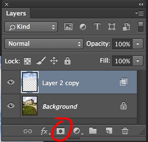
Applying a Layer Mask
You will now see a layer mask on the sky layer as shown:
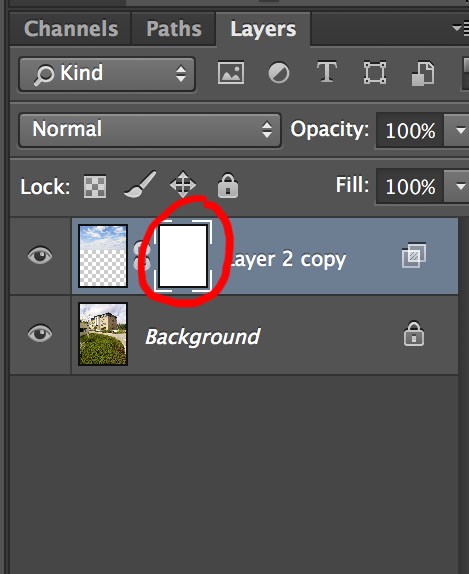
Layer Mask.
Notice the layer mask has a border around it which is white in the corners. This shows it is the layer mask that is selected and not the layer itself. Painting black on the layer mask will hide the sky and painting white will reveal. You will notice that the layer mask just shows white at the moment meaning all the sky is revealed. (Ignoring the effects of blending options for the moment) You could paint black with a brush, but this will take a long time. A much better option is to make a selection and fill that selection with black. Here’s where it is a huge advantage mixing blending options and a layer mask. You only have to select accurately in a few areas. Here’s an image showing my selection made using the polygon lasso. The area circled in red is where you need to be accurate with the selection. The rest can be done more quickly and doesn’t need to go to the roofline of the building as this is already hidden with the blending options.
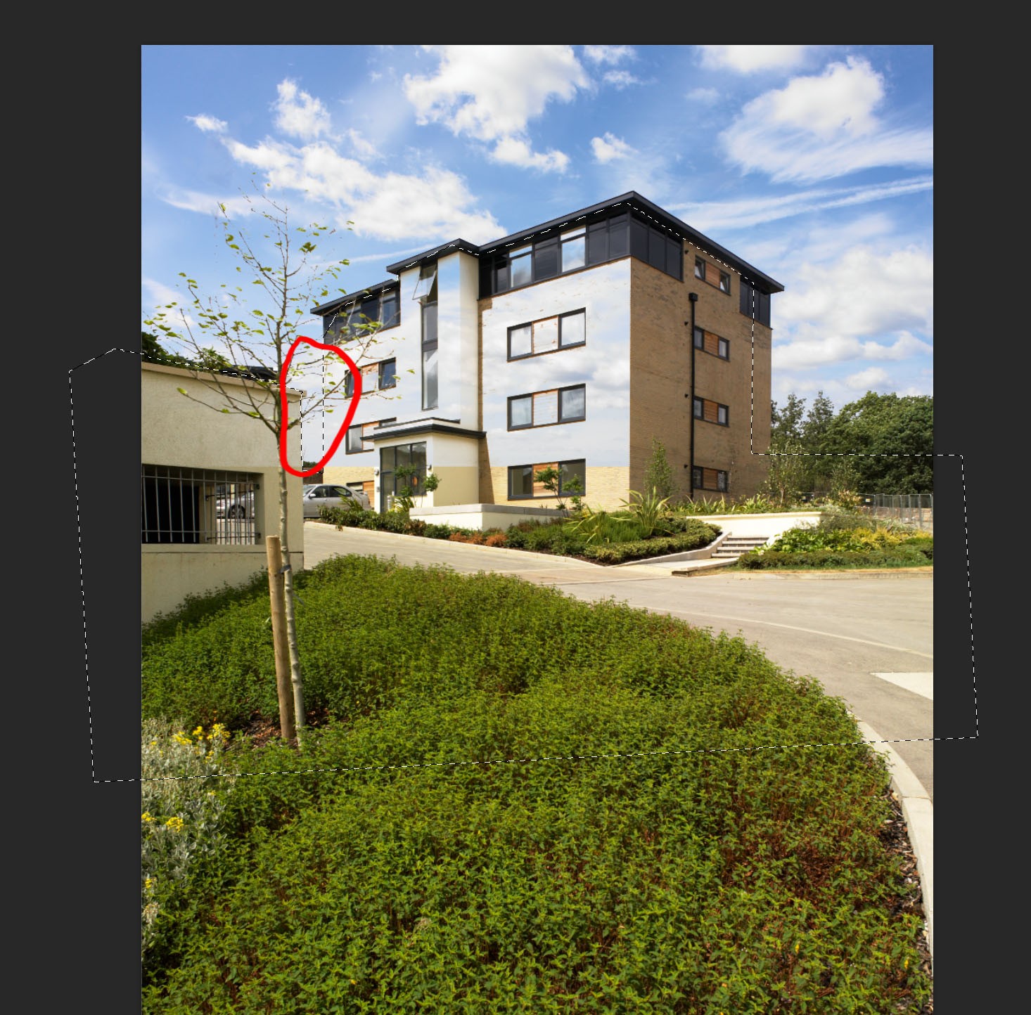
Selection
This may be hard to see so for illustrative purposes only here’s the selection shown in quick mask mode. The red areas show parts of the image not selected:
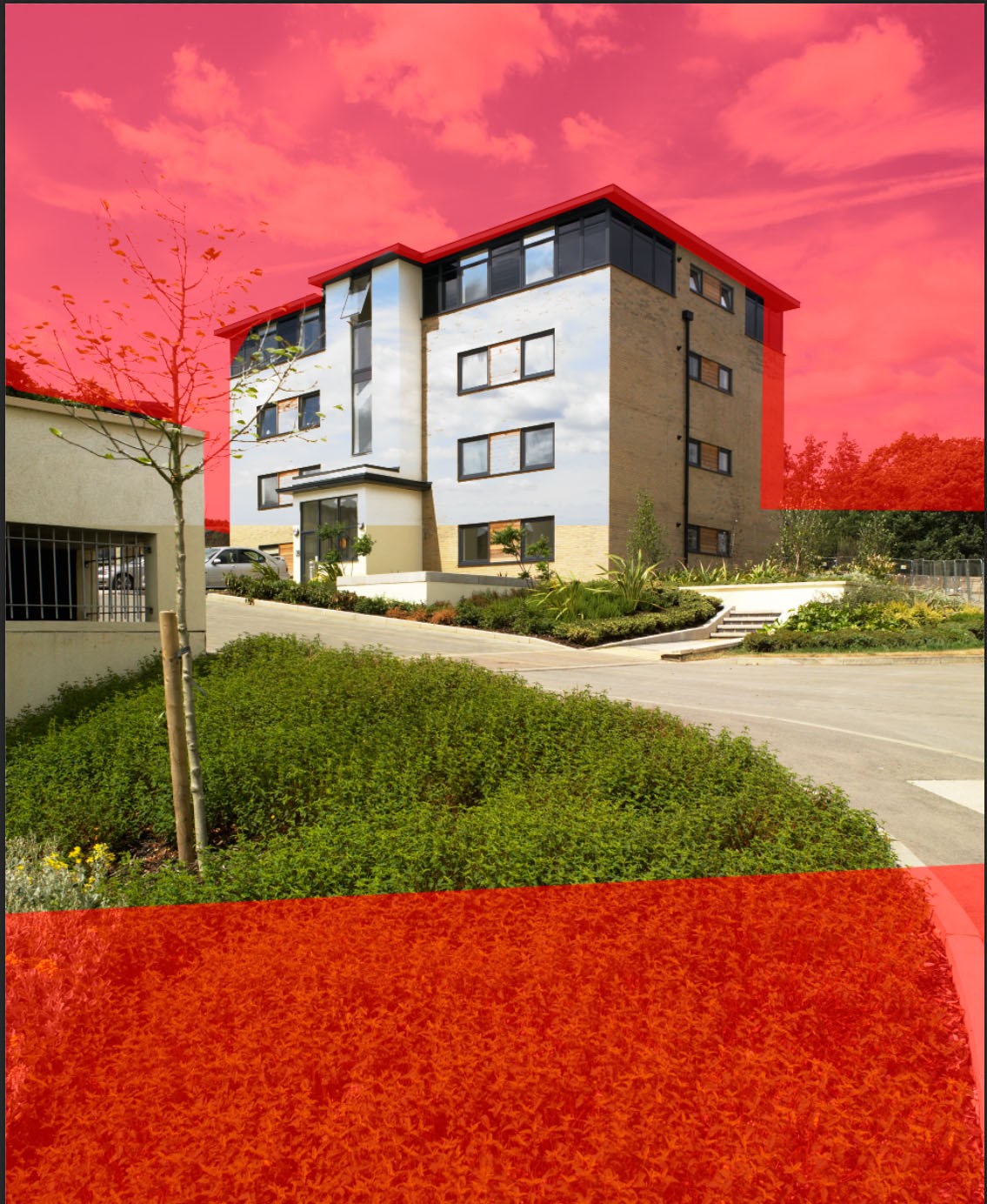
Selection shown in Quick Mask Mode.
Notice how the selection doesn’t need to go to the bottom of the image as there is no sky to hide here. Also where the darker parts of the building meet the sky you don’t need to follow the building edge, but can just select somewhere within the dark area.
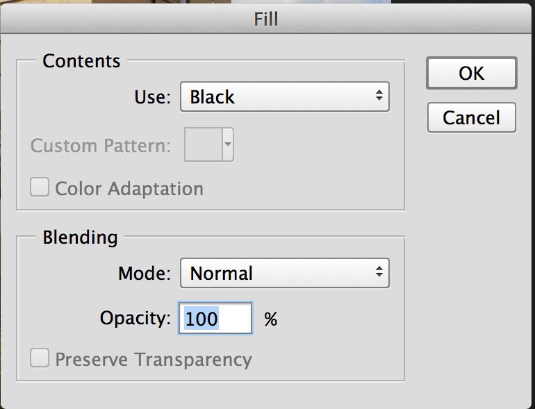
With the selection active (not in quick mask mode) go to Edit>Fill and select “Black” from the drop down menu as shown. Make sure you have the Layer Mask selected in the layers pallet, otherwise you will be painting black onto the actual image.
Photoshop’s fill option
Here’s how the image looks now:
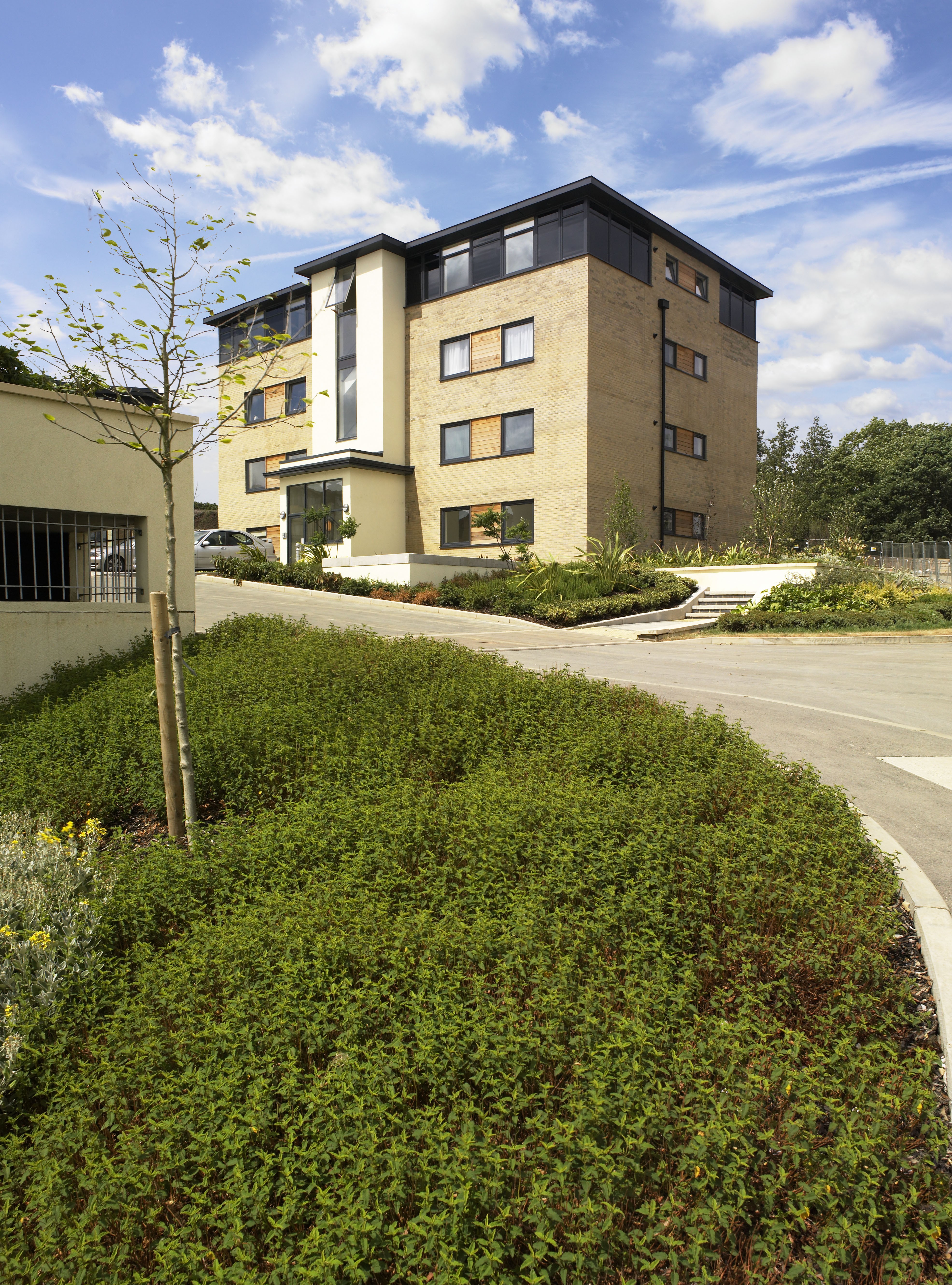
Almost there.
There’s just a bit of tidying up to do now. Taking a closer look at the tree branches there’s a bit of a halo effect:
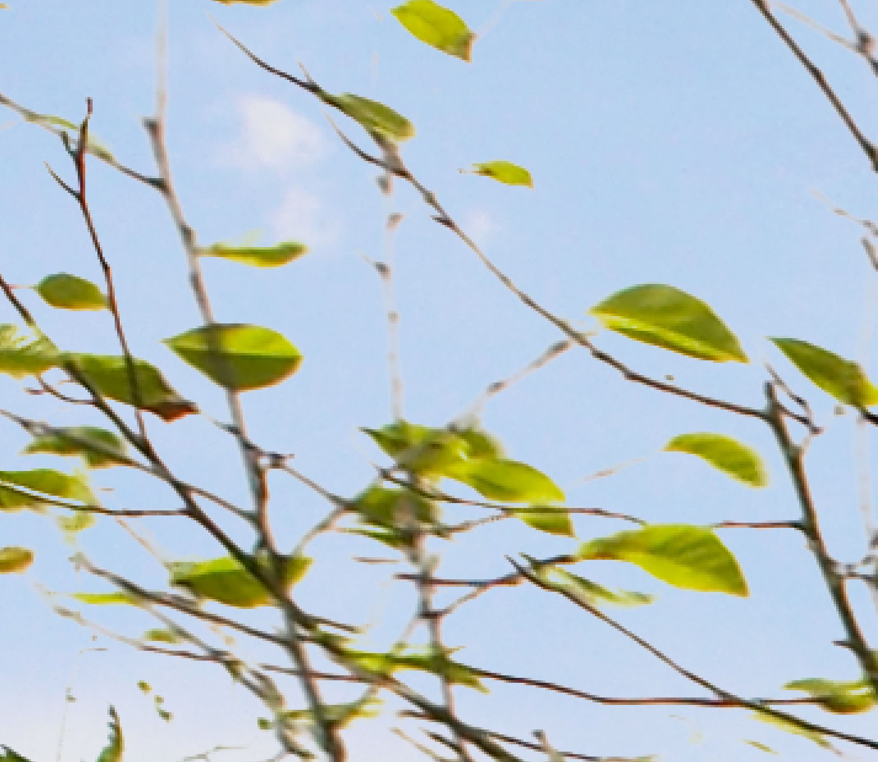
Blending Options effect on blurred edges.
This may be ok for some people, but it is quite simple to get a more natural look.
Make sure the layer mask is selected on your sky layer. Press the “G” key to select the gradient tool. select the radial gradient going from black to transparent as shown;
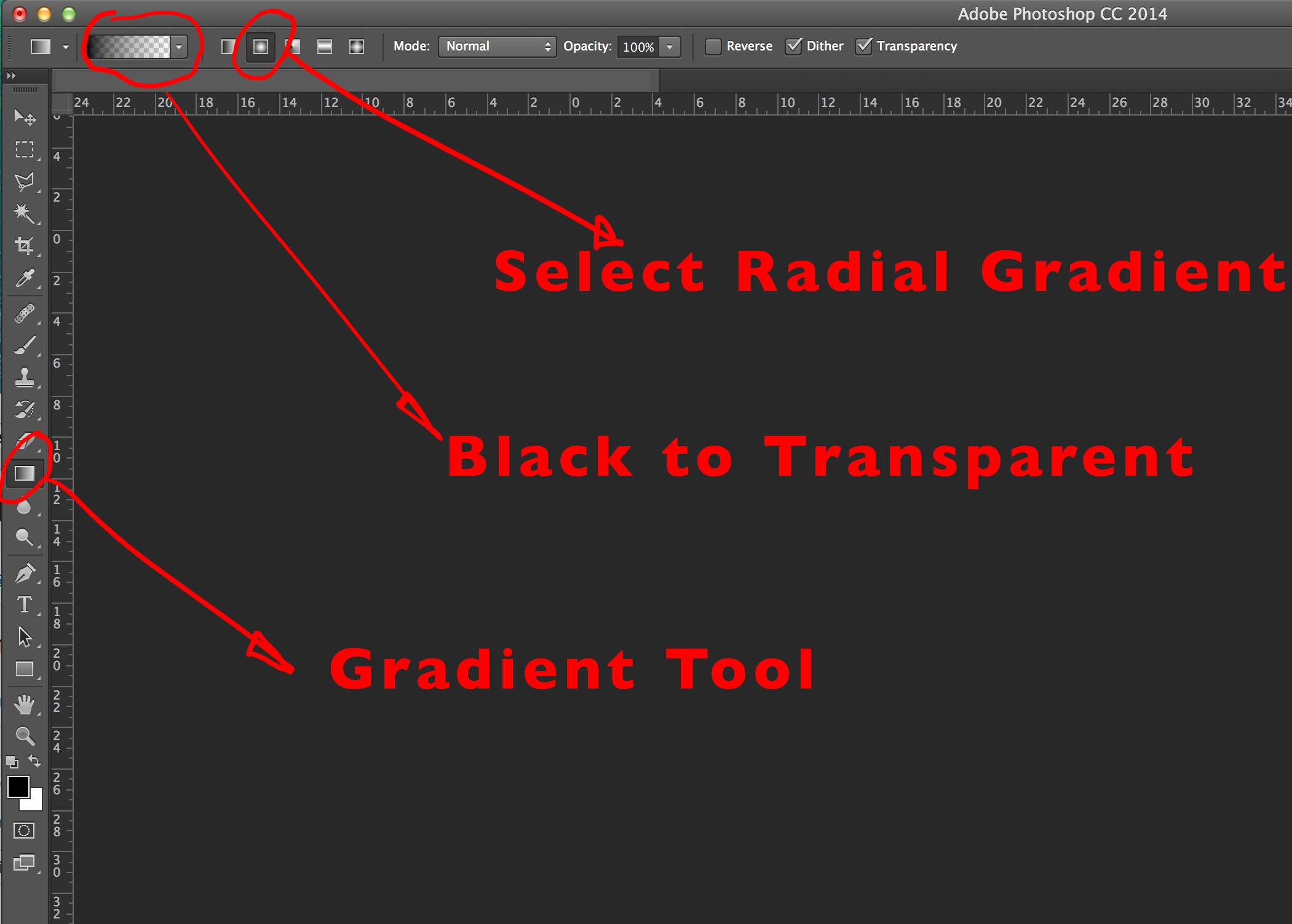
Photoshops Gradient Options
Click and drag from the centre of the tree branches to a small way outside the tree as shown by the red arrow. The direction you drag in is not important, but the distance certainly is.
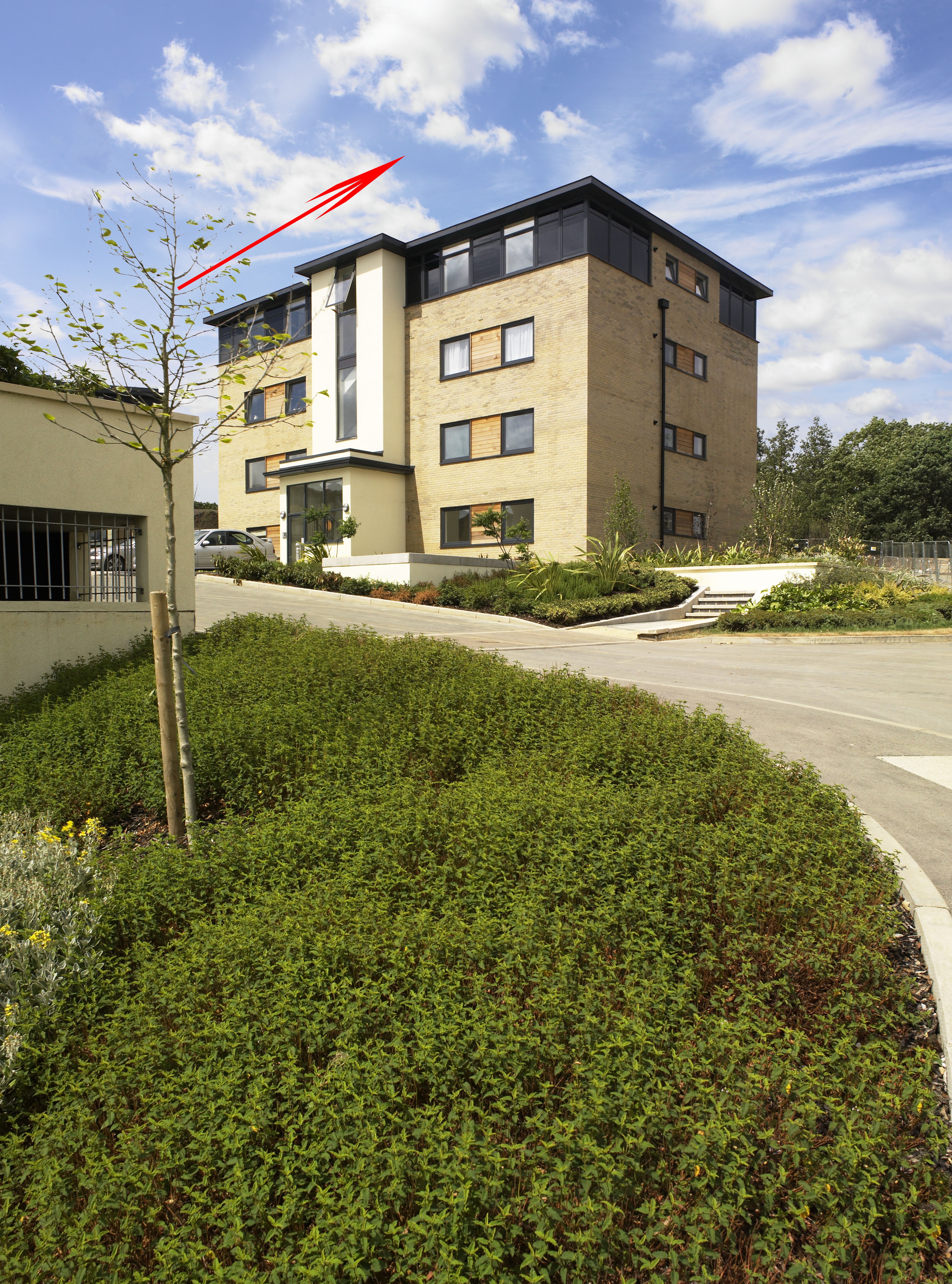
Click and drag gradient
Here’s your final result with a close up showing how the blurred branches look:

Final result
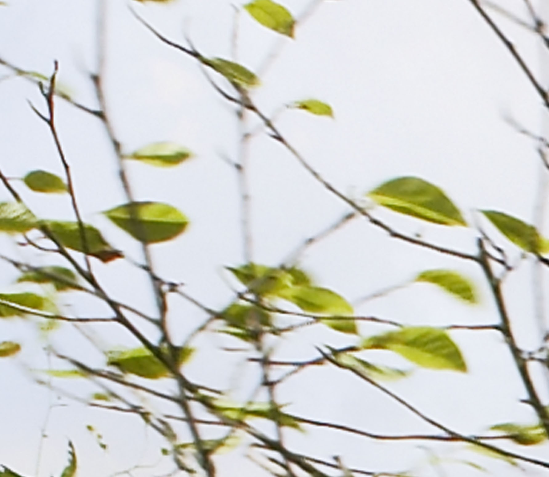
Tree detail after using Gradient tool.
What we have created here is the effect a highlight area in the sky. We are showing the background layer and so seeing the blurred branches as they naturally are. If the light patch is too harsh you can also get a good effect by lowering the opacity of the gradient tool. This is a very simple idea and may feel like cheating, but I prefer the more natural look achieved.
Here’s and image showing the layer mask with hidden sky areas shown in red:
Hidden areas shown in red.
A good point to keep in mind is if you need to fade out a sky to reveal the background layer try to position a highlight patch or white cloud from the sky you’re adding over the relevant area.
This has taken longer to explain than to do, but once you are used to working with these ideas ten minutes is not an unreasonable time to add sky to an image like this.
Of course some images are more problematic. I use OnOne’s masking software a lot which makes very short work of some images. Other images are a lot simpler and a sky can be added using only Photoshops blending blending options in seconds.
In general Photoshop has some great functions for achieving lots of results. If you cannot achieve what you want using one method don’t feel you have to be limited. Quite often using a combination of methods works very well. In this case blending options and layer mask have been used in conjunction with each other.
I hope you have learned a lot from this post. If there are any points you are not clear on please feel free to post any questions.
Creating a Black and white Landscape from a Smart Phone Original
Creating a black and white Landscape from smart phone originals
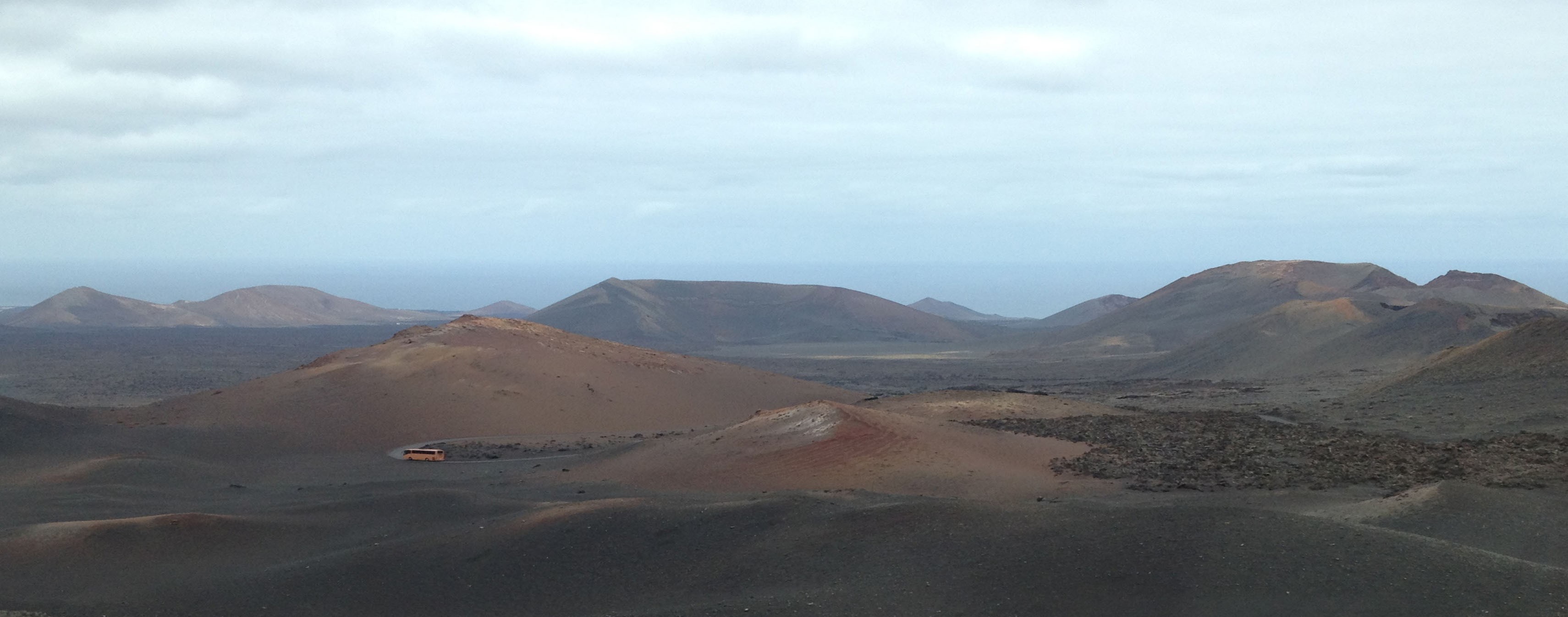
This blog was originally meant to be about how to make good black and white conversions in Photoshop. I’m not a professional photographer, so my first task was to find a useable, professional quality image that I had permission to use and that would look good in black and white. After trawling through several options there was nothing that really grabbed me.
I resorted to recent holiday shots I took on an iPhone and found an interesting shot of Lanzarote taken through the coach window. I am more used to working with images taken on medium and large format backs at very high resolution and so was not expecting any great results.
After playing a while with the image I decided to pull in a more interesting sky shot by the missus on her Samsung Galaxy S3. She’s got this thing about shooting into the sun and I decided to use this strong light source to create some more interest in the shading of the picture. I love to work in this way with Photoshop. It allows a gradual build up layers, creating highlights and shadows to add a bit more drama. It’s also great fun!
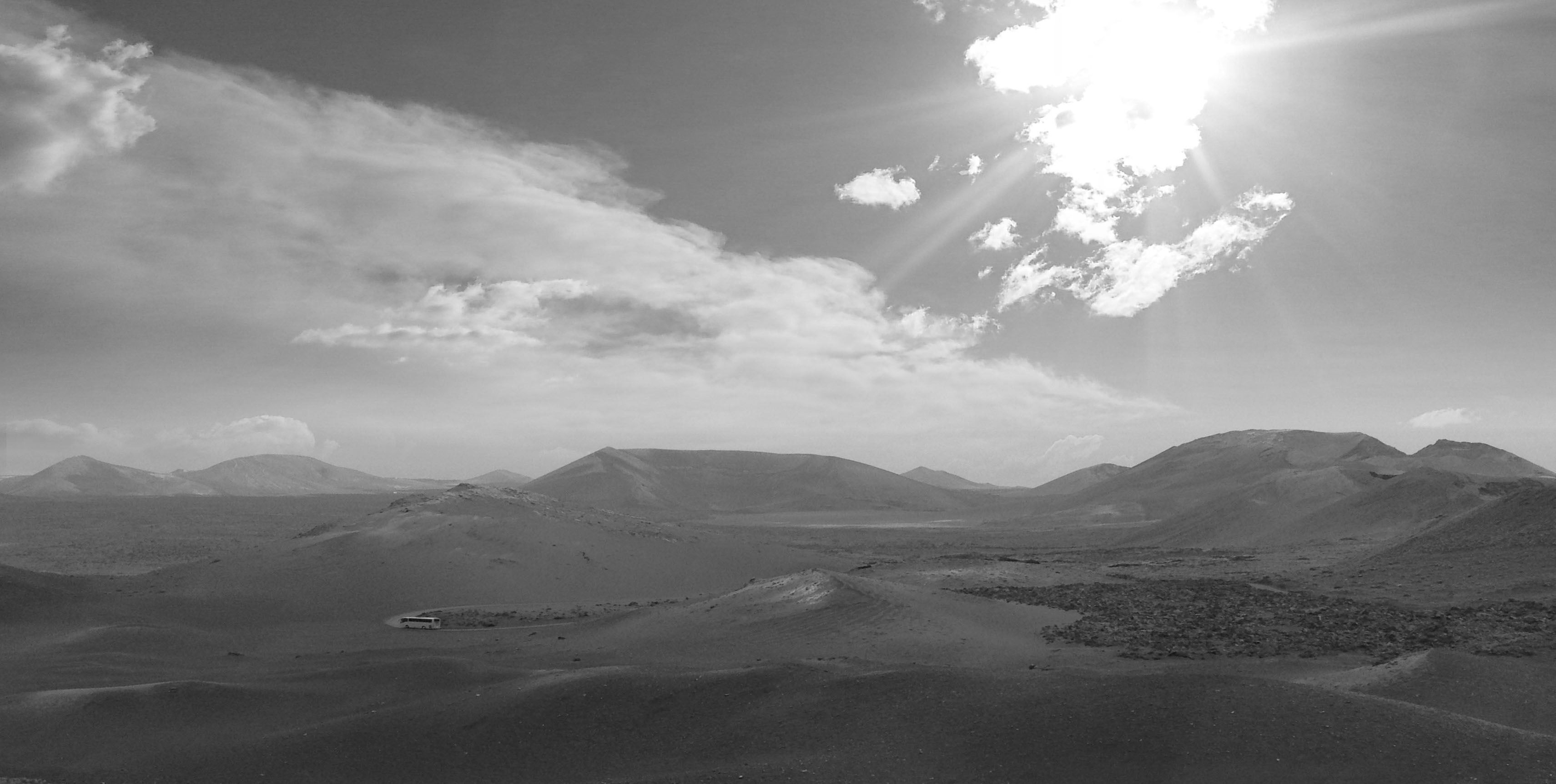
Here’s the final result.
Final Image
So I will briefly discuss how I make black and white conversions and my thought process when doing so. I will also discuss the various ideas and techniques I use in shading the image. These will be more in the form of general guidelines as a more detailed descriptions would be like a painter explaining each individual brush stroke.
I hope you get some useful ideas from this blog and have as much fun as I did in creating this image.
The Process
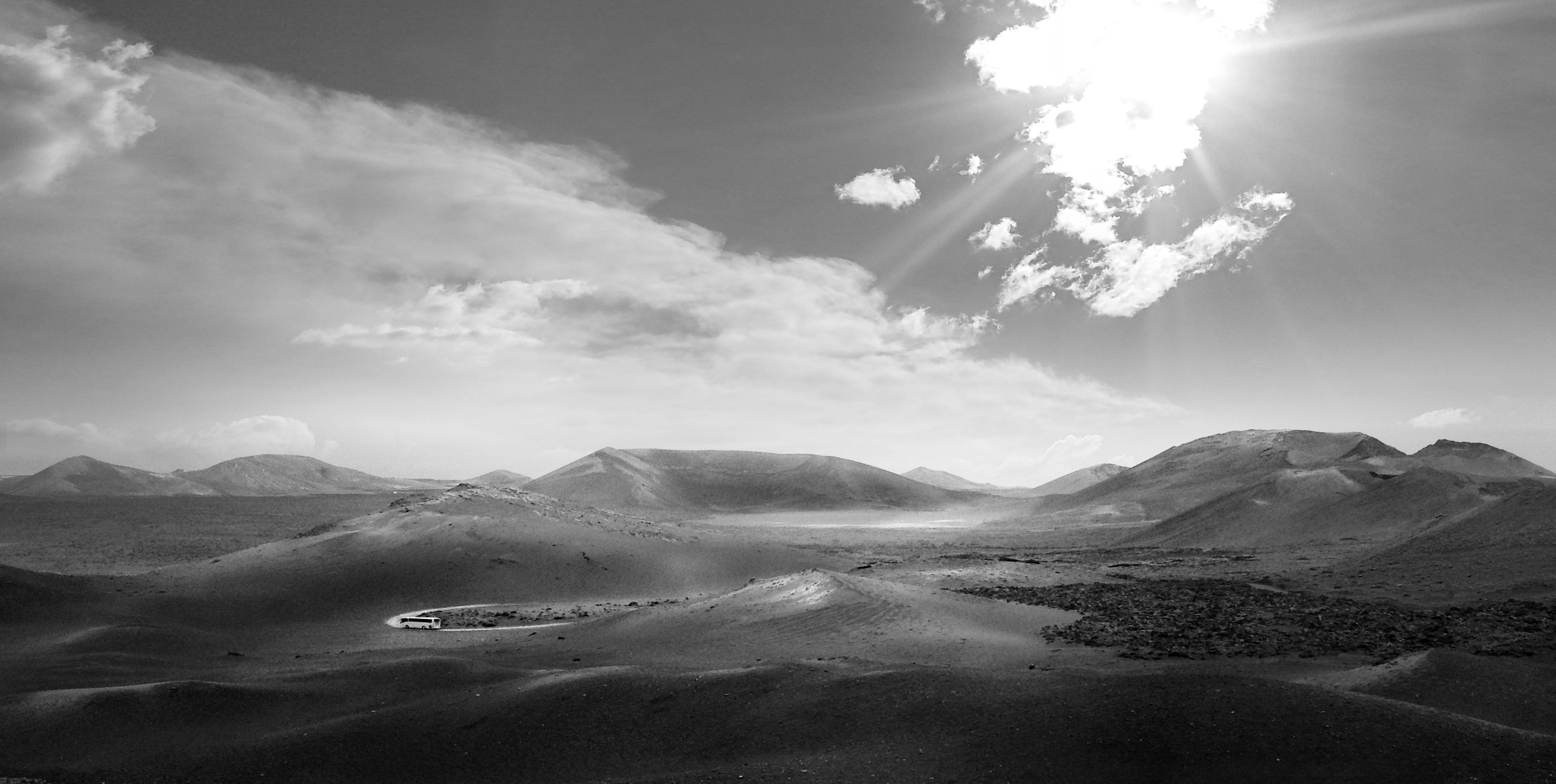
Here’s my starting image.
Original image from iPhone
The first step is to get a useable black and white conversion. I have used an adjustment layer to achieve this, deliberately going for a flat look as I want to add my own shadows and highlights. Here’s the setting I used in the black and white options.
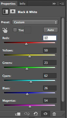
Black and White settings
The list of colours represents the colours from the original image. The numbers and sliders show how light or dark that colour will be in the conversion. For example to convert the reds into a light grey the red slider needs to be moved to the right, and to the left to convert to a darker grey. this is the same idea as using colour filters when shooting on black and white film.
Here’s how the image looks with the adjustments shown.
Basic black and white conversion.
There’s not a huge range of colours in this image, so getting contrast via a black and white conversion is a bit tricky. Taking yellow areas lighter in the conversion and red areas darker was one option, but I chose to be a bit more creative and manually paint in shadows and highlights, giving me a lot more flexibility and I believe giving a better end result.
First to bring in a more definite light source. Here’s the sky image I’m going to put in showing the black and white conversion.
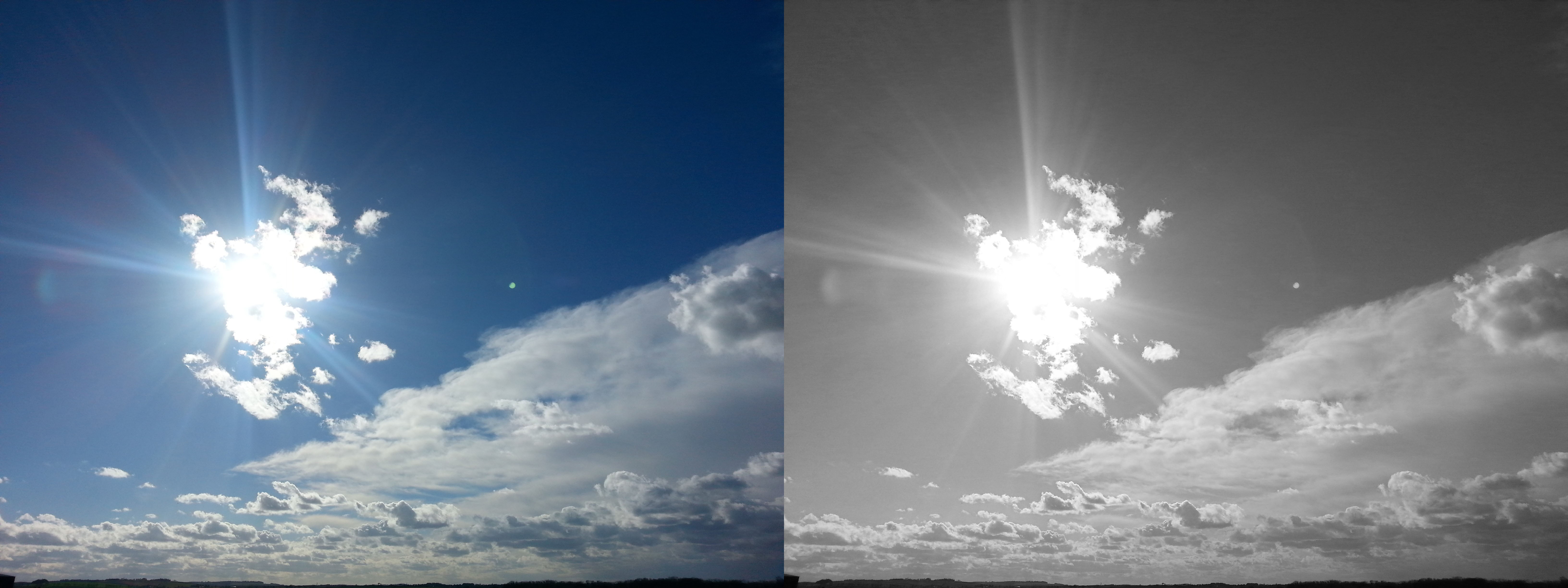
Black and white conversion of sky.
I have made a selection of the sky on the original image using the magic wand tool, brought in the new sky, applied a mask and flipped the sky on the horizontal axis. You need to unlink the sky from the mask to avoid flipping the mask too.
here’s the composite image now.
Black and White Composite.
Next I will add light and shade using two types of adjustment layer, Curves and levels. In addition to this I will use a dodge and burn layer. This is done by creating a new layer in the layers pallet. The shortcut for this is Shift, ⌘ Cmd and N keys if you’re on a Mac. Fill the layer completely with 50% grey and change it’s blending mode to “Overlay”. Painting black on this layer will make the image darker and white will make it lighter. I set my brush opacity to a maximum of 10%, otherwise the effect will be too harsh.
When making these adjustments I keep several things in mind.
Firstly the direction of the light from top right hand side to bottom left.
Secondly picking out and defining certain areas such as the curved road, individual sand dunes and a stronger horizon.
Lastly, more general shading over larger areas of the picture. In general the blacks get stronger as they get closer to the foreground and I have used a curves layer to darken the edges of the image making the more central light areas pop out more.
Here’s the Layers pallet showing all the layers used in this image. I tend to use a lot of layers when gradually shading areas, as it is very easy to backtrack and experiment with ideas. If any new ideas are not working you can just trash the relevant layer.
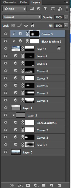
Layers Pallet
It is worth noting I have kept all layers here, including the original black and white conversion layers, keeping the whole image editable at all times.
For a direct comparison here’s side by side images showing different stages.
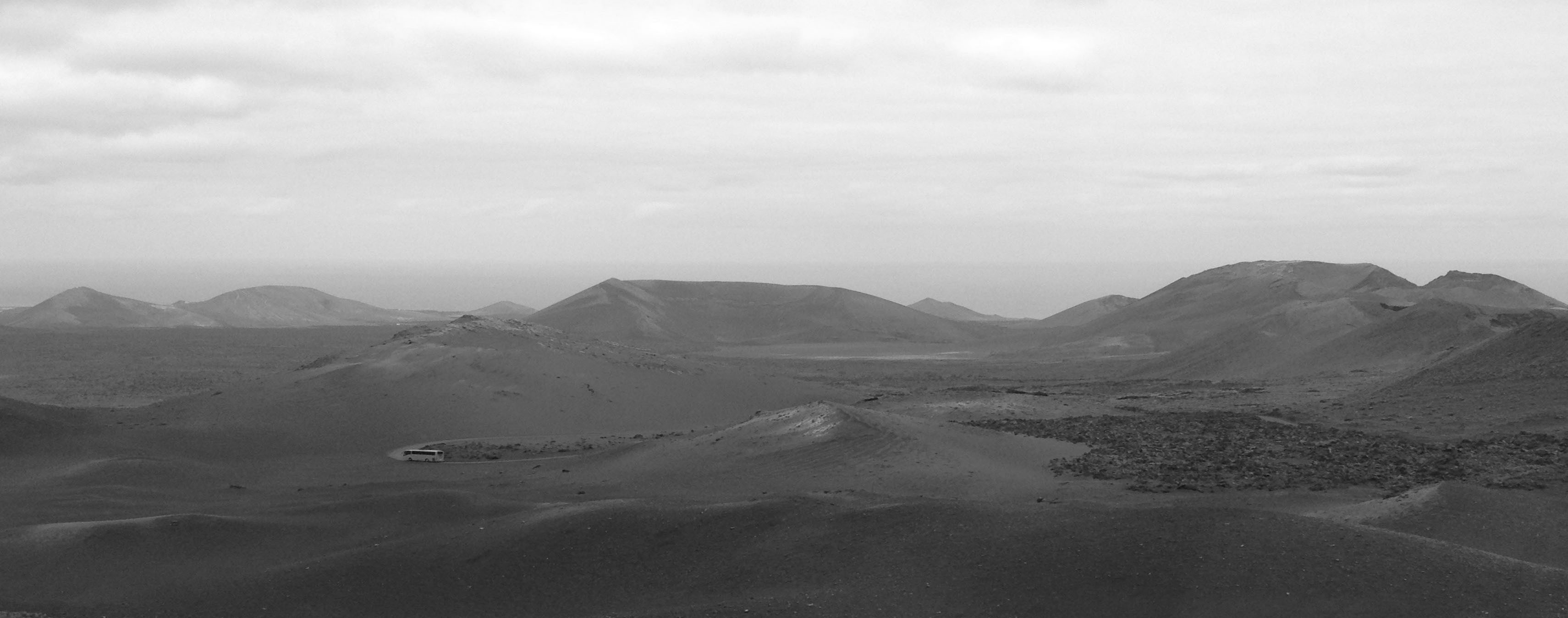
Original image from iPhone
Black and White Composite.
Final Image
Making Photoshop Composites more believable.
Making Photoshop Composites more believable
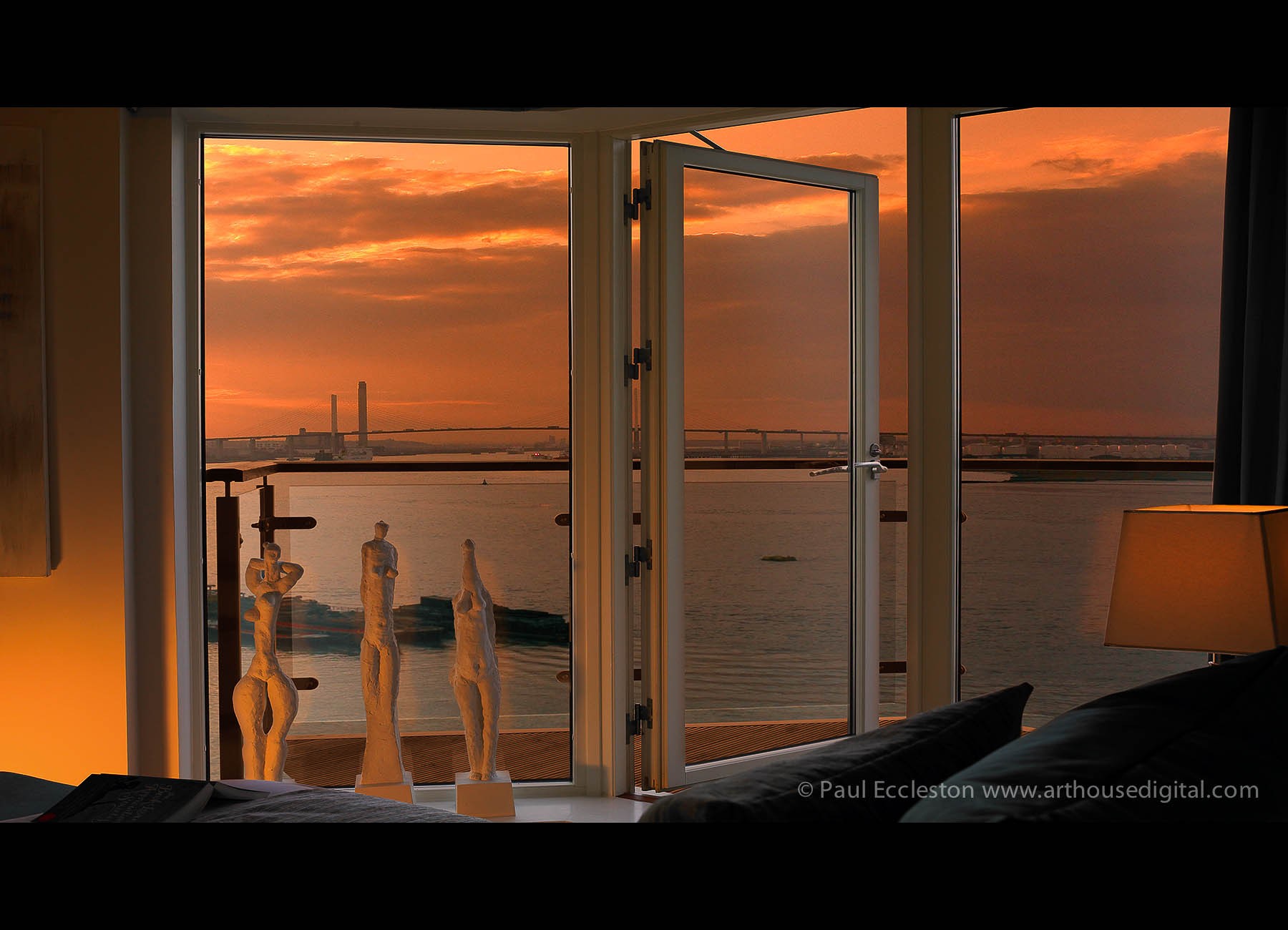
This blog is not meant as a step by step tutorial, but more of a guide for those who have a good understanding of Photoshop and need some ideas on how to make their Photoshop composites more believable. Below are before and after shots showing the retouching I’ll be discussing (figs.01 & 02). These shots are used with kind permission of Paul Eccleston at Arthouse Advertising Photography.
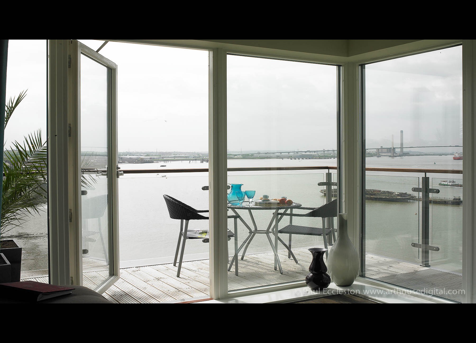
Before Retouching (fig.01)
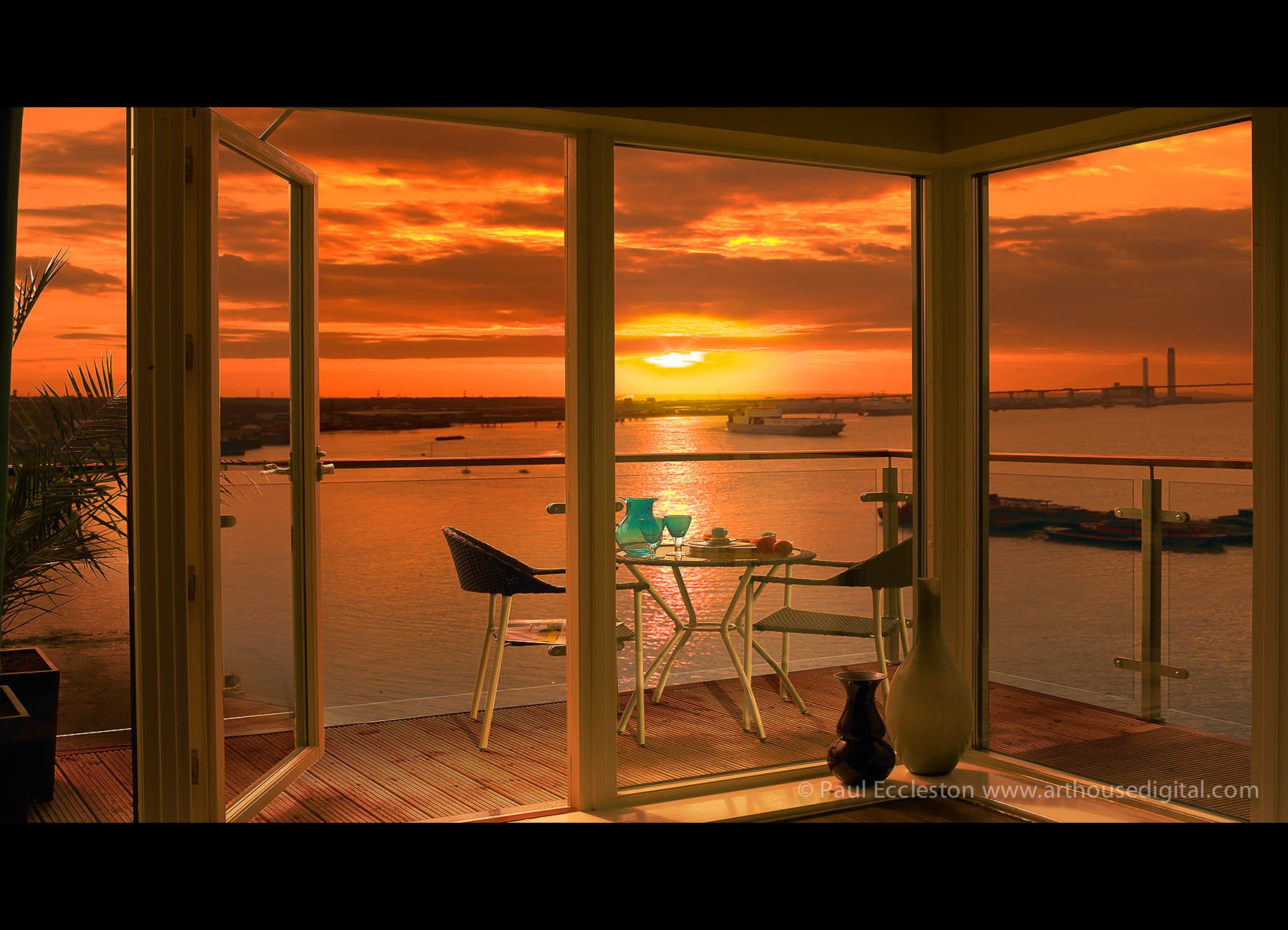
After Retouching (fig.02)
A Brief Overview of what’s been done
The sunset view was shot on a different day before the apartment was even built. I have added this view and then changed light and colour values of the original interior shot to match. These are the basics, but in addition to this I always look for as many ways as possible in which the two images can interact with each other. This is what will make the difference between a Photoshop composite looking believable or not. Sometimes small details added are barely noticeable in the final image, but would stand out like a sore thumb if left out.
Starting Point
As the colour needs to have some large alterations I have gone back and reprocessed the original RAW file. I could have alternatively made adjustments in Photoshop if there was no RAW file available. I would always recommend using adjustment layers, especially in a case like this, as it is likely I will need to go back and make alterations. A huge amount of warming up is obviously needed, but in addition to this I have added saturation, taken the exposure down and increased the contrast using curves i.e. making an “S” shape to the curve.
The Tedious Bits
First I use the pen tool to draw around the window frame. This can be a bit time consuming, especially if you’re as fussy as me, but it’s well worth doing as it will make life easier later on. In addition to this I will make a selection from the path, apply a small amount of feathering, make any adjustments in quick mask mode and save the selection which will be in the channels pallet.
Bringing in the view
The sunset view can be brought in on a layer above the original image and a layer mask applied to hide the unwanted areas using the selection made earlier. Positioning of the horizon is very important here. This example is simple as I have been able to match to the original horizon. If it is not obvious where the horizon line is you can use perspective lines to locate it as in fig.04.
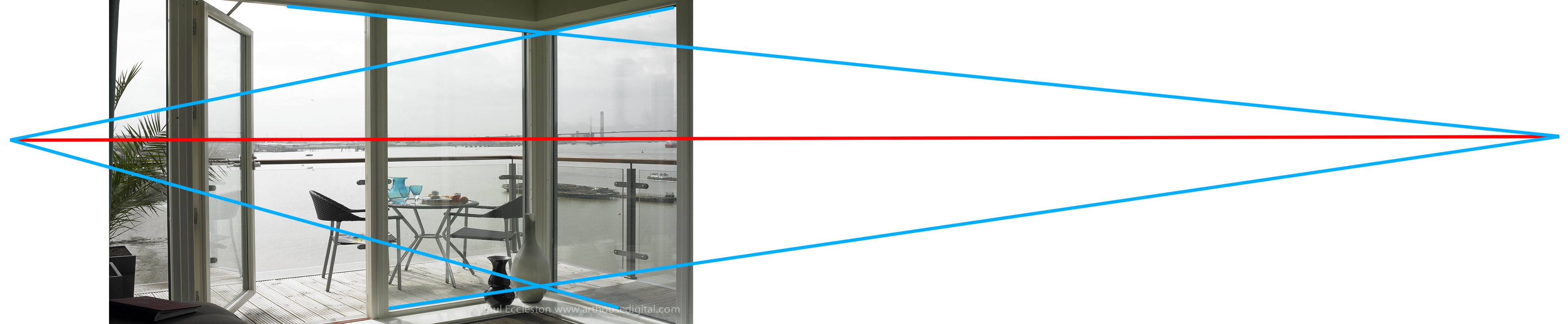
Fig.04
Also important is scale of the sunset image. Again I use the original as a guide. I have shifted the sunset view to the right a little so the sun is not blocked by the door frame.
I have also applied a very small amount of blur to the view to allow for depth of field. I prefer to use Lens Blur. It’s slower to work with, but gives a much cleaner, photorealistic result. Without this subtle change the view would look unrealistic and too sharp.
Blending of images
At this point we can look at the composite and see the two images are not really working yet (fig.05)
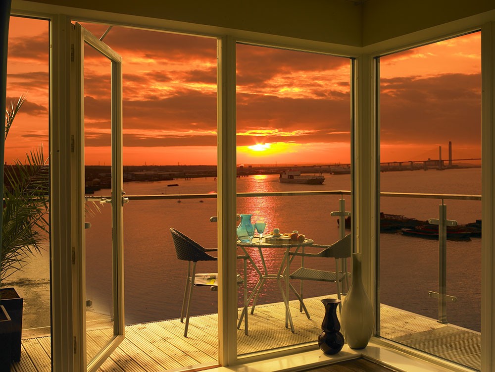
Fig.05
The interior is looking very yellow compared to the red sunset. It is quick to reprocess the image: lay over the top of the original background layer and re-apply the mask from my saved selection. I could alternatively make alterations in Photoshop to any existing adjustment layers or add new ones if needed.
Also the sun on the original image was at a higher angle making the deck too bright and, to a smaller degree, the beach area on the left hand side. These should be darkened down on separate layers. You can use one or more of several options from an adjustment layer (Levels, Brightness/Contrast, Curves or Hugh/Saturation) to painting on black at a very low opacity or using a non destructive Dodge/Burn layer. To get the colour strength and contrast levels right I actually used a combination of all of these in this example.
Here’s how the image is looking now (fig.06)
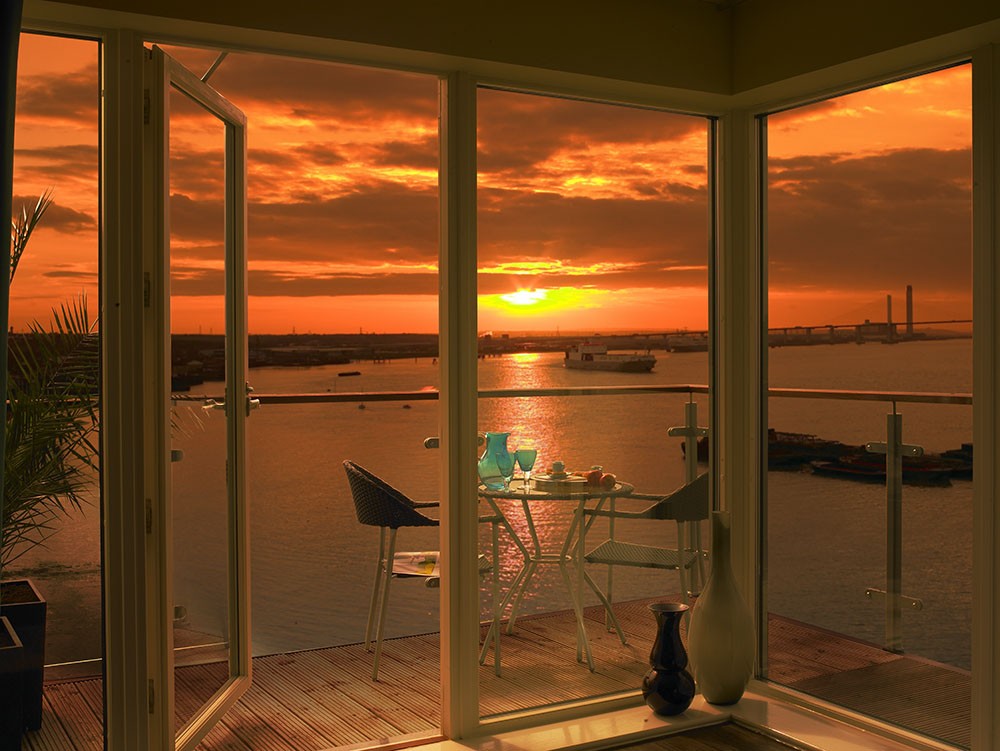
Fig.06
The all important final touches
So what’s still wrong with this Photoshop composite?
Firstly, the colour graduation around the sun needs tidying up. I have done this using colorize in a Hugh Saturation adjustment layer and masking out as necessary.
Secondly, I need to add glass to the windows and around the balcony. The four windows have had low opacity white painted on a separate layer. In addition I have overlaid low opacity grey to the open door and right hand window, which are at an angle. The balcony glass is tinted so I have added a low opacity grey using the original image to get an accurate shape to the panes of glass. The edging of the glass is very important here. A white line is needed where light reflects off the bottom of the glass and a darker line where the sides and top are visible (fig.07)
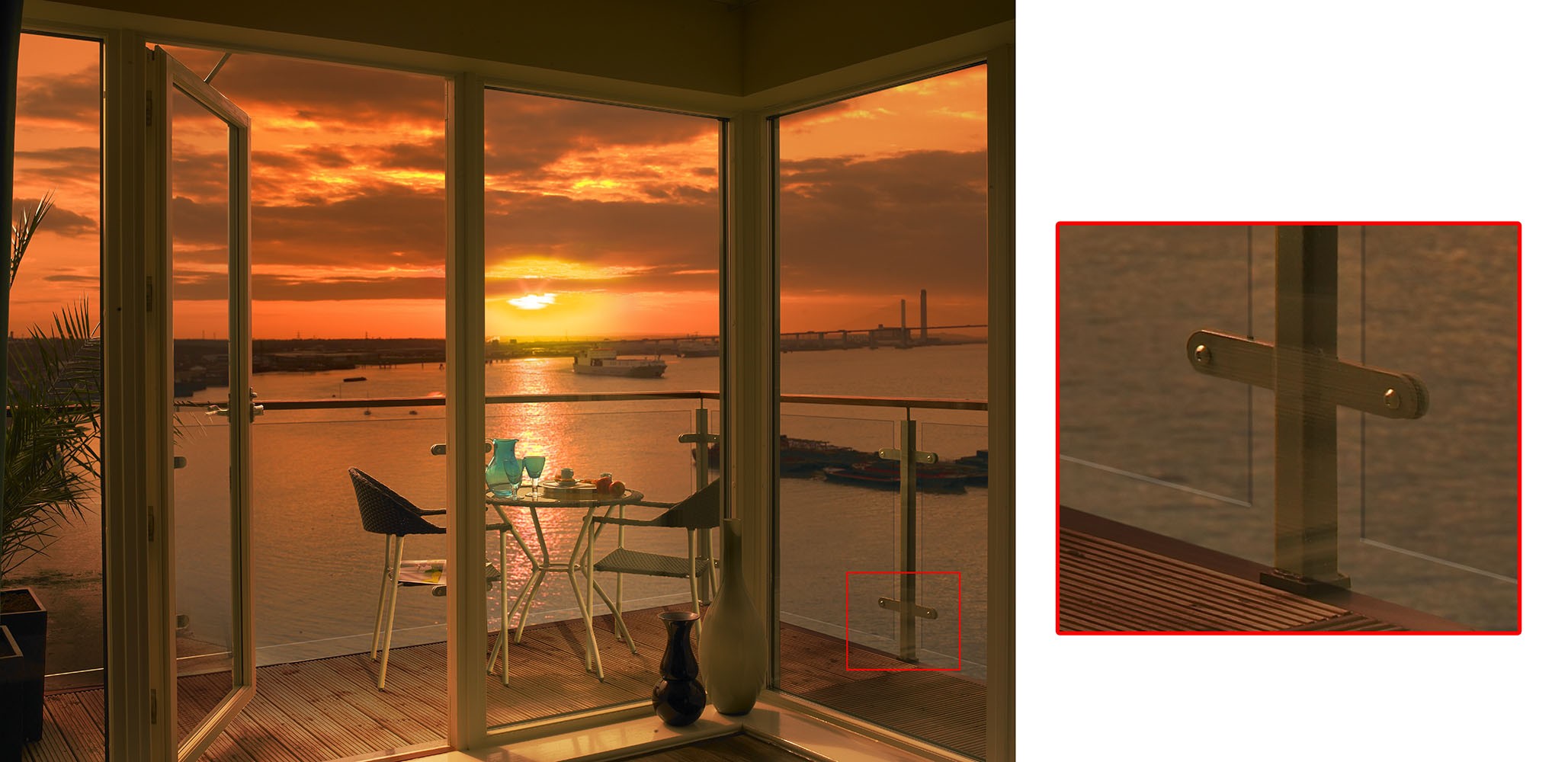
Fig.07
Thirdly, I have deliberately left a certain amount of light on the decking as the balcony is an important part of the shot and I don’t want it to be silhouetted. I have imagined this light has come from inside, effectively reversing the main light direction in this part of the image. To draw attention to this and pull your eye towards the balcony furniture I have added highlights and shadows to the table and chair legs.
Here’s the final image again;
After Retouching
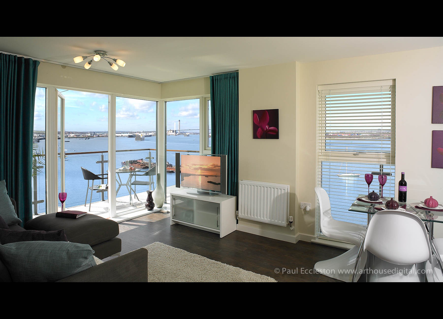
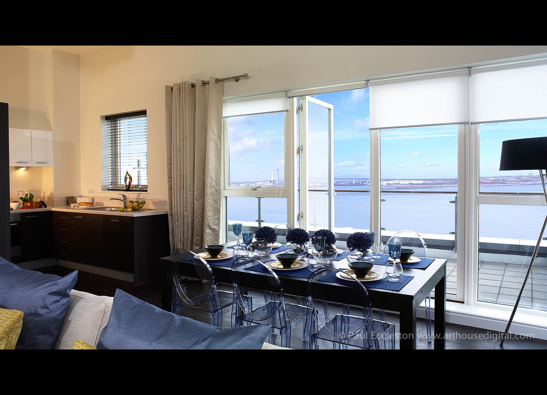
To give an idea of what can be done, here is another Photoshop Composite from the same original.

You can also see full screen versions of these images in my portfolio section on this website. https://www.adshotsdigital.com/high-end-retouching-portfolio-gallery/
I have assumed you know Photoshop reasonably well in this blog. If there are any points you are not sure about please leave a comment.
16 bit mode in Photoshop.
Preserving Image quality using 16 bit mode in Photoshop
I would like to share a method I use in my retouching which minimises loss in quality when making adjustments to processed image files in Adobe Photoshop.
I don’t know if any other retouchers use this method, but I haven’t come across it anywhere else.
16 bit mode v 8 bit mode
A digital image does not show a smooth graduation of tones from light to dark, but a series of steps. These steps are so small that they appear as a smooth graduation to the human eye. When in RGB mode 8 bit is sometimes called 24 bit, as it is 8 bits for each of the three colour channels (3×8=24), or 32 bit if using 4 colour channels in CMYK (4×8=32).
You may have noticed that black in Photoshop has a numeric value of 0, and white has a numeric value of 255. This gives us 256 steps, as the first step is 0 and not 1. For the mathematicians among you 2x2x2x2x2x2x2x2=256. There are eight 2s in that sum, which gives us a bit depth of 8.
16 bit mode gives us many more steps (65536 for each colour channel rather than 256). This will visually look no different to the human eye, but will double the size of your file, making it slower to work with, and using up twice the amount of Hard Drive space.
So What’s the Point of 16 Bit Mode?
The whole point of 16 bit mode is that it minimises quality loss when making adjustments to colour, brightness, levels, curves etc. This will show in your image where there are graduations that don’t run smoothly.
To illustrate this point there are 2 images below. The first image has had a large adjustment made to the levels in 8 bit mode, then I’ve tried to get back to the original image with another levels adjustment in 8 bit mode, resulting in a loss of quality (fig.1).
Fig.01
The second image shows the original file without any loss in quality (fig.2).

Fig.02
Looking particularly at the bottom right hand quadrant, you can see blotches on fig.01, where there should be a smooth graduation.
This loss in quality can be seen more clearly when looking at the histogram. The better quality image is represented by the histogram as seen in the levels pallet (fig.03). Note the smoothness to the graphs curve.
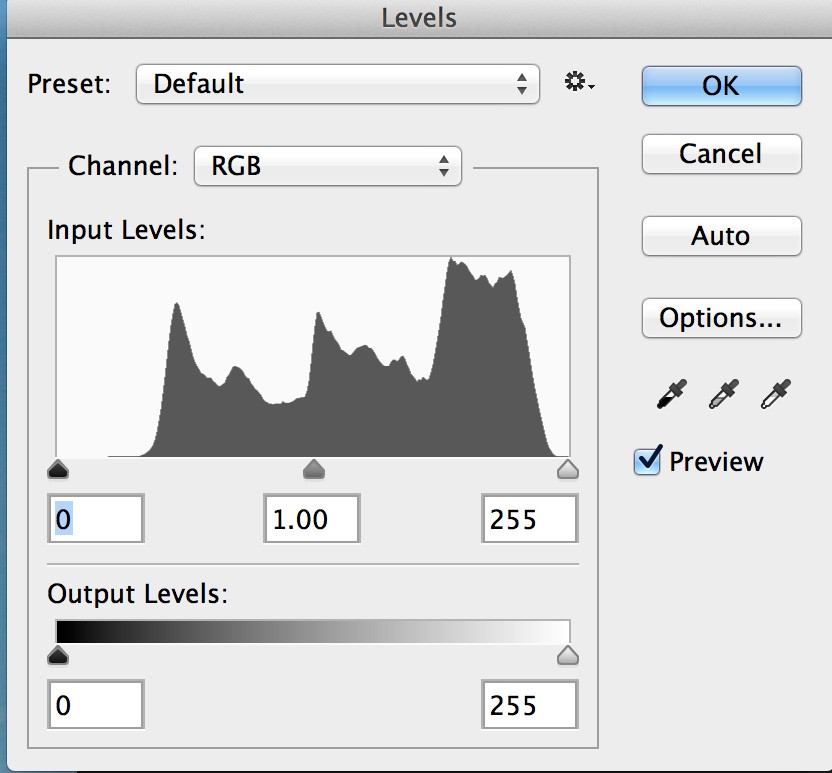
Fig.03
And here’s the histogram from the poorer quality image. Note the sharp peaks and troughs in the graphs curve (fig.04).
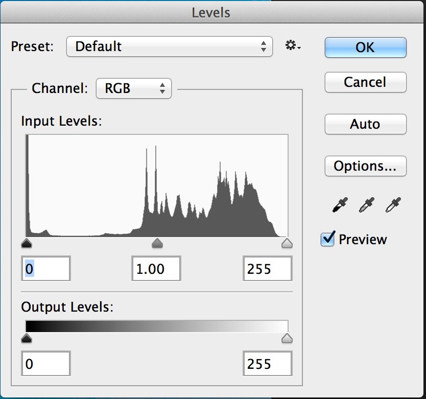
Fig.04
Here’s the important point; a 16 bit image is no better quality than an 8 bit image, unless you’re going to make adjustments.
The more common way of working
The more common way of working is to convert to 16 bit mode, make the necessary adjustments, and then convert back to 8 bit mode.
My variation on this
I always prefer to work with adjustment layers, which can be accessed via the layers pallet (fig.05).
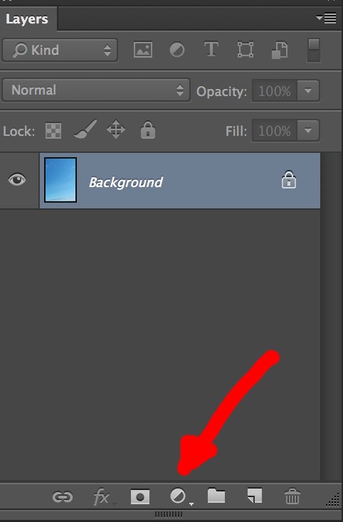
Fig.05
Adjustments can be made in 8 bit mode, as they are not applied to the image, but live on a separate layer.
Once you have built up all the adjustment layers you need, you can convert to 16 bit mode, flatten the image and convert back to 8 bit mode. Although this is a very simple three steps I would recommend recording an Action for it (see previous blog). I have one in my Actions pallet, which I call “Flat 16”. It allows an image to be flattened at a high quality, with a single click, and is an action I use regularly.
My Workflow Ideas
I usually store two versions of retouched images. The first one is a flattened image, as described above, and usually the version supplied to the client. The second version is a .psd file, with all the layers. This gives me the flexibility to make any additional adjustments more easily.
Final Point
Using 16 bit mode as described above, has a definite quality benefit, but you can still do better, making adjustments to RAW files where possible. I will always get as close as possible to the perfect image by utilising the flexibility inherent in RAW files. Photoshops editing capabilities are more comprehensive than processing sofware, which is why I often use the above method. This difference is however, getting smaller and I can’t help speculate that tonal adjustments to RAW files will one day be as good.
As usual, any relevant comments on this blog are very welcome.
Photoshop Actions
Photoshop Actions: A brief explanation
Photoshop Actions is a way of recording a sequence of tasks in photoshop, which can then be played back at the click of a button. This in itself is a real time saver, but when used in conjunction with Adobe Bridge an action can be applied to any number of images via the image processing tab saving huge amounts of time. Those long repetitive tasks can be set in motion while you have a cup of tea and put your feet up.
Finding the actions Window
In any version of Photoshop go to the top of the screen and click on Window/Actions. (fig.01)
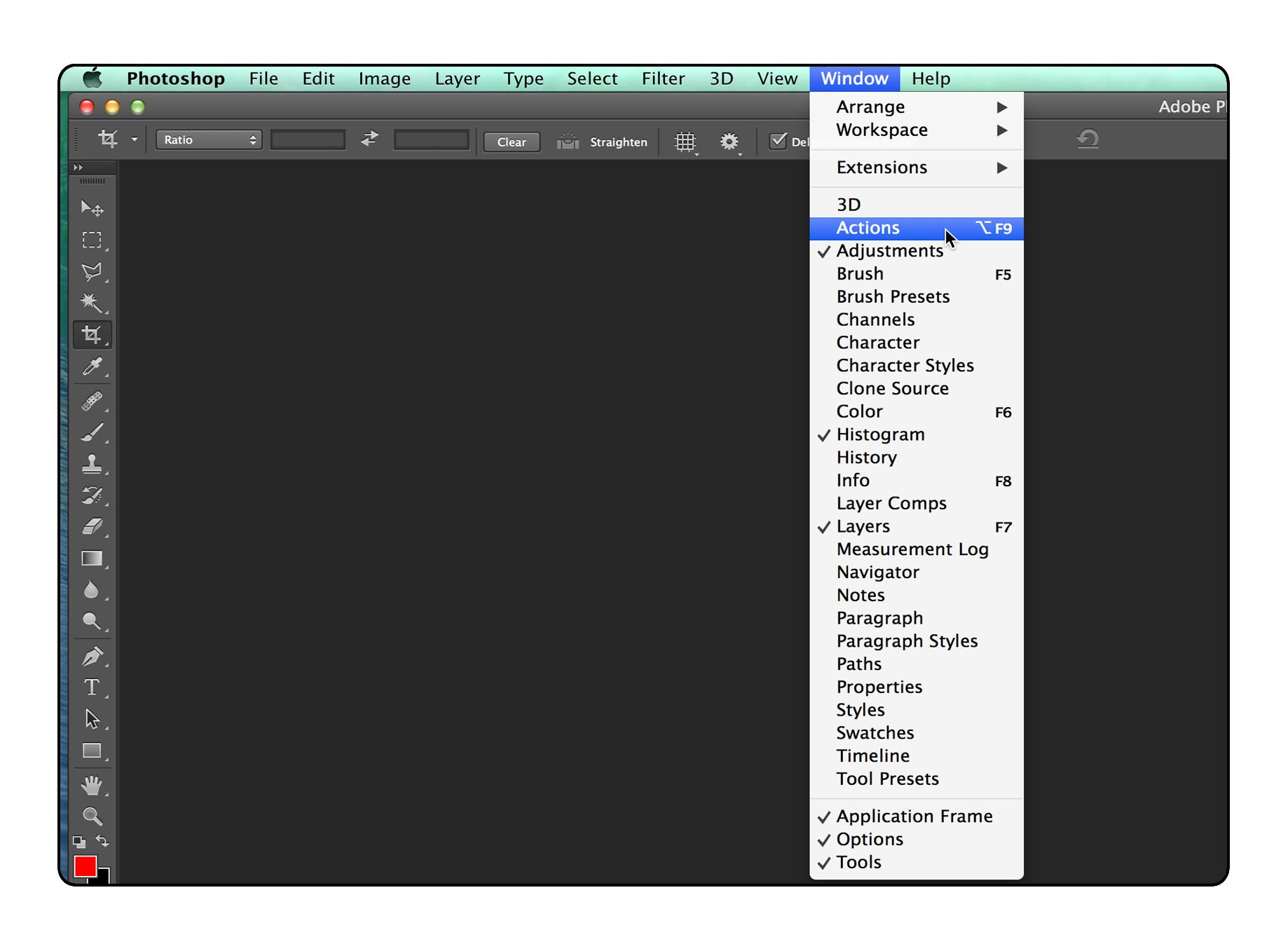
fig.01
OR In Photoshop cc make sure you’re in the “Photography” Workspace (fig.02)

fig.02
The Actions Window can be found by clicking on the play icon. (fig.03 & 04)
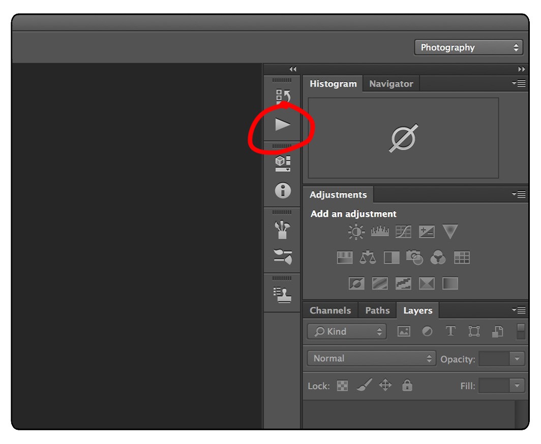
fig.03
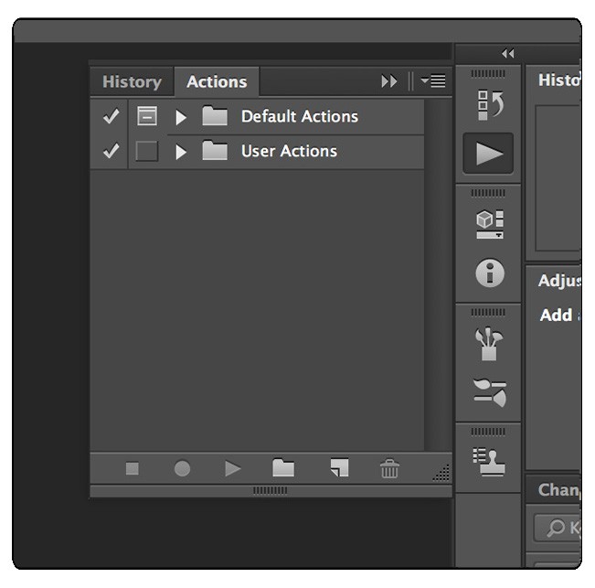
fig.04
Recording an Action
Looking back to fig.04 you can see that there are 2 folders labelled “Default Actions” and “User Actions”. These are known as “Sets” in the actions window. You can record an action into either of these sets, but for this example I’m going to record into a new set.
Click in the top right hand side of the Actions window. (fig.05).
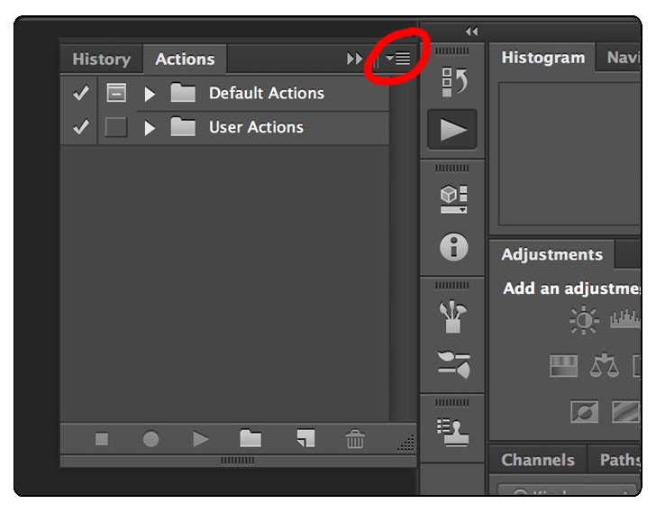
fig.05
Select “New Set…” (fig.05a)
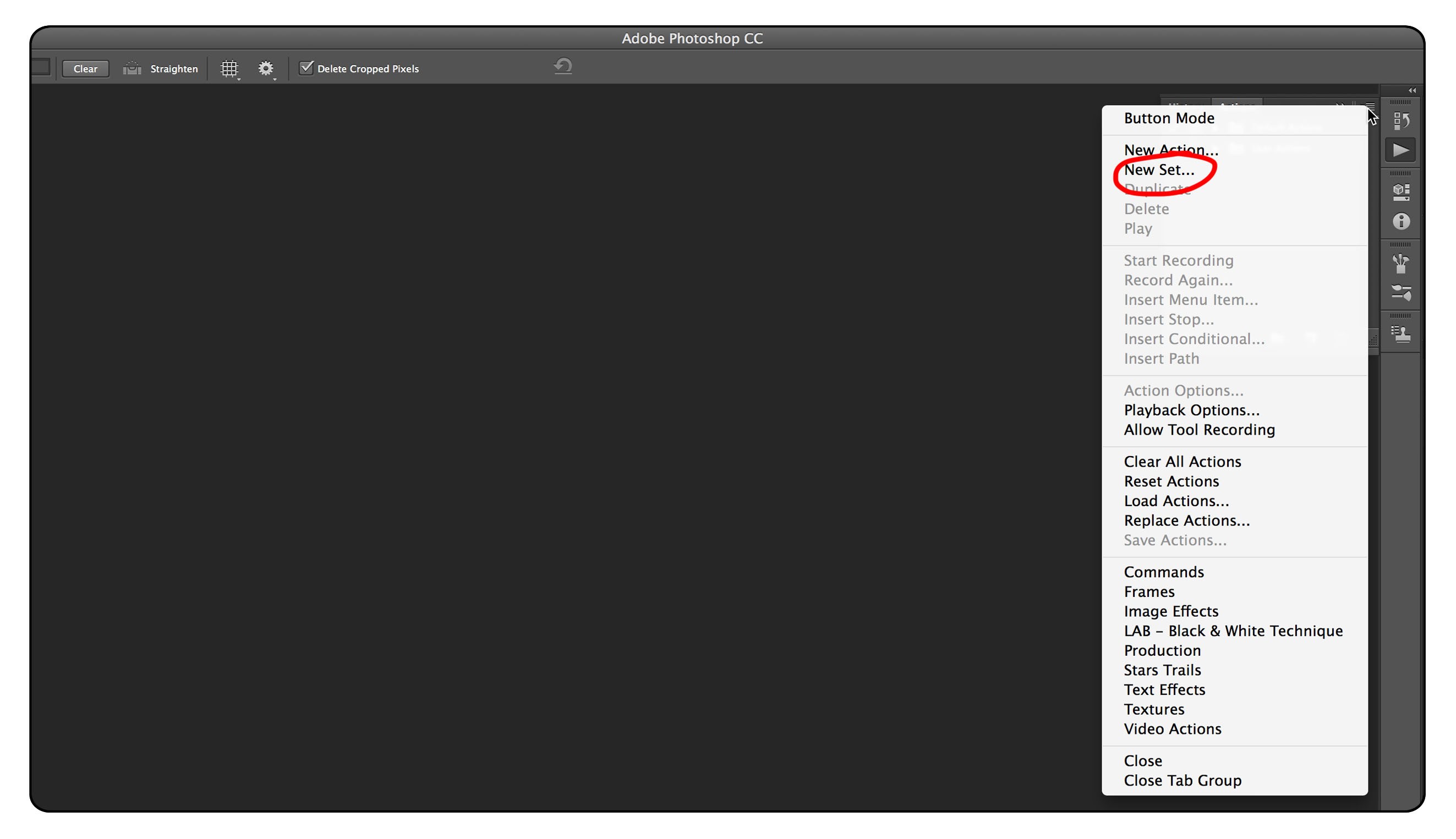
fig.05a
Type in a relevant name. I’m going to call mine “Contacts” as I’ll eventually set up several actions related to writing contacts.
Below is a contact open in Photoshop that I would like to extend the canvas on, add a title to and add copyright details to in the bottom right hand corner.
Click on the top right hand corner of the Actions window again and this time select “New Action…”. Name the action something appropriate. I’ll call mine “Title and Copyright”.
The record button should already be active and the new set and action visible as shown below. (fig.06)
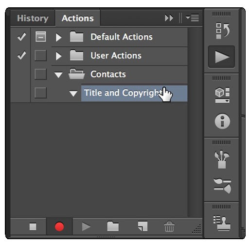
fig.06
Now to start doing the tasks in photoshop:
Click on “Image” then “Canvas Size”. (fig.07)
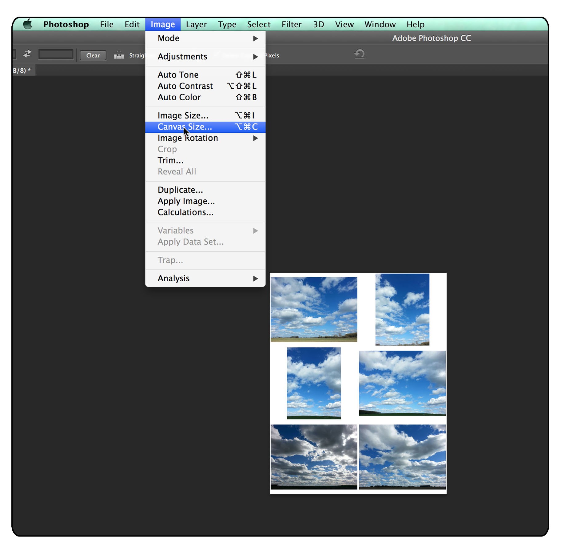
fig.07
I’m increasing my image size from 25.4cm to 29.7cm so have changed the height accordingly. The width is left unchanged. Also make sure the “Canvas extension color” is set to “White”. This is preferable to selecting “Background color” which by default is white, but may easily change without you realising. (fig.08)
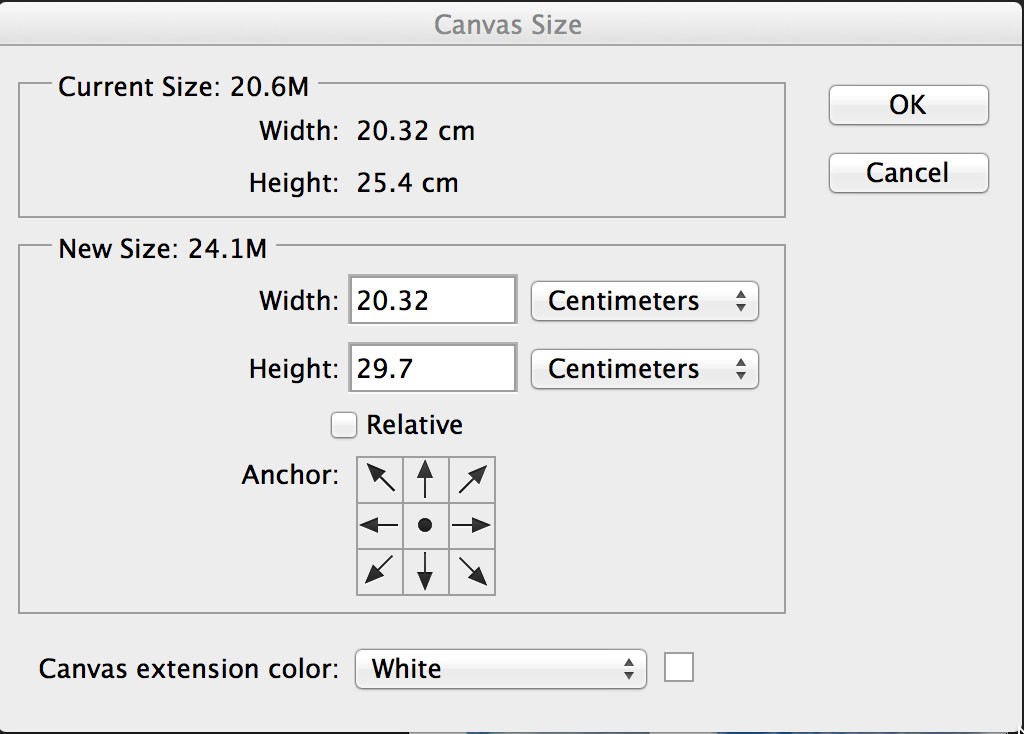
fig.08
Next type in copyright details on one layer and the title on a separate layer using Photoshop’s Type tool. You can reposition as needed.
Here’s the finished contact. (fig.09)
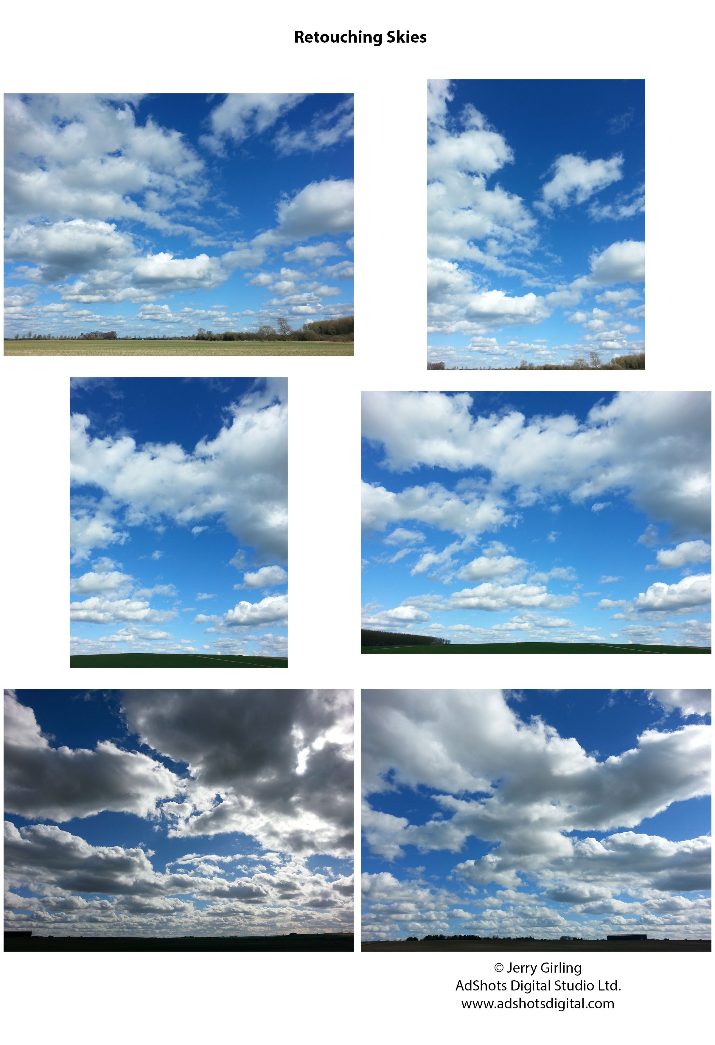
fig.09
Be sure to press the stop button to stop recording, once you’re happy with the results. (fig.10)
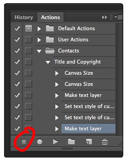
fig.10
Playing an Action on an open image
This is very simple. Open the image in Photoshop. Press the play button. Assuming all contacts are of the same size, the canvas will be extended, typing applied and positioned exactly as before.
Playing the Action on a batch of images selected in Adobe Bridge
Here’s where the real time saver comes in.
Open up Adobe Bridge and select the images you want to apply the action to: click on the first image, press the shift key, then click on the last image.
Go to Tools/Photoshop/Image Processor (fig.11)
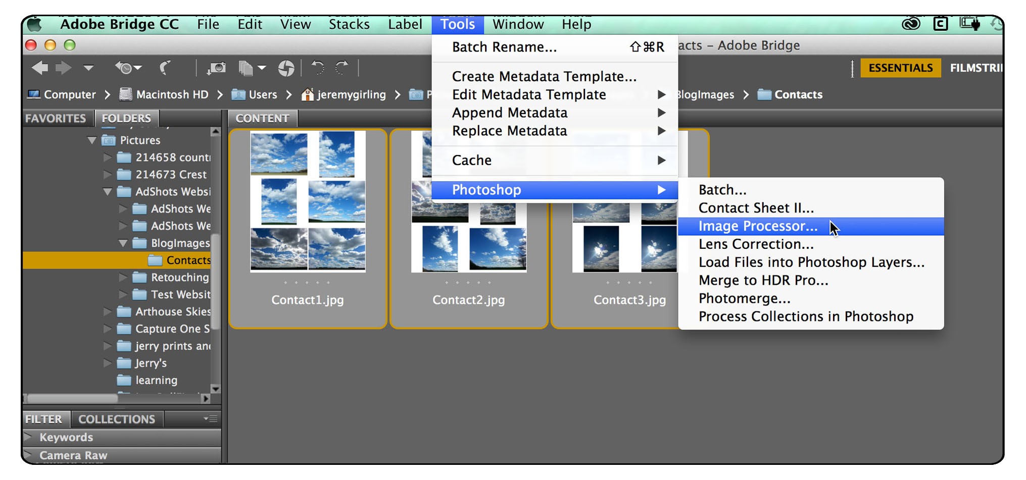
fig.11
Sections 1-3 are fairly self explanatory. The images will be processed into a folder labelled (JPEG) in the same locations. They will only be saved as jpegs, but you can select multiple file types in section 3.
Section 4 is where you select the “Set” or folder that your Action is in (in this case “Contacts”) and then the action itself (Title and Copyright). Making sure the “Run Action” box is ticked.
In addition to this I have chosen to embed my copyright details in the file, and it is good practice to “Include ICC Profile”.
Here’s the Image Processor window with details filled in, as described above, showing where to find the “Run Action” section. (fig.12)
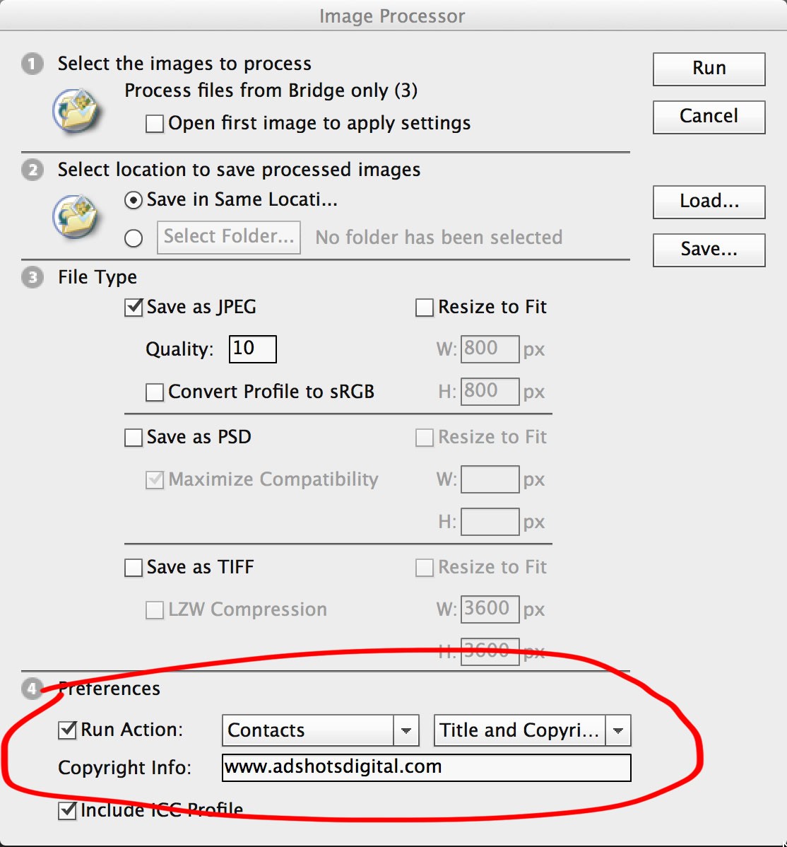
fig.12
Click on the “Run Button” in the top right hand of the “Image Processor” window to process the images.
All the original images are kept untouched and the new processed images saved in a folder labelled according to the file type selected.
I hope you have found this useful. Once you get the idea of Actions, you start to come up with all sorts of ideas of when to use them. Any time you find yourself repeating the same task over and over again in Photoshop stop and think if you could do this with an Action.
Next blog I will show you an action which I call “Flat 16”, which will explain how to make adjustments to images without a loss in quality.
As always, any comments or information you would like to share are very welcome.
19 Photoshop Time Saving Tips
19 Photoshop Time Saving Tips
I have noticed a recent trend, particularly in Architectural photography, for a higher volume of shots per job. Sometimes as much work is done in front of a computer as is done from behind the camera. This is not including complex retouching, but just getting images up to an acceptable standard.
Going back to the “good old days” of film; six to twelve shots, supplied on 5×4 film, with a 2 to 3 day turnaround was quite normal. Clients also had larger budgets to spend on advertising i.e. being able to splash out on models, props and, of course, photography.
Today, we live in a very different world, where a significantly higher volume of shots are expected and sometimes need to be supplied within one day of shooting. Photographers in the advertising business have a dilemma: do they work on quality or quantity. Most photographers will want to go with quality, but clients want choice and push towards quantity.
Having a good workflow, automating those long tedious tasks, knowing the short cuts (particularly in Photoshop) and knowing your client will allow photographers and retouchers to get a larger volume of shots up to a good standard within a required period of time.
Below I would like to share a few of my favourite Photoshop time-saving tips, using Mac. If you’re not already using them, I would recommend that you do. The time invested in learning them will more than be paid back.
Moving around the image quickly
- • ⌘Cmd and Spacebar. Click and drag to the right to zoom in. Click and drag to the left to zoom out. On older versions of Photoshop you need to click and draw a box around the area you want to zoom in on.
- • Hold down the spacebar, click and drag to scroll around the image when zoomed in
- • Press and hold the ⌘Cmd key to temporarily access the move tool. When you let go of the ⌘ Cmd key you automatically go back to the last tool selected in the tool pallet. (This is different from using the “V” key which changes the tool selected in the tool pallet to the move tool)
- • To see the whole image again, in a full sized window press ⌘ Cmd and 0 keys.
- • To zoom in by increments press ⌘Cmd and + keys.
- • To zoom out by increments press ⌘Cmd and – keys.
Selecting useful tools
- • B key to select brush.
- • J key to select Healing tool.
- • L key to select Lasso selection tool.
- • T key for type tool.
- • C key for crop tool.
- • G key for gradient tool.
- • P key for pen tool.
- • S key for stamp tool (also known as clone tool).
Other useful shortcuts
- • [ (open square brackets) key to decrease size of any brush tools.
- • ] (close square brackets) key to increase size of any brush tools.
- • Number keys to change opacity of any of the brush tools by increments of 10%: 1=10%, 2=20%, 3=30% etc. The only not so obvious one is 0=100%.
- • ⌘Cmd and Z key to undo last history state. Pressing repeatedly will toggle between the last 2 states recorded in the history pallett. To keep moving back through the history states use the ⌥Alt key also (i.e. ⌥Alt, ⌘Cmd and Z keys).
- • ⌘Cmd and S keys to save your work. Press these keys regularly to avoid accidentally losing work. I’m in the habit of pressing these keys every time I answer the phone.
There are many more shortcuts, but these are what I consider to be the most important. Using them regularly will save hours of time.
If there are any other tools or menu items not mentioned here that you use regularly it is quite simple to find out the shortcut. Hovering over a tool in the tool pallett should reveal the shortcut to that tool. Viewing dropdown menus also shows shortcuts. It’s important to note there’s not a shortcut for everything.
I would also recommend learning to use Photoshop’s actions. This is very useful to apply a sequence of tasks on one or more images at the click of a button. It is also a big enough topic for a blog all of its own, which I will write about next.
If there are any Photoshop shortcuts you use regularly or related comments and questions, please feel free to share them on this blog.